News from Around the AHL/NHL/KHL 2020-21

Status
Not open for further replies.

PK Cronin

Bailey Fan Club Prez
Feb 11, 2013
34,263
23,656
I mostly agree with you but i hate the VAN gradient (all gradient jerseys for that matter), love LAK and think the DET ones suck.

I fluctuated with Vancouver, the gradient is really interested and just decided I liked it (I hated it on the original jersey they're using as inspiration). I'd like to see it on a player and on the ice though. Usually gradients completely suck though. The Kings one is very strong, it's just in a strong field in that division. One of the better ones for sure. The more I look at the Islanders one, the more I think it would've looked better with the new NY logo on it. Obviously that wouldn't be retro at all so here we are.
 
  • Like
Reactions: Mr Misunderstood

Richie Daggers Crime

Boosted 9 times double masked they/them
Mar 8, 2004
17,369
6,647
Boise
Which of the reverse retro jerseys do you like best? Genuinely curious given your background.

I had to go look them up, which means I'll be sending you an invoice.

Some of them, like the Isles or say, Philly or the Oilers, didn't make enough of a change for me to care either way.

My favorite ones are Colorado, Minnesota, Pittsburgh, and Carolina. They should have gone with plain white with the Carolina, though.

Worst ones: Buffalo, Vancouver, Rangers, and Winnipeg.
 
  • Like
Reactions: PK Cronin

eoin92

Registered User
Jun 14, 2013
4,707
2,049
This jersey is just fine. I don’t need to be at an islanders home game with thousands of ranger fans chanting “we want fish sticks” ever again.
 

Throttle

Registered User
Sep 22, 2020
5,536
4,217
I fluctuated with Vancouver, the gradient is really interested and just decided I liked it (I hated it on the original jersey they're using as inspiration). I'd like to see it on a player and on the ice though. Usually gradients completely suck though. The Kings one is very strong, it's just in a strong field in that division. One of the better ones for sure. The more I look at the Islanders one, the more I think it would've looked better with the new NY logo on it. Obviously that wouldn't be retro at all so here we are.
The PAC is mainly awful, except the Kings.
 

Throttle

Registered User
Sep 22, 2020
5,536
4,217
Couple of interesting orange concepts, first is basically what they should have gone with if they stuck with the theme, second integrates the fisherman but simplifies the color scheme:

CHECK OUT What the Isles Alternate Jersey Should Look Like


What's with the obsession of Isles fans wanting a full on orange uniform? Tone down the orange, if anything.

and...enough of the lighthouse from the 90s with the wave already. It was a shoulder patch, nothing more, nothing less. It's tied to the fisherman era. It's a lighthouse of all things. It has limited meaning and appeal beyond the 'LI is the best place on Earth' crowd. Did FL make the palm tree shoulder patch a primary? Look at that Vegas RR jersey and you can see the bad side of making shoulder patches your primary even for limited edition runs.
 

MJF

Hope is not a strategy
Sep 6, 2003
27,090
19,854
NYC
What's with the obsession of Isles fans wanting a full on orange uniform? Tone down the orange, if anything.

and...enough of the lighthouse from the 90s with the wave already. It was a shoulder patch, nothing more, nothing less. It's tied to the fisherman era. It's a lighthouse of all things. It has limited meaning and appeal beyond the 'LI is the best place on Earth' crowd. Did FL make the palm tree shoulder patch a primary? Look at that Vegas RR jersey and you can see the bad side of making shoulder patches your primary even for limited edition runs.
I would have taken the Lighthouse ahead of the dopey fisherman as the crest on a blue, teal, orange, silver alternate jersey.
 

seabass45

Registered User
Jan 12, 2007
8,165
1,442
What's with the obsession of Isles fans wanting a full on orange uniform? Tone down the orange, if anything.
The theme* is reverse retros, take a classic jersey and do something new with the color scheme. I don't think anyone has an obsession with orange jerseys (we don't have a great history with it in practice) but it's the most obvious choice if you're going with the theme.

*I guess the theme is also making money, which the Isles won't be doing much of here since there's barely a difference between this and the standard jersey.
 

se7en

infamous...
Apr 14, 2010
1,155
30
Maui, HI
I thought I'd pop in, I agree with almost everyone's takes..

The new RR jersey is underwhelming & I think alot of us hoped for something more but at least its clean. I feel like Lou, with the new arena & the Islanders becoming more relevant again wanted to keep it simple with no gimmicks & harken back to the glory days as if we're now entering them again.

As for fishsticks. I have a love/ hate for them. I became an Islanders fan that year. I just lost my North Stars that year & we moved from Minnesota to Queens. They were hideous BUT at the same time, im at the point where enough time has passed that I can enjoy the misery of those years & embrace it now if done right.. I found a cool concept one, ill try to post it.

Lastly, i think Colorado/Quebec, Carolina/Hartford & new Wild /North Stars jerseys are the best (but I love those old teams) i wish Minny would of gone with the "M" instead of the logo tho (assuming North Stars logo was off limits). Anaheims are my least favorite. That level of campy Disney throwback makes the Fisherman look classy.
 
Last edited:

se7en

infamous...
Apr 14, 2010
1,155
30
Maui, HI
I thought this did fishsticks some justice. Id change it a bit but I could of supported a fisherman RR jersey in this updated style or similar
 

Attachments

  • Screenshot_20201114-220247_Instagram.jpg
    Screenshot_20201114-220247_Instagram.jpg
    653.5 KB · Views: 12
  • Like
Reactions: Quicklime

seabass45

Registered User
Jan 12, 2007
8,165
1,442
I thought I'd pop in, I agree with almost everyone's takes..

The new RR jersey is underwhelming & I think alot of us hoped for something more but at least its clean. I feel like Lou, with the new arena & the Islanders becoming more relevant again wanted to keep it simple with no gimmicks & harken back to the glory days as if we're now entering them again.

As for fishsticks. I have a love/ hate for them. I became an Islanders fan that year. I just lost my North Stars that year & we moved from Minnesota to Queens. They were hideous BUT at the same time, im at the point where enough time has passed that I can enjoy the misery of those years & embrace it now if done right.. I found a cool concept one, ill try to post it.

Lastly, i think Colorado/Quebec, Carolina/Hartford & new Wild /North Stars jerseys are the best (but I love those old teams) i wish Minny would of gone with the "M" instead of the logo tho (assuming North Stars logo was off limits). Anaheims are my least favorite. That level of campy Disney throwback makes the Fisherman look classy.
It's fascinating because the push for the fishsticks jersey seems to be coming from the younger portion of the fanbase, which has no connection to the "glory days". I would guess that the fans who want to ignore that era trend a bit older. I'm in the middle, born in 82 so I'm just young enough to have no recollection of the cup teams, and also of the age that had gotten both iterations of the 90s jerseys and thought both were cool. I also want them to keep trying something new even if they keep screwing it up.
 

Throttle

Registered User
Sep 22, 2020
5,536
4,217
I would have taken the Lighthouse ahead of the dopey fisherman as the crest on a blue, teal, orange, silver alternate jersey.
That's kinda like selecting the last seat in coach on an airplane.
 

Throttle

Registered User
Sep 22, 2020
5,536
4,217
The theme* is reverse retros, take a classic jersey and do something new with the color scheme. I don't think anyone has an obsession with orange jerseys (we don't have a great history with it in practice) but it's the most obvious choice if you're going with the theme.

*I guess the theme is also making money, which the Isles won't be doing much of here since there's barely a difference between this and the standard jersey.
Lots of fan mockups have an all orange for the Isles outside the RR theme. Its in their color palette, but, IMO, stay in limited use as it's not an appealing primary color for the most part.
 

MJF

Hope is not a strategy
Sep 6, 2003
27,090
19,854
NYC
That's kinda like selecting the last seat in coach on an airplane.
The Lighthouse was never offensive to me. The colors and numbers on the fishsticks jerseys were fine. It was always about that dumb logo.
 

Throttle

Registered User
Sep 22, 2020
5,536
4,217
It's fascinating because the push for the fishsticks jersey seems to be coming from the younger portion of the fanbase, which has no connection to the "glory days". I would guess that the fans who want to ignore that era trend a bit older. I'm in the middle, born in 82 so I'm just young enough to have no recollection of the cup teams, and also of the age that had gotten both iterations of the 90s jerseys and thought both were cool. I also want them to keep trying something new even if they keep screwing it up.
Probably, but also seems to go with the theme of 'do it' because that's what 'I' want just to see it vs. understanding how cartoony that logo is for the NHL. Its similar to something prevalent in the AHL, ECHL, and Canadian Jr. leagues.

There's a lot of pent up stuff from the older crowd and the major shift in the brand. However, its more the cartoony aspect of the logo that doesn't work for a NHL team.
 

Throttle

Registered User
Sep 22, 2020
5,536
4,217
The Lighthouse was never offensive to me. The colors and numbers on the fishsticks jerseys were fine. It was always about that dumb logo.
I don't think the lighthouse offends anyone, it's just a lighthouse.
 

se7en

infamous...
Apr 14, 2010
1,155
30
Maui, HI
It's fascinating because the push for the fishsticks jersey seems to be coming from the younger portion of the fanbase, which has no connection to the "glory days". I would guess that the fans who want to ignore that era trend a bit older. I'm in the middle, born in 82 so I'm just young enough to have no recollection of the cup teams, and also of the age that had gotten both iterations of the 90s jerseys and thought both were cool. I also want them to keep trying something new even if they keep screwing it up.

Im with you on that, I'm born in '81 & I was about 12 when we moved to NY. I had no problem with the Fisherman jersey at the time, I was too young to think about it objectively.

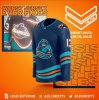
My first game at the coliseum, I was in that fishsticks jersey watching as we destroyed the Rangers. It was so much fun & was just stoked to now have the Islanders as my new team. It wasn't til I started hitting my teens when I starting really hearing all the distain for that jersey & started to understand more about what was happening to the franchise & how we became a joke. Thats when my indifference turned to dislike & I was happy to have shifted away from it & I just wanted to pretend it never happened.

But now I'm old enough to just appreciate thats when I met & fell in love with the Islanders. Embrace the giant gaff, & have some fun with it.

I will say this, finally being a contender again helps alot! This was the first year in all my Fandom that my Rangers & Flyers fans friends actually gave the nod of respect. It was nice. Taking out the Penguins & Capitals in the playoffs the last 2 years gave us so much more noticable respect nationally.

Hopefully we keep it going! I have all my faith in Lou & Barry!
 
  • Like
Reactions: Quicklime

se7en

infamous...
Apr 14, 2010
1,155
30
Maui, HI
Just can't agree. I really dig those Oilers uniforms. I'd like to see Arizona use that purple more.

Those Oilers threads are sweet! I think they nailed it. HM to Kings

Yotes did something cool but I still struggle with hockey & southwest desert theme mix. Its cool for them but yet, well... awkward haha
 

Richie Daggers Crime

Boosted 9 times double masked they/them
Mar 8, 2004
17,369
6,647
Boise
The Lighthouse was never offensive to me. The colors and numbers on the fishsticks jerseys were fine. It was always about that dumb logo.

The waves are just objectively bad. Setting aside that they caused everything in the jersey to be awkwardly placed and angled, and that they clashed in terms of design with the logo... they look like they were hand drawn.
 
  • Like
Reactions: And You Feel Shame
Status
Not open for further replies.

Ad

Upcoming events

  • Great Britain vs Finland
    Great Britain vs Finland
    Wagers: 1
    Staked: $400.00
    Event closes
    • Updated:
  • Kazakhstan vs Slovakia
    Kazakhstan vs Slovakia
    Event closes
    • Updated:
  • Darmstadt vs Hoffenheim
    Darmstadt vs Hoffenheim
    Event closes
    • Updated:
  • Canada vs Denmark
    Canada vs Denmark
    Wagers: 2
    Staked: $1,010.00
    Event closes
    • Updated:
  • France vs Latvia
    France vs Latvia
    Wagers: 3
    Staked: $1,461.00
    Event closes
    • Updated:

Ad

Ad