Rumor: Linden " wheels in motion " jersey change?

Win One Before I Die

Cautious Optimism
Jul 31, 2007
5,119
4
I'm basically fine with changing and updating the jerseys every once in awhile, as it's a must as times evolve, but the logo needs to standpat for the most part. See: Chicago, Detroit, Philadelphia, New York I/R, Boston.

I think the biggest problem with the Canucks jersey is in fact the logo. What does an Orca have to do with a Canuck? Was the Orca even a Vancouver thing or was it Orca Bay?
 

vadim sharifijanov

Registered User
Oct 10, 2007
28,794
16,262
^ i'm not an expert on these things but is the orca design specific to any nation's formal artistic traditions, or is it just generic stereotypical native NWC art?
 

Bro Horvat

2011 Truther
Mar 20, 2013
1,219
0
Vancouver
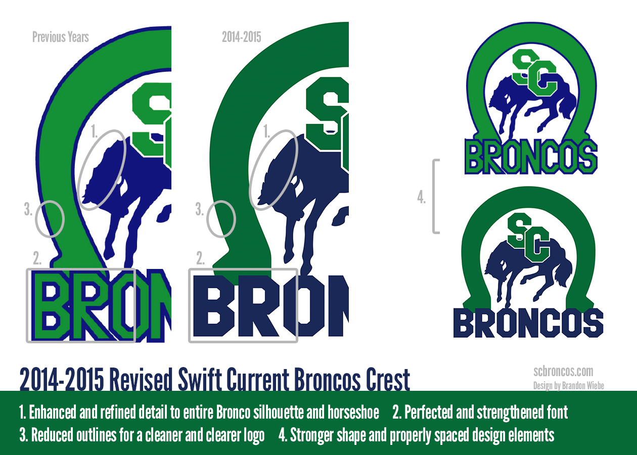
The organization should bring in Brandon Wiebe, engineer of the Swift Current Broncos' new-old visual design. Clearly he knows how to make blue, green and white work cohesively.

BpN5degCEAAQJD2.jpg:large


b32b69623d87512dfdd21328ce9b16fb.jpg

You're better than this Zombo! You're a graphic designer.
 

PG Canuck

Registered User
Mar 29, 2010
62,963
24,135
Looks so weird and empty without the wordmark. :laugh: Maybe it's because of the no shoulder patches, which I think shouldn't be removed.
 

PG Canuck

Registered User
Mar 29, 2010
62,963
24,135
Zombo, anyway you could put shoulder patches back on? I'm interested to see what it would look like then. Looking at that jersey further, I'd definitely want the stick in rink logo back, or some other logo because I'm not liking the orca alone.
 

polarbearcub

Registered User
May 7, 2011
13,845
1,903
Vancouver
I've also included a variant with the logo trimmed in green.


iDGlcu6.jpg
Looks ok....I just hate that word mark. Better gone.

Someone mentioned to me that the third jerseys have been worn 10 times already and the regular ones 12.....

Wonder if they're phasing out the word marked ones.

I also wanna see what a white version of the current third stink in rink would look like.
 

SvenBaertschi

Not Sven Baerschi
Aug 19, 2012
829
2
I hate the logo and the name :S

wtf is a canuck... a Canadian (sometimes derogatory in US use)

oh awesome name....
 

Zombotron

Supreme Overlord of Crap
Jan 3, 2010
18,336
9,870
Toronto
wtf is a canuck... a Canadian (sometimes derogatory in US use)

oh awesome name....

Yeah. How about Pioneers or Voyagers or Lumberjacks or Royals or Empire, names much more befitting of the history of the city and region? In a perfect world, Vancouver and Calgary would trade team names because Calgary Canucks sounds phonetically superior to Calgary Flames (not to mention the fact that the Flames are named for the Alberta energy industry - a bit of a contentious industry in today's day and age), and Vancouver Flames would be an appropriate name for this team, taking into consideration the Great Fire which burnt all of Vancouver down, and from which the town was started over, becoming what it is today.

Or...

Vancouver_Blazers.png


In the end it's all for naught because we're stuck with it.
 

GetFocht

Indestructible
Jun 11, 2013
9,077
4,373
Canucks logo is actually one of the modern designs in the league. Look at every logo in the NHL, none of them are much better.
 

NuxFan09

Registered User
Jun 8, 2008
21,649
2,631
Merritt, BC
I think the organization should just go back to the stick in rink. Take the current 3rd jersey and make that the primary. I like the idea of going back to the team's roots. The Canucks are the 11th oldest team in the league (tied with Buffalo). Of the 10 which are older, 9 have all stuck with their original logos.
 

Zombotron

Supreme Overlord of Crap
Jan 3, 2010
18,336
9,870
Toronto
Canucks logo is actually one of the modern designs in the league. Look at every logo in the NHL, none of them are much better.

Five years from now, when the design is over twenty years old, its staying power will probably be realized and they'll either keep it wholesale or simplify it like Nashville did with their logo (which was introduced at the exact same time as the Canucks' logo - off-season 1997).

I'd be interested in seeing something radical replace it, but we pretty much have to accept that this is what's going to happen.
 

NuxFan09

Registered User
Jun 8, 2008
21,649
2,631
Merritt, BC
Canucks logo is actually one of the modern designs in the league. Look at every logo in the NHL, none of them are much better.

Oh, no doubt it's a good looking logo (in my mind anyway). I think it's the lack of relevancy to the team name that makes it stick out in a negative way. If our team name was, say, the Vancouver Orcas, it would be fantastic.

I love our jersey. I just want to get back to the team's roots and then stick with that for good.
 

carolinacanuck

Registered User
Apr 5, 2007
2,549
92
The Carolinas
johnny canuck all day, everyday. it's the only logo that really exemplifies a 'canuck'

i wear my new stylized stick n rink hat down here in the states and people have no idea what it is.

johnny canuck - skates, gloves, hockeystick...it just screams hockey and canuck. love it.
 

polarbearcub

Registered User
May 7, 2011
13,845
1,903
Vancouver
johnny canuck all day, everyday. it's the only logo that really exemplifies a 'canuck'

i wear my new stylized stick n rink hat down here in the states and people have no idea what it is.

johnny canuck - skates, gloves, hockeystick...it just screams hockey and canuck. love it.

Johnny Canuck logo makes me want to punch things ... Just by opinion. Looks cartoony and amateur IMO
 

jrlp

Registered User
Jan 30, 2008
263
4
Vancouver
I've often thought the wordmark was a neat idea that couldn't overcome the strikes against it. It's the longest wordmark so it lacks the more compact boldness and wider arc of say, Dallas. It doesn't benefit from the more spacious diagonal placement we see in Colorado or Rangers. And because the letters need to be sized to fit, it's too small to be effective while at the same time taking up too much room, leaving the logo a bit undersized and too low on the chest IMO. The Millionaire V solves this problem nicely plus has the vintage touch. The Orca alone is quite nice, one of the better modern designs that thankfully lack that awful pointy, spikeyness of Nashville, Buffalo Slug or that damned webbed foot Ducks D. Stick In Rink was of course super cool (and nearly ruined) but it will thankfully survive simply because the eye test nullifies any case against it, really. Simple, clean, side-steps hang ups like "what is a canuck" or other representation vs association gripes. Seems to me - lose wordmark or Stick In Rink or V = problem solved.
 

SvenBaertschi

Not Sven Baerschi
Aug 19, 2012
829
2
Yeah. How about Pioneers or Voyagers or Lumberjacks or Royals or Empire, names much more befitting of the history of the city and region? In a perfect world, Vancouver and Calgary would trade team names because Calgary Canucks sounds phonetically superior to Calgary Flames (not to mention the fact that the Flames are named for the Alberta energy industry - a bit of a contentious industry in today's day and age), and Vancouver Flames would be an appropriate name for this team, taking into consideration the Great Fire which burnt all of Vancouver down, and from which the town was started over, becoming what it is today.

Or...

Vancouver_Blazers.png


In the end it's all for naught because we're stuck with it.

Vancouver Blazers would be hilarious and fitting lol
 

davidlindquist

Registered User
May 7, 2015
2
0
Victoria BC
RE: Vancouver Jersey Change

I'm a die hard Vancouver Canucks fan, however, I dislike everything about their current uniforms.

In my opinion, all the elements are already created in uniform's past to make a solid new set of jerseys -- I took a shot at re-designing the uniforms how I'd like to see them...

http://i.imgur.com/7Um3Ctc.png

PS: Please forgive the 'fat boy' jersey template used.
 

ginner classic

Dammit Jim!
Mar 4, 2002
10,636
935
Douglas Park
I'm a die hard Vancouver Canucks fan, however, I dislike everything about their current uniforms.

In my opinion, all the elements are already created in uniform's past to make a solid new set of jerseys -- I took a shot at re-designing the uniforms how I'd like to see them...

http://i.imgur.com/7Um3Ctc.png

PS: Please forgive the 'fat boy' jersey template used.

Green on the shoulders of the dark jersey. Keep the white collar
 

VanJack

Registered User
Jul 11, 2014
21,252
14,427
johnny canuck all day, everyday. it's the only logo that really exemplifies a 'canuck'

i wear my new stylized stick n rink hat down here in the states and people have no idea what it is.

johnny canuck - skates, gloves, hockeystick...it just screams hockey and canuck. love it.

Agree with this...what has an Orca whale got to do with the name 'Canucks' anyway?.....logo was changed originally because the 'Nucks owners had two sports franchises, the NHL team and the NBA Grizzlies and the parent company was called "Orca Bay Sports and Entertainment'. So we became the first NHL team in history with a logo to match the owners' holding company....Dumb.....how about bringing back the original stylized stick with the Johnny Canuck logo just above it?....can't tell me it would look any more ridiculous than that howling coyote or a shark biting a hockey stick.:shakehead
 

Ad

Upcoming events

Ad

Ad