Coyotes Reverse Retro Jersey Discussion

Imaravencawcaw

Registered User
Jul 19, 2018
1,142
1,815
From what I understand they will be worn a few times during the season.

They're also our opening night uniforms.


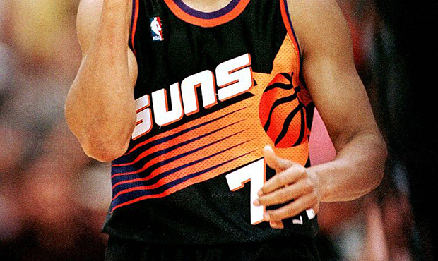
The socks actually make the jersey look a million times better. Purple, orange, and black really bring back memories of those badass Suns jerseys from the glory days.

GettyImages-51546602-2.jpg

gallery_93finals.jpg
 
  • Like
Reactions: Naych_PHX

rt

The Kinder, Gentler Version
May 13, 2004
97,492
46,440
A Rockwellian Pleasantville
The socks actually make the jersey look a million times better. Purple, orange, and black really bring back memories of those badass Suns jerseys from the glory days.

GettyImages-51546602-2.jpg

gallery_93finals.jpg
I like the socks and pants. I like the sleeves. I like the primary purple focus. And I like the Kachina head logo. I hate the trim and I think the lizards are pointless and random. The bottom trim should be some kind of native clay pot design pattern to tie in the lizard petroglyph design. The clipart cacti are pure trash. And the lizards are pointless without some design element that makes sense of them.
 
  • Like
Reactions: Fuhrious

CLW

Registered User
Nov 11, 2018
6,835
6,436
If you look at the shirt as a whole the cacti landscape is not important as such, it's barely noticeable. But the cacti landscape is part of what makes the Peyote shirt brilliant, by far the best shirt out of all these retros. This shirt is the only one that manages to break out of the conventional (and predictably boring) and create art, it even achieves the metaphysical! :)

Without the cacti landscape the shirt would have too much purple and the Coyote head would be lessened. Now the Coyote appears as a spirit totem on the night sky above the desert on a background of Imperial Purple (the color of the Roman Emperors). The cacti landscape's golden sand tones balances nicely against the purple and helps frame and put the focus on the coyote. They could have gone with some boring sand colored sleeves and rims without the landscape, but the shirt would have been lessened and lost the story and overall impact. Now the Coyote, the main symbol, is iconic and totem like.

This shirt is an instant design classic! :thumbu:
 
  • Like
Reactions: Neighborhood Coyote

rt

The Kinder, Gentler Version
May 13, 2004
97,492
46,440
A Rockwellian Pleasantville
Here's eliminating the cacti, and then just adding solid color. I think the right solution is some stylized trim in a native amarican pattern. But I'm using MS Paint and didn't want to spend more than five minutes.
 

Attachments

  • NoCacti.png
    NoCacti.png
    702.5 KB · Views: 16

rt

The Kinder, Gentler Version
May 13, 2004
97,492
46,440
A Rockwellian Pleasantville
If you look at the shirt as a whole the cacti landscape is not important as such, it's barely noticeable. But the cacti landscape is part of what makes the Peyote shirt brilliant, by far the best shirt out of all these retros. This shirt is the only one that manages to break out of the conventional (and predictably boring) and create art, it even achieves the metaphysical! :)

Without the cacti landscape the shirt would have too much purple and the Coyote head would be lessened. Now the Coyote appears as a spirit totem on the night sky above the desert on a background of Imperial Purple (the color of the Roman Emperors). The cacti landscape's golden sand tones balances nicely against the purple and helps frame and put the focus on the coyote. They could have gone with some boring sand colored sleeves and rims without the landscape, but the shirt would have been lessened and lost the story and overall impact. Now the Coyote, the main symbol, is iconic and totem like.

This shirt is an instant design classic! :thumbu:
It's not the concept of the landscape, it's the execution. It looks like absolute shit. Clipart garbage. See how they made the Gilia Monster? Does it look like a clipart Gila Monster? Nope. It's stylized and cool as hell. Make the mountains and cactus look like the Gila Monster, and suddenly you have a good design that's actually cohesive. The desert landscape as designed make ZERO sense. There's absolutely no design cohesion.
 

Canis Latrans

Registered User
Jan 19, 2015
1,250
969
Australia
I don't like the landscape either. It looks like the background from a Mario game, which is retro, but I speculated that it'd make for a mess of clashing styles and it has. It's the mullet of jerseys, kind of formal up top and then party down at the waist. The sock pattern somewhat reminds me of purple Team Germany.

I guess it's fine for an alternative jersey, but if they want to take some inspiration from this and apply it to a brand new main jersey, I think you want to ditch the landscape for the Southwestern patterned striping. One other thing I do like about these is the lack of white on the edging. Instead they've used the sand/cream tone. Hopefully they continue that on any new away jerseys as the white doesn't look good with the Coyotes' color palette.
 
  • Like
Reactions: Neighborhood Coyote

WrinkledPossum

Play Dead
Apr 23, 2016
3,367
1,068
I like them as they are. I like the green cactus as another color involved in the trim. Yah I agree with RT the design of the cacti is a bit like clip Art but these were originally made in the 90s. They're unique and different, I'm a huge fan.

Also love the purple. IDC if the Sun's also wear purple. It looks good. It's also an original color of the team. The purple moon logo is pretty iconic for the franchise. These are going to look great on opening night with the moon at center ice.


Jakey53

Registered User
Aug 27, 2011
30,151
9,189
From what I understand they will be worn a few times during the season.

They're also our opening night uniforms.


I'm starting to like the purple more and more. All of our uniforms have messy trims. Clean that up, and with our unique logo, we could have one of the best selling jersey's in the league.
 
  • Like
Reactions: Coyotedroppings

The Feckless Puck

Registered Loser
Sponsor
Oct 26, 2006
18,566
11,462
The biggest issue I had with the "classic" third jersey that this is based on was the awful, awful green color they used as the jersey base. The purple fixes it. Love it.
 

CLW

Registered User
Nov 11, 2018
6,835
6,436
Here's eliminating the cacti, and then just adding solid color. I think the right solution is some stylized trim in a native amarican pattern. But I'm using MS Paint and didn't want to spend more than five minutes.

I agree with this. The cacti just don't work like they are. The current cacti are what makes the shirt fugly (if brilliant). Stylized cacti, angular to fit the Coyote head and Gila, or even just abstract green angular colors, would work so much better. Without green the sand gold field is a bit too bland imo so getting rid of the green touch diminishes the overall impact.
 

rt

The Kinder, Gentler Version
May 13, 2004
97,492
46,440
A Rockwellian Pleasantville
I agree with this. The cacti just don't work like they are. The current cacti are what makes the shirt fugly (if brilliant). Stylized cacti, angular to fit the Coyote head and Gila, or even just abstract green angular colors, would work so much better. Without green the sand gold field is a bit too bland imo so getting rid of the green touch diminishes the overall impact.
The problem with Orange sand field being to bland is it being just a f***ing sand field. Lol. It’s stupid.

Imagine it being a Hopi clay pot design. The Kachina is a Hopi tradition. Google imagine Hopi Clay Pot, Hopi Woven Basket, or Hopi Weaving Pattern. There’s a ton of great stuff. The Gila Monster reminds me of a Hopi Petroglyph. You could add some of that to the trim. Use these designs as inspiration to come up with a bottom trim that ties in the petroglyph lizards, with the Kachina doll Coyote, and the overall color scheme.

I have three graphic designers in my agency that could get me something vastly superior to this by the end of the day today if I just offered them a bottle of whisky and an Uber Eats coupon for $25 bucks.
 

SniperHF

Rejecting Reports
Mar 9, 2007
42,747
21,532
Phoenix
I don't like the old or the new one :P

At least it's just a gimmicky part time jersey.

Moon returning is like 100/10 decision though and one that should have been made years ago. When we were heavily using the red, it coulda been red like it was in the logos on the walls. Now back to purple with the return of the old kits. They even had that whole raise the moon shtick during the intro a couple years ago.
 

Heldig

Registered User
Apr 12, 2002
17,024
10,429
BC
It would be cool to see a version with the stylized cactus. Overall, I kind of like them, especially as an alternative jersey. Definitely unique AND the best logo in hockey!
 

Vinny Boombatz

formerly ctwin22
Mar 21, 2008
10,999
6,599
Chandler, AZ
Just an FYI that the HockeyGuy ranked Arizona as the best retro jersey. 1st time in the HockeyGuy's existence on his channel that he's selected Arizona first for anything. In the best Carl Spackler voice "so we've got that going for us, which is nice".
 
  • Like
Reactions: Neighborhood Coyote

Tanic

Registered User
Dec 28, 2003
208
75
Visit site
Moon returning is like 100/10 decision though and one that should have been made years ago.

The center ice moon was removed from America West Arena after numerous visiting teams complained that they were losing the puck in the purple paint. Guess everyone forgot. :D
 

rt

The Kinder, Gentler Version
May 13, 2004
97,492
46,440
A Rockwellian Pleasantville
Some teams did really well with this, Arizona included I think.

Some teams did absolutely terrible. Toronto and Detroit come to mind. Then teams like NYI didn't seem to do anything??
Arizona seems to have really got the point and nailed the delivery with the specific goal in mind. These were supposed to be whacky. Then you have Detroit. Whoa.
 
  • Like
Reactions: Interior Cascadian

Ad

Upcoming events

  • Inter Milan vs Torino
    Inter Milan vs Torino
    Wagers: 5
    Staked: $2,752.00
    Event closes
    • Updated:
  • Metz vs Lille
    Metz vs Lille
    Wagers: 3
    Staked: $354.00
    Event closes
    • Updated:
  • Cádiz vs Mallorca
    Cádiz vs Mallorca
    Wagers: 3
    Staked: $340.00
    Event closes
    • Updated:
  • Bologna vs Udinese
    Bologna vs Udinese
    Wagers: 4
    Staked: $365.00
    Event closes
    • Updated:
  • Clermont Foot vs Reims
    Clermont Foot vs Reims
    Wagers: 1
    Staked: $15.00
    Event closes
    • Updated:

Ad

Ad