Engineer
Rustled your jimmies
- Dec 23, 2013
- 6,143
- 1,892
I can’t believe you offered such beautiful work for free.... and that it was declinedMan, I tried...

I can’t believe you offered such beautiful work for free.... and that it was declinedMan, I tried...
I can’t believe you offered such beautiful work for free.... and that it was declined

If anybody wants to get frustrated, just remember that our home jerseys under the Reebok Edge templates were the longest running unchanged jersey set in the league. We went a decade without altering them, and only changed them because we had to in order to have them fit the new Adizero template.
And then they basically shoe horned that same old tired generic RBK Sens edge piece of garbage template into the new Adidas template, kissed the fingers and proclaimed, perfectos!
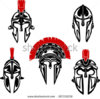
I remember talk that the first 3D in 98(?) was modeled after Daigle.Sens should change their logo to be Karlsson wearing the centurion helmet. He'd have to stay. It wouldn't make sense for him to leave at that point.
Sure!

That's a neat concept.
Anyone willing to try the same thing with the original 2D logo?

Hm. I don't hate it!Not bad. Might even work decently as a gray or faded out black, too.

Hm. I don't hate it!
It would be good timing, too, if we're planning on getting rid of the face of the franchise anyway!It does have a certain something. Much better than the 3D logo. Zorf's idea to get rid of the face definitely has a lot of potential.
It would be good timing, too, if we're planning on getting rid of the face of the franchise anyway!

If I had the opportunity I’d definitely bring back the 2D design. But Just for the sake of it I thought maybe let’s try and put a new design together. I want to stick with the 2D or a front facing more aggressive centurion helmet but maybe incorporate some sort of wreath to represent the Ottawa O.
If someone could mash the pics together using their editing skills I’d love to see what could be made of it.

")
I made that a few years ago, not many people liked it, admittedly I am not a professional graphic designer.
VGK logo is a similar concept. This logo concept was made well before then, but it's not exactly a unique idea.
Here is a version without the ring around it. I'm not a fan, maybe it would be improved if the outline was removed from around where the face was, but I dunno.Sure!

Here is a version without the ring around it. I'm not a fan, maybe it would be improved if the outline was removed from around where the face was, but I dunno.