
Drytoast
Registered User
- Sep 27, 2017
- 6,364
- 4,533
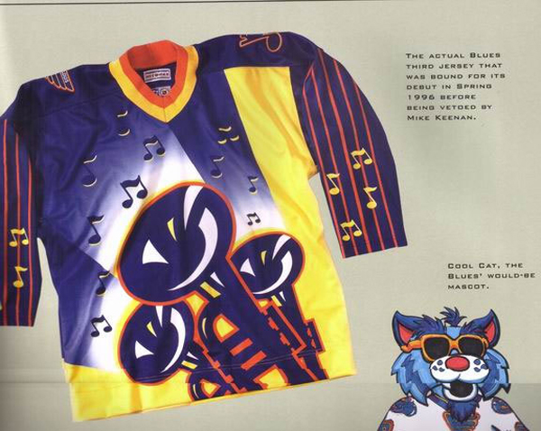
Bonus pic of cool cat too.
Someone was paid lots of money to come up with that design and then it was approved by a board of directors.
Let that sink in.
Bonus pic of cool cat too.
My favorite part about that jersey and the little factoids on that pic are that the creative team behind was probably really excited about those jerseys and someone took it to Mike Keenan - probably with a big smile and full of enthusiasm for the work they had done and they hand it to him and he was probably just like **** No and threw it back at them.Someone was paid lots of money to come up with that design and then it was approved by a board of directors.
Let that sink in.
If you hate the bklyn Jersey your opinion should never be taken seriously, it’s like they made the adidas all stars into a hockey jersey
My favorite part about that jersey and the little factoids on that pic are that the creative team behind was probably really excited about those jerseys and someone took it to Mike Keenan - probably with a big smile and full of enthusiasm for the work they had done and they hand it to him and he was probably just like **** No and threw it back at them.
Imagine how bad the players actually wearing it had to feel about it.Someone was paid lots of money to come up with that design and then it was approved by a board of directors.
Let that sink in.
The classic isles jerseys are so nice. I don’t know why they keep trying to change them.Wait what? The black Brooklyn jerseys were terrible, as were those ****ty NY Mets ripoff black jerseys. Not sure which one I hate more
I thought this was the worst one.... and then 3 posts downNothing is worse than this:

I saw this.Bonus pic of cool cat too.
Make it so ugly that the ugliness is the marketing, saves money on marketing... or drugs it’s always drugs.How many people had to look at it first and say “yeah thats the one”. Managers owners marketing etc
Anything with green and blue as the primary colors. I'm looking at you, Vancouver!
The 1990s was a terrible time for hockey jerseys.

Yeah they are. I even liked when they went to the darker navy from like 97-07. When reebok took over though, those originally edge jerseys were awful. Glad that in 2010 they went back to their classic look.The classic isles jerseys are so nice. I don’t know why they keep trying to change them.
I can’t roll my eyes hard enough at you comparing the isles best and worst third jerseys ever to each otherWait what? The black Brooklyn jerseys were terrible, as were those ****ty NY Mets ripoff black jerseys. Not sure which one I hate more
You can’t market Long Island, if it wasn’t for the history attached to the classic logo it would’ve been changed and no one would be looking backThe classic isles jerseys are so nice. I don’t know why they keep trying to change them.
In honor of the Isles bringing back fisherman jerseys for sale at their team store I thought I would pose the question of what was the worst jersey of the modern era? The Fisherman? The Buffaslug? The Vancouver "V"? The Brent Yormark Islanders Jersey? Any of the 10,000 Habs centenary heritage jerseys? What's your pick?
Their best third jerseys ever were their current homes, which started as a third. Black belongs nowhere near an islander jersey. The stadium series and their current 3rd are leagues better than that black Brett Yormark Nets branding abominationI can’t roll my eyes hard enough at you comparing the isles best and worst third jerseys ever to each other
You just hate Brooklyn, and I’m talking about the wave, Orange, arched letters stadium series, bklyn and current thirdTheir best third jerseys ever were their current homes, which started as a third. Black belongs nowhere near an islander jersey. The stadium series and their current 3rd are leagues better than that black Brett Yormark Nets branding abomination
That is too horrible for words drugs must have been involved in the design of that.Bonus pic of cool cat too.
As a kid, I really liked that jersey. Now? Yuck.

