
I always liked the fisherman. Almost everything from the Reebok era was garbage.
What was the worst jersey in modern NHL history?
- Thread starter sabremike
- Start date
You are using an out of date browser. It may not display this or other websites correctly.
You should upgrade or use an alternative browser.
You should upgrade or use an alternative browser.

kaiser matias
Registered User
- Mar 22, 2004
- 4,720
- 1,859
The border is kind of odd, but i find this, and the original Coyotes logo, far superior to what is used now, especially in terms of colour. The Navajo inspired design gives it a regional feel, not just a generic corporate logo like they have now.
LamorielloAndSon
Registered User
- May 28, 2018
- 1,775
- 702
If you hate the bklyn Jersey your opinion should never be taken seriously, it’s like they made the adidas all stars into a hockey jerseyIn honor of the Isles bringing back fisherman jerseys for sale at their team store I thought I would pose the question of what was the worst jersey of the modern era? The Fisherman? The Buffaslug? The Vancouver "V"? The Brent Yormark Islanders Jersey? Any of the 10,000 Habs centenary heritage jerseys? What's your pick?
Fig
Absolute Horse Shirt
- Dec 15, 2014
- 12,965
- 8,452
I get what the Canucks were trying to do... but the Canucks China warm up specials were really awful IMO. They should have added more green to replace the blue in their other jersey than MS Paint their logo on a red backdrop. Green is also a lucky color in Chinese culture. The patch looks pretty cool, but it looks crooked and out of place on the jersey.

Canucks to celebrate Chinese New Year with commemorative warmup jerseys
Canucks to celebrate Chinese New Year with commemorative warmup jerseys
LamorielloAndSon
Registered User
- May 28, 2018
- 1,775
- 702
The 1990s was a terrible time for hockey jerseys.
I just bought this shirt and I can’t wait for it to be shippedFlying Duck

Nashville in yellow, any variation. Such an ugly colour, and a terrible idea to match the helmets.
stampedingviking
Registered User
If that’s true, this message should be written in Braille.I just bought this shirt and I can’t wait for it to be shipped
hangman005
Mark Stones Spleen
As a general rule I go with any of the oilers puke orange jerseys... but man some of these are so so so much worse
Mobiandi
Registered User
- Jan 17, 2015
- 20,949
- 17,321
Always hated the Pittsburgh vegas gold jerseys
puckpilot
Registered User
- Oct 23, 2016
- 1,228
- 880
I loved that jersey. I actually own one with Jason Allison on the back. Feels like double cringe now, maybe it’s worth money
Hey, never let anyone telly you what you can or can not love.
I grew up with Vancouver's plate of spaghetti jersey. Yeah, it's not the greatest, but I got good memories that go along with that jersey, so I can't hate on it.
Winner winner Sheen dinner. Cant top that.Bonus pic of cool cat too.
ATypicalCanadian
Registered User
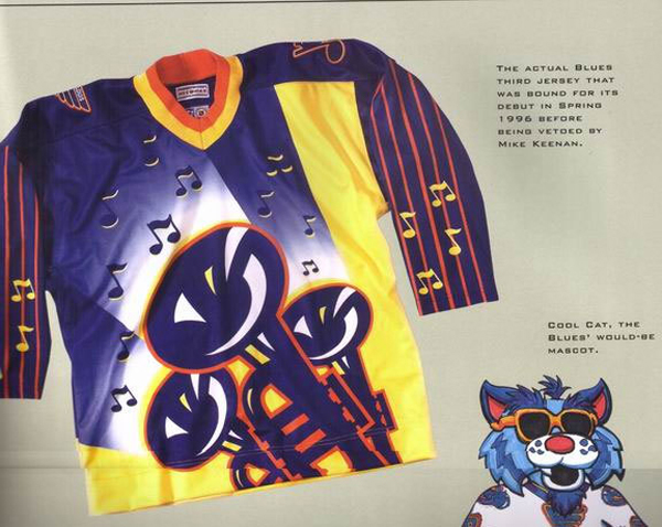
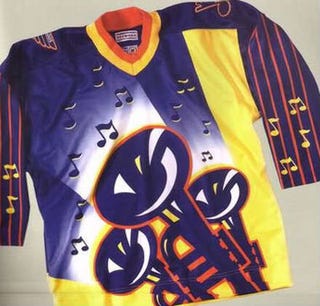
Anyone have an image of the Blues jersey that was so terrible it was scrapped entirely before it could ever be worn?
Benedict Kovalchuk
Kovalchuk: A spy?
Always thought this jersey was so cool tbh. On another note, I cannot for the life of me figure out why Calgary kept those hideous horse jerseys for as long as they did.
How many people had to look at it first and say “yeah thats the one”. Managers owners marketing etcThese?

Machinehead
GoAwayTrouba
The current Nashville home jerseys.
It's everything wrong with the mustard mobile and it replaced a great jersey.
I know everyone has this weird phobia with piping but it was working for them.
It's everything wrong with the mustard mobile and it replaced a great jersey.
I know everyone has this weird phobia with piping but it was working for them.
Nashville in yellow, any variation. Such an ugly colour, and a terrible idea to match the helmets.
I agree. Cannot stomach the current mustard yellow.
weaponomega
Registered User
At a 45 degree angle, the bear head looks like a pinched off piece of poo a dog would leave on your front yard.

As a kid, I really liked that jersey. Now? Yuck.
End on a Hinote
Registered Abuser
Canucks' skate jersey
Get out.
Howie Hodge
Zombie Woof

Horrible jerseys from the imbecilic Ted Black. The Sabres Turd jerseys. Thank you Turd Black...
EdJovanovski
#RempeForCalder
The blue in the logo looks awfulI get what the Canucks were trying to do... but the Canucks China warm up specials were really awful IMO. They should have added more green to replace the blue in their other jersey than MS Paint their logo on a red backdrop. Green is also a lucky color in Chinese culture. The patch looks pretty cool, but it looks crooked and out of place on the jersey.
Canucks to celebrate Chinese New Year with commemorative warmup jerseys
EdJovanovski
#RempeForCalder
Howie Hodge
Zombie Woof
The Buffaslug Jerseys. Ugly jersey, beyond horrendous logo. We thought they were a prank when they were unveiled. And I still think someone lost a bet somewhere along the line with these "classics"....

The subject of constant ridicule. And to be honest, they deserved the scorn they received.

The subject of constant ridicule. And to be honest, they deserved the scorn they received.
GreenBubbleRaincoat
Registered User
The player wearing that jersey also looks like a pinched off piece of poo a dog would leave on your front yard. Go to hell, McLaren.At a 45 degree angle, the bear head looks like a pinched off piece of poo a dog would leave on your front yard.