The Dallas Mooterus is my choice all-time. Presently it is the Tampa Bay Lighting with the worst jersey, just looks like a half-baked Leafs ripoff. Unambitious.
The Islanders own this thread. Nothing but one bad jersey after another. I would say the fisherman jersey is the worst though. It spawned the term “fishsticks”.
The Dallas Mooterus is my choice all-time. Presently it is the Tampa Bay Lighting with the worst jersey, just looks like a half-baked Leafs ripoff. Unambitious.
This.
Our SNES jerseys were terrible as well.
The OG Panthers one with the big panther head and the small body.
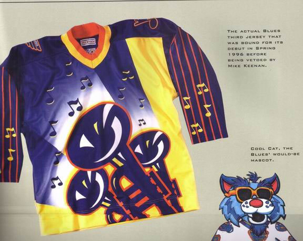
The St. Louis trumpet abomination.
The black Calgary Flames one, or the one with the dragon head.
This site uses cookies to help personalise content, tailor your experience and to keep you logged in if you register.
By continuing to use this site, you are consenting to our use of cookies.