
Weezeric
Registered User
- Jan 27, 2015
- 4,487
- 6,586
Lets not forget all of those teal sharks we see on tv during shark week!
Oh.
^ where sharks live
Lets not forget all of those teal sharks we see on tv during shark week!
Oh.
you're putting way, way too much thought into this.
Red velour... like a mob boss's tracksuit.Do people really think those red jerseys look good? Looks like a red velvet hockey jersey
The grey ones are ok. I would have to see them on the ice first though.
UGLY. Couldn’t pay me to get one.

Ah Nobody you kill me sometimes. You really do.Hey, if someone paid me enough, of course I would get one. If someone paid me even more, I would wear the damn thing. My momma didn't raise no fool.

Should of had "Winnipeg" written down the sleeve.
It's better than the aviator for sure. At least the logo is good.
in case you weren't aware, this board's purpose is for people to opine.Give it up already. You've been raging about jerseys for 9 years now, and I've lost count of how many threads you've started about it and how many times you've claimed your opinion is universal. They've released 3 jerseys now with your precious 80's logo. Do you even own any of these? I suggest you buy all three of them, wear them at home, and admire yourself in the mirror while running archive footage in the background. Peace out. :p
WTF does opine mean?in case you weren't aware, this board's purpose is for people to opine.
let him be.
 Just kidding i googled it.
 WTF does opine mean?

Are you saying your momma raised someone else instead of you?Hey, if someone paid me enough, of course I would get one. If someone paid me even more, I would wear the damn thing. My momma didn't raise no fool.
Are you saying your momma raised someone else instead of you?

Ours are so ugly and drab. Why? Because everything is too dark. If you're gonna go with a dark grey, you need a lighter colour to balance. So if your blue is gonna be darker, you gotta go more with a light silver. And if you're gonna choose a dark, greenish grey as the primary 'colour', then the blue has to be lighter. Or use white accent. And a splash of red. Instead it's dark blue with dark grey. The logo doesn't stand out like it should. Nothing does. It's just dark, and boring, and depressing. Ugh. I'm not a huge fan of the aviators but at least they have a brighter colour and a little panache.
With red as an accent color.
I'm not a big fan of this one, looks too much like those Carolina alternates
I think that is an outlier opinion. The Athletic did a power ranking of all the Retro Reverse jerseys and the Jets tied for 26th (with Philly and Anaheim) with an average score of 4.3 out of 10. Only the Stars, Wings and Isles finished lower.This thread just shows how subjective taste is. FWIW I listen to a hockey podcast by two guys in California who are obviously unbiased. They both ranked the Jets jersey as one of the better ones. Top 3 jersey.
I think that is an outlier opinion. The Athletic did a power ranking of all the Retro Reverse jerseys and the Jets tied for 26th (with Philly and Anaheim) with an average score of 4.3 out of 10. Only the Stars, Wings and Isles finished lower.
"More than a quarter of our panelists gave this a 1...Gray is an awful primary color and putting a bad logo on it doesn’t help."
Grey IS an awful primary colour for a jersey. The old pie-plate logo was not good. Nostalgia clouds many people's judgement about it, but make no mistake: if anyone proposed that as a new logo today they'd be laughed out of the...uh...logo factory. Taking the red out only hurts.
Ours are so ugly and drab. Why? Because everything is too dark. If you're gonna go with a dark grey, you need a lighter colour to balance. So if your blue is gonna be darker, you gotta go more with a light silver. And if you're gonna choose a dark, greenish grey as the primary 'colour', then the blue has to be lighter. Or use white accent. And a splash of red. Instead it's dark blue with dark grey. The logo doesn't stand out like it should. Nothing does. It's just dark, and boring, and depressing. Ugh. I'm not a huge fan of the aviators but at least they have a brighter colour and a little panache.
That is spot on! You described it perfectly. I can visualize exactly what you're implying. The grey is a horribly drab primary colour. I can't believe they actually chose this.It's like looking at an earlier jersey on an old console TV where someone has gone and messed with the Tint knob.
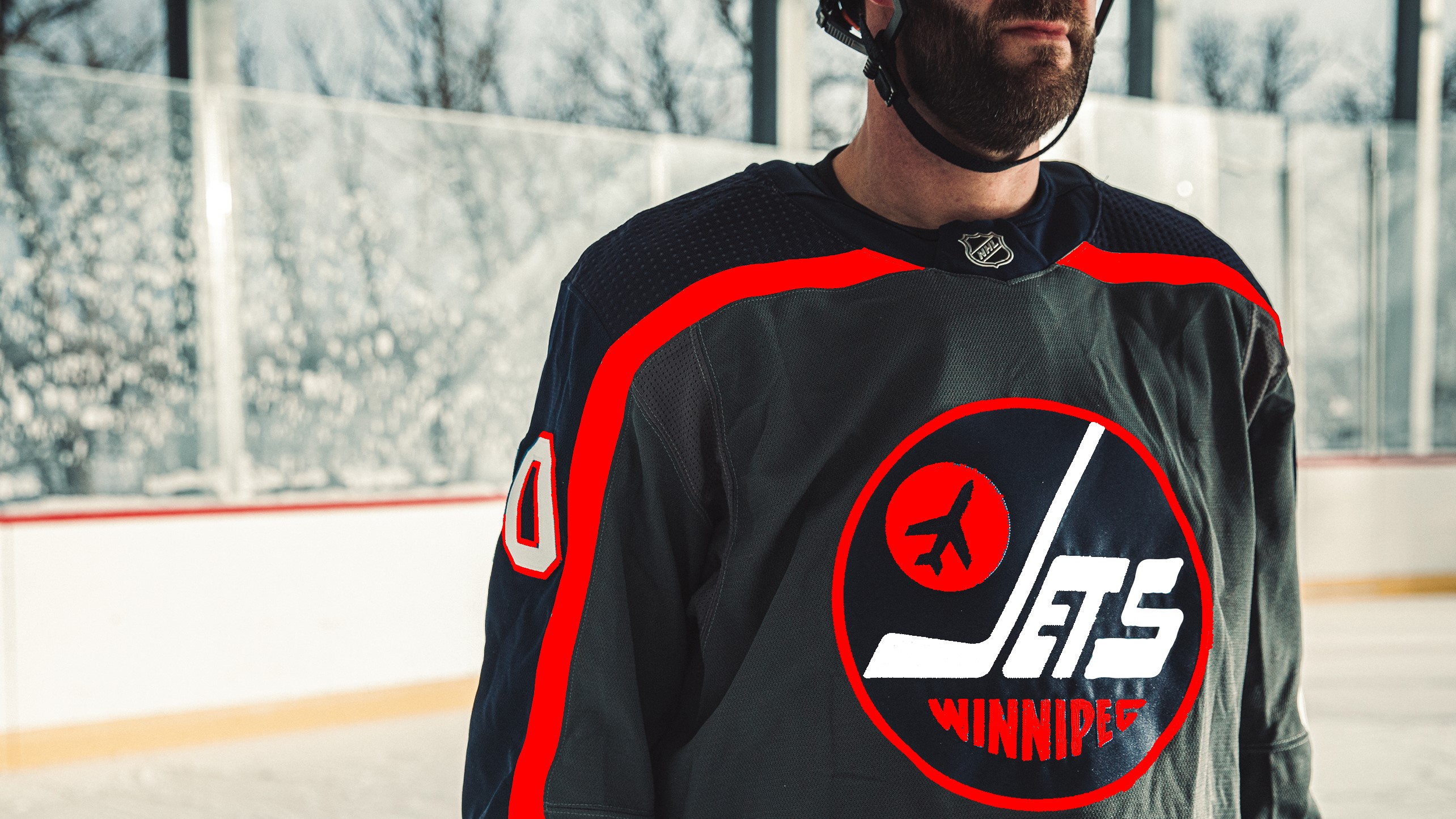
Here's what he based the design off ofThis dude gets it:View attachment 377149


