
Confirmed with Link: Royal Blue Is Back In 2020-21
- Thread starter Bones Malone
- Start date
You are using an out of date browser. It may not display this or other websites correctly.
You should upgrade or use an alternative browser.
You should upgrade or use an alternative browser.
Jim Bob
RIP RJ
First, the bad....The white stripe on the home jersey looks bad, escpecially because there is no white stripe outlining the gold stripe on the pants. No shoulder logo is also a swing and miss. The small version of the crest should have went there or a totally different logo....but something.
Good....the colors and general design. And NO CHEST NUMBERS!
Not bad but could have been better.
I like the no shoulder logo. And they did the cool charging buffalo for the helmet decals, which I really like.
The white stripes on the blue jerseys and the inconsistent ordering of the stripes on the white jerseys are the only minor issues I have. Given how badly they could have screwed it up, having two really minor issues with the entire sets is a win in my book.
I don't know why the NHL doesn't go with whites at home for the first half of the season and darks for the second half. It would probably boost jersey sales as well.
Is it that hard to come up with something so easy that all would like?
Jim Bob
RIP RJ
Are teams getting away from the laced up collars again? Not to be nit-picky but I liked those.
Since the switch to adidas jerseys, has any new jersey had them?
tsujimoto74
Moderator
- May 28, 2012
- 29,937
- 22,117
Sabretooth
Registered User
EichHart
Registered User
Gabrielor
"Win with us or watch us win." - Rasmus Dahlin
Since the switch to adidas jerseys, has any new jersey had them?
I'm not sure.
SackTastic
Registered User
- Mar 25, 2011
- 7,829
- 1,915
I don't know why the NHL doesn't go with whites at home for the first half of the season and darks for the second half. It would probably boost jersey sales as well.
Is it that hard to come up with something so easy that all would like?
It's because of 3rd jerseys, and most of them being dark.
If you have home darks as standard, the road team only has to bring whites with them, since the home team will always have a dark jersey. (Regular home or 3rd.) If you had home whites and dark 3rds, the road team then has to carry both whites and darks because the home team could decide on a rando 3rd jersey night.
Apparently the rule from the NHL is that if your 3rd jersey is white, you can then wear home whites regularly also. In typical NHL fashion, this doesn't solve the problem of a road team carrying 2 jerseys, because they'd have to have darks for one team and whites for another team on the same trip. But hey, maybe the NHL's incompetence could be our gain!
")
SackTastic
Registered User
- Mar 25, 2011
- 7,829
- 1,915
Are teams getting away from the laced up collars again? Not to be nit-picky but I liked those.
I also was a big fan of those. Except when I saw people who had them tied; then it took every ounce of my being not to go untie them.
Jim Bob
RIP RJ
Beautiful.
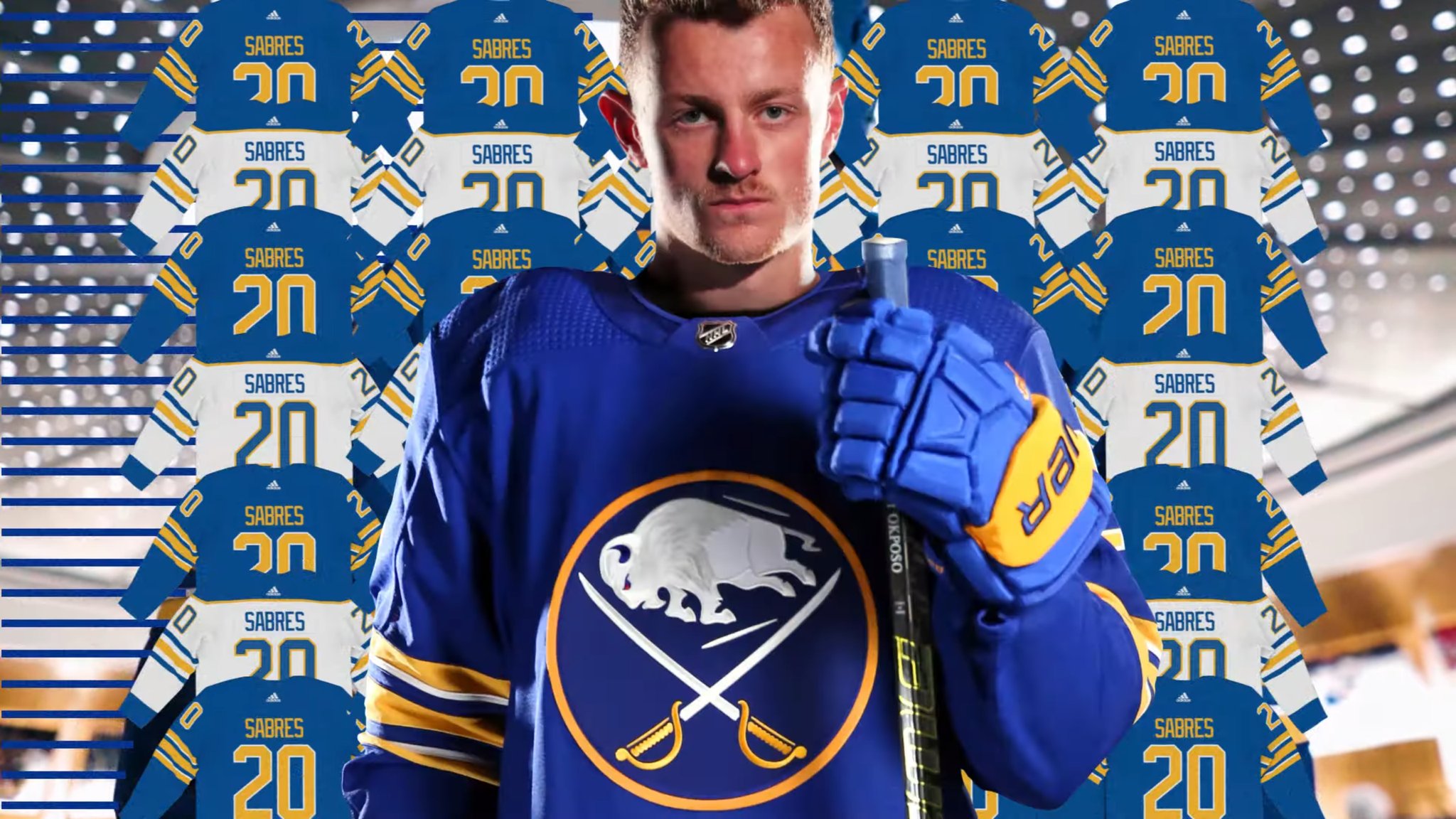
I wonder if Okposo is OK with Jack borrowing his stick?
- Feb 3, 2015
- 4,273
- 3,896
I've never understood why the majority of people seem to prefer the white version of a teams jersey or why white is the home jersey. I've always preferred the full color jersey of any team I'm a fan of. Shouldn't you want to display your full colors at home, and be forced to wear boring white on the road? I don't get it.
That’s what the AHL currently does, and it’s awesome.I don't know why the NHL doesn't go with whites at home for the first half of the season and darks for the second half. It would probably boost jersey sales as well.
Is it that hard to come up with something so easy that all would like?
Dubi Doo
Registered User
- Aug 27, 2008
- 19,432
- 12,918
Beautiful. At least now if we suck; we suck in style!
The Bills and Sabres can now make a case for best jerseys in both the NFL and NHL. The Bills, for me- it's not even close.
The Bills and Sabres can now make a case for best jerseys in both the NFL and NHL. The Bills, for me- it's not even close.
I’d rather see every other team’s colors and have the white at home. Every home game looks the same with darks at home. But that’s just my opinion.I've never understood why the majority of people seem to prefer the white version of a teams jersey or why white is the home jersey. I've always preferred the full color jersey of any team I'm a fan of. Shouldn't you want to display your full colors at home, and be forced to wear boring white on the road? I don't get it.
Der Jaeger
Generational EBUG
I'm confused. Who took the video and pictures? Who is running their website? Who modeled the jerseys in the video? I thought everyone was fired???
SackTastic
Registered User
- Mar 25, 2011
- 7,829
- 1,915
I've never understood why the majority of people seem to prefer the white version of a teams jersey or why white is the home jersey. I've always preferred the full color jersey of any team I'm a fan of. Shouldn't you want to display your full colors at home, and be forced to wear boring white on the road? I don't get it.
It's nostalgia in a lot of ways. Many of us of a certain age grew up watching them in home whites. For me, I ninja watched a lot of games on a 13" black and white TV with a very creative aluminum foil antenna, so white jerseys helped. ( I'm only 42, so I'm not THAT old, but growing up that was the best I could get. Rest of the time it was RJ on the clock radio. )
SackTastic
Registered User
- Mar 25, 2011
- 7,829
- 1,915
Some explanation on the piping added to the dark sweater.
Inside the long-awaited return of Sabres' royal blue and gold jerseys
Also :
Inside the long-awaited return of Sabres' royal blue and gold jerseys
The royal jersey includes white-outlined gold numbers and no striping on the shoulders. There's also no yellow on the collar and the royal used on the uniform resembles that used by the original jersey in 1970. However, the first prototype presented to the Pegulas had three gold and two royal stripes on each arm and the waist, much like the original royal blue jersey, but this led to the white crest “dominating a sea of royal and gold,” said Cravotta.
With not enough time to work with Adidas on alterations, Cravotta, Durbin and Raccuia began to cut strips of white felt and placed them on top of the jersey in search of a solution. After a few days of working sessions in the PSE and Adpro Sports offices, the group decided on two thin, white piping between the gold and royal stripes on the arms and waist.
Photos were taken to send to ownership and Adidas, and both jerseys were finalized in late 2019.
“It’s this very slight adjustment,” Cravotta said. “That’s what we wanted. We didn’t want this banding to become overwhelming. It’s a very subtle but important detail. The white one was perfect. There was never a question in my mind, and the team that worked on it. We loved it right off the bat.”
Also :
The new uniforms do not have patches on the shoulders and there aren’t numbers on the chest. Instead, they opted for one subtle change to honor the city. An electric flash logo was placed inside the back collar of the jersey, an ode to the municipal flag of Buffalo. These will serve as the primary jerseys for the distant future and the 50th anniversary jersey won’t be used as an alternate in 2020-21.
Fezzy126
Rebuilding...
- May 10, 2017
- 8,753
- 11,558
Icethetics did a blog on the jerseys that actually matches my thoughts word for word. I even like the white striped piping on the blues and the alternating colors on the whites, as the blogger mentioned it gives the jerseys depth and a more modern feel to compliment to classic look.
I really like the subtle touches on the inside of the collar as well:
Just really well done all the way around. It feels good to not be mad, angry, or disappointed about sabres-related news.
Man of Principles
The Krueger Effect
- Nov 30, 2011
- 2,278
- 384
OkimLom
Registered User
- May 3, 2010
- 15,282
- 6,756
I wonder if Okposo is OK with Jack borrowing his stick?
It's that level of detail that I was missing from news like this...
But in all seriousness, really nicely done jerseys.
I think this will provide a much more enjoyable hockey product as a viewer. As a hockey fan first, it was very depressing to watch such boring jerseys on TV. I'm not even talking about the level of play, but as a product on TV. It felt like watching the early 2000's with those colors. IF Buffalo continued with Blue and Gold for those godawful years, those would've been the colors. There was nothing youthful about them. There was no excitement associated with them.
Now let's just hope there's more changes to the presentation of the game from the Sabres side. Work on getting some unique chants for the fans in that dead of an arena. Something besides the classic "Let's Go Buffalo" rhythm.
It's a great first step taken for many more steps needed to improve the product.
MayDay
Registered User
Beautiful. At least now if we suck; we suck in style!
The Bills and Sabres can now make a case for best jerseys in both the NFL and NHL. The Bills, for me- it's not even close.
The Bills uniforms are nice. Would be perfect if they brought back the red helmets from the 90s.
Ad
Upcoming events
-
 Game 2 Dallas Mavericks @ Oklahoma City Thunder - OKC leads series 1-0Wagers: 5Staked: $1,505.00Event closes
- Updated:
-
 Game 2 Colorado Avalanche @ Dallas Stars - COL leads 1-0Wagers: 12Staked: $30,937.00Event closes
- Updated:
-
-
-