markpenske
Registered User
- Jul 2, 2015
- 1,566
- 738
royal blue looks like pajamas for a small kid. I would prefer a darker blue
It’ll be this
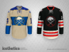
I’m typically against black designs for uniforms, but that is freaking hot. Damn, that is nice. Is it real or just a concept Jersey?I’d be down if they ever did the black one.
No doubt. I think it was only there because we played NYR.Didn't the Winter Classic jerseys have a stupid "NY" between the swords? Is that gone, I hope?
No doubt. I think it was only there because we played NYR.
No chance they include NY in the logo. I’m on mobile, but Icethetics said they might incorporate the 50th anniversary embroidery, which is up my alley. (I’m sure it was posted, I just cant see)Didn't the Winter Classic jerseys have a stupid "NY" between the swords? Is that gone, I hope?
No chance they include NY in the logo. I’m on mobile, but Icethetics said they might incorporate the 50th anniversary embroidery, which is up my alley. (I’m sure it was posted, I just cant see)
I think the confusion surrounding the color hue, that was originally leaked/speculatedYeah, the 50th embroidery is a really nice update. I guess I was thrown off by the whole "based off the Winter Classic" logo remark. Why not just say it's based off the original logo? It's been updated many times throughout the years anyway, but people still know what that means.
I would love to be sitting where you are, in the "there's something so obviously stupid that they could do, but there's no chance they do it" seats. It's standing room only in the "they f*** everything up, so of course there's a chance" section.No chance they include NY in the logo. I’m on mobile, but Icethetics said they might incorporate the 50th anniversary embroidery, which is up my alley. (I’m sure it was posted, I just cant see)
I’m typically against black designs for uniforms, but that is freaking hot. Damn, that is nice. Is it real or just a concept Jersey?
Edit- never mind, just saw that it’s a concept submission.

royal blue looks like pajamas for a small kid. I would prefer a darker blue
White jerseys with black puck-sized polka dots might give us a chance to steal some games.
I liked the 3 sets of stripes. Different. And no white.I suspect your comment will garner much bad will but as a follower from 1970 on, I too thought the original royal - away in those days - uni's also looked like pajamas.
I think it was the 3 sets of gold stripes on each leg that did it for me. Never thought it was the shade of blue.
Of course, Punch wanted to ef over the Leaf's uni's at the time so there ya go.
A single wide yellow stripe up the back would be appropriate.I liked the 3 sets of stripes. Different. And no white.