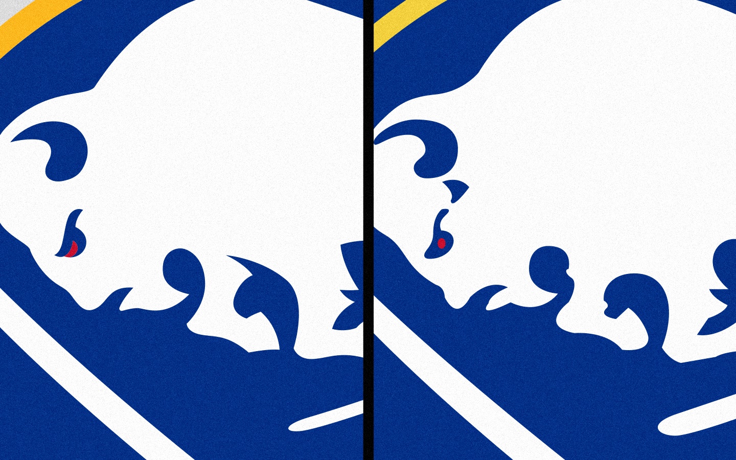
Confirmed with Link: Royal Blue Is Back In 2020-21

BloFan4Life

Registered User
Jul 8, 2009
4,063
932
NY
The blue looks different in every picture.

I will need to see them in action before making a judgement. I hope it looks like the lighter shade of blue and not the darker. I like the blue of the old days.

Crest almost looks too big, but again, will need to how it looks when a player skates.
 
  • Like
Reactions: Bferra13

kirby11

Registered User
Mar 16, 2011
9,786
4,666
Buffalo, NY
The Bills uniforms are nice. Would be perfect if they brought back the red helmets from the 90s.

Short of that (idk if there's still some weird NFL rule about shells), I'd love if they changed their helmets to have the white face masks they used in the Dallas game and brought back the red end zones.
 

Jag68Sid87

Sullivan gots to go!
Oct 1, 2003
35,584
1,260
Montreal, QC
I really dig these uniforms. I own a Perreault 11 blue jersey (CCM), and just looking at it now the buffalo's eye is colored red on mine. Was that a thing back in the 70's? Is the red eye gone on these?

Yeah, your jerseys are probably better looking in white than blue, but I am almost always more partial to every team's colored jersey than the white one.

In fact, if it were up to me I would have a great number of games with both teams sporting their colors. Dallas is green, Buffalo is blue. I think that would look fantastic. Like in the Premier League when Chelsea plays Liverpool and both wear their primary colors.

Anyway, good stuff.
 

sabresfan3383

Registered User
Dec 3, 2004
1,109
47
Tonawanda, NY
Since the switch to adidas jerseys, has any new jersey had them?

I'm not sure.

Yes, the current Sabres had a faux tie down neck, along with a few other teams:
thumb.aspx

thumb.aspx

The Rangers, Canadiens, Hurricanes, Leafs, Bruins, Sharks, Stars all have tie down necks
thumb.aspx
 

zbubble

Registered User
Jul 29, 2005
2,566
178
I really dig these uniforms. I own a Perreault 11 blue jersey (CCM), and just looking at it now the buffalo's eye is colored red on mine. Was that a thing back in the 70's? Is the red eye gone on these?

They've always had the red eye on the original logo, and it still exists in the "new" jersey.
 

Smehlik MyFinger

Registered User
Sep 16, 2017
29
11
Just an FYI, the royal is the same as used on the 2018 winter classic.

gold hasn’t changed from the current one used.
 

PegulasSportsEmpire

Registered User
Mar 24, 2007
288
136
BUFFALO
The Sabres have redeemed themselves and improved when it comes to Off-Ice things.

You think of the misspelled knock off jerseys etc..... it is refreshing to see them improve on that side of things.

Yes, they gotta improve the On-Ice product but we'll talk about that in other threads.
 

OkimLom

Registered User
May 3, 2010
15,215
6,689
The Sabres have redeemed themselves and improved when it comes to Off-Ice things.

You think of the misspelled knock off jerseys etc..... it is refreshing to see them improve on that side of things.

Yes, they gotta improve the On-Ice product but we'll talk about that in other threads.

Seeing as they misspelled the Jerseys AFTER they finalized these jerseys, I'd say we've yet to see if they learned from anything.

The jersey is a nice design and a great first step to getting the organization to a 1st class level organization, but they haven't redeemed themselves for the "off-ice/entertainment" side of the organization yet. They have a ways to go.
 
  • Like
Reactions: sabremike

jc17

Registered User
Jun 14, 2013
11,023
7,750
Yes, the current Sabres had a faux tie down neck, along with a few other teams:
thumb.aspx

thumb.aspx

The Rangers, Canadiens, Hurricanes, Leafs, Bruins, Sharks, Stars all have tie down necks
thumb.aspx
After spending the morning looking at the new ones, now seeing the old ones it's such a stark difference. This upgrade was really necessary
 

Ad

Upcoming events

Ad

Ad