Confirmed with Link: Rangers Reveal Liberty Jersey (and somehow mess it up)

Which one do you hope it's based on?

  • Liberty

  • 2012 Cream Winter Classic

  • 2018 Navy Winter Classic

  • "New York" Wordmark

  • 1970's Rangers Crest


Results are only viewable after voting.

Harbour Dog

Registered User
Jul 16, 2015
10,338
13,035
St. John's
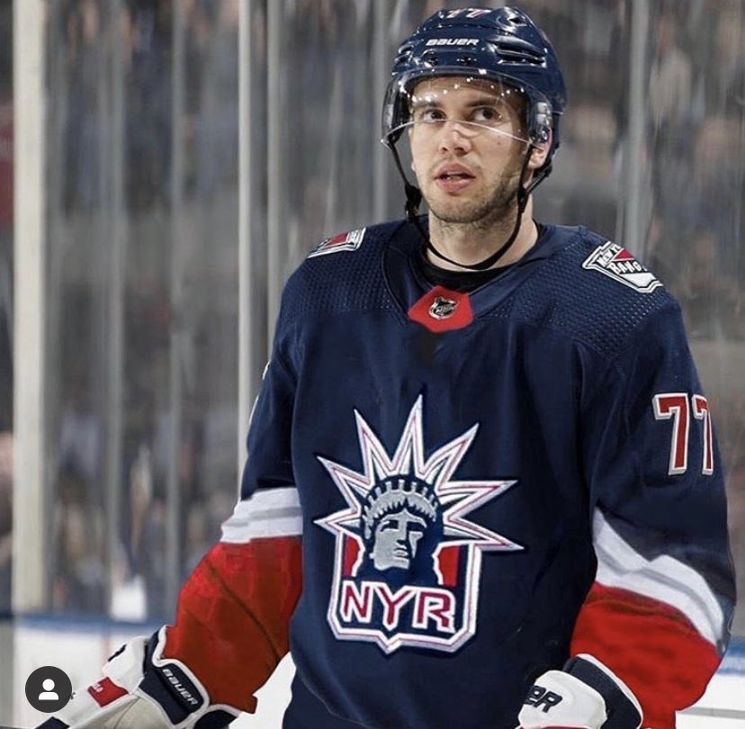
Not really a fan of these. But I'm not big on the Liberty jerseys anyway, and wasn't going to buy one regardless of how nice it was.

Colorado knocked theirs out of the park.

After that; Boston, Edmonton, LA, and Montreal are my favourites.

And who can turn up their nose at a Whalers' jersey? Not I.
 
Last edited:
  • Like
Reactions: ecemleafs

CasusBelli

HFBoards Sponsor
Sponsor
Jul 6, 2017
13,025
11,965
In no particular order: Knights, Bruins, Hawks, Flames, Isles and Habs are alright. The rest suck. Florida’s represents the biggest improvement over the current main jerseys.
 

Beer League Sniper

Homeless Man's Rick Nash
Apr 27, 2010
4,736
1,545
City in a Forest
I just don't understand why they stripped away any semblance of personality from the original liberty jerseys. Some teams, love or hate the jersey, took huge risks. We did the exact opposite. I'd rather have ended up with something like Dallas than what we received.

Unless they win the cup in these, I'm not buying one. Boring AF.
 

Harbour Dog

Registered User
Jul 16, 2015
10,338
13,035
St. John's
Just had a thought (after laughing my way through the models with the exact same look on their face in every jersey picture); how much better would every single one of those jerseys look if they had past legends of each team modelling them?

edit - also, did anybody else notice how the NHL tried to downplay the Blackhawks logo by having that jersey pictured side on, and not even showing it in the video?
 
  • Like
Reactions: Pidto Files

mike14

Rampage Sherpa
Jun 22, 2006
17,921
10,937
Melbourne
Did we not understand what 'reverse means?
Seriously boring jerseys.
They'll probably look ok on the ice, but they've certainly saved my wife the effort of having to try and track one down as an Xmas present for me
 

and 99 others

la la la la la la la... a little bit alexis
Jul 27, 2011
673
693
It looks good, just plain. It will probably look very good on the ice. It’s not a jersey that I look at just the sweater and say wow that’s beautiful, but in action the set will probably look really slick and modern and work well. Doesn’t make me want to buy one but does make me eager to see it on the ice.

I get why people are upset and I overall have a very “meh” reaction to the jersey itself. I just have a feeling the on ice product will work well.

The on-ice product always looks nicer for the rangers because they have the best color pattern in the league with their red pants. Felt the same "meh" feeling about seeing the 2012 Winter Classic jerseys when they were first revealed, but the end product with the socks and full jersey was really nice.

Jerseys will always look worse when the people modeling them are wearing jeans.
 
  • Like
Reactions: OthmannOut

EdJovanovski

#RempeForCalder
Apr 26, 2016
28,799
57,007
The Rempire State
The on-ice product always looks nicer for the rangers because they have the best color pattern in the league with their red pants. Felt the same "meh" feeling about seeing the 2012 Winter Classic jerseys when they were first revealed, but the end product with the socks and full jersey was really nice.

Jerseys will always look worse when the people modeling them are wearing jeans.
If I end up buying the Liberty I'll have to pick up some red hockey pants to wear around with em
 
  • Like
Reactions: Profet

mti79

Registered User
May 11, 2007
4,096
415
Its almost like the isles were the kid in school who had all month to work on their science project but didn't so they did a half ass job the night before.

The bruins one looks like a caricature of a bear. Awful. Love the Colorado one. Love the whalers one. The caps one looks sharp.
 
  • Like
Reactions: NYRangers16

Harbour Dog

Registered User
Jul 16, 2015
10,338
13,035
St. John's
Its almost like the isles were the kid in school who had all month to work on their science project but didn't so they did a half ass job the night before.

The bruins one looks like a caricature of a bear. Awful. Love the Colorado one. Love the whalers one. The caps one looks sharp.

Isn't the Bruins one the traditional B in a circle?

That is what NHL.com is showing.
 

Charlie Conway

Oxford Comma
Nov 2, 2013
5,012
2,623
Isn't the Bruins one the traditional B in a circle?

That is what NHL.com is showing.

I believe they have the bear on the shoulder patches. I've seen it called the meth bear.

KASo8y8.png
 

will1066

Your positivity is not welcomed
Oct 12, 2008
44,420
60,899
For a second there, I thought it was gonna be Zucc modeling the jersey in the video, with those shoulder-length curls.
 
  • Like
Reactions: NYRangers16

NYRFAN218

King
May 2, 2007
17,143
1,554
New York, NY
Good news is I think the program is only for this season and being worn a game or two.

Hopefully they take all the feedback and come out with a better version of the Liberty as a 3rd the following season. All they needed to do was bring back the original navy or white designs though I know that doesn’t correlate with the “reverse retro” theme of the program.
 

NYR

Registered User
Mar 1, 2002
8,604
2,690
LI
Sorry but I hate it
They're terrible!
It's equivalent to the Gortons fish stick Jersey.
I'd much prefer the vintage style..
 
  • Like
Reactions: EdJovanovski

Machinehead

GoAwayTrouba
Jan 21, 2011
142,909
113,962
NYC
I get that they had to do the reverse thing (although the Islanders just said f*** that) but they should have just flipped the secondary colors and gone with that mock with the white sleeves.
 

RGY

Kreid or Die
Jul 18, 2005
24,713
13,940
Long Island, NY
Their third jersey. On the other hand, that jersey is REALLY bad, because it's entirely orange.
Ahhhh I dont know how I forgot about the Might Ducks logo being on that one. I think it has to do with it being too Orange, which is the first think that comes to mind. Heck I though the had the gold “D” on the front.

Yeah I was hoping for the old school Mighty Ducks ones.
 

will1066

Your positivity is not welcomed
Oct 12, 2008
44,420
60,899
Panthers' looks really good. Pens is a remix of their 90s road and home, with their diagonal word mark. Seems like some teams got extra TLC for their uniforms.
 

Ad

Upcoming events

Ad

Ad