
RemoAZ
Let it burn
Yikes I hope not. He's already nonconfrontational enough. Don't need to put him in a soft ass sweater too.I heard purple is his favorite color.")
Yikes I hope not. He's already nonconfrontational enough. Don't need to put him in a soft ass sweater too.I heard purple is his favorite color.
Is AM Auston Matthews? Or Alex Muerelo? The initials using for players/gms/coaches you guys have adopted for some reason is annoying to follow.Let's ask AM what HE wants as a jersey. Whatever he wants, that's what we go with.
I was assuming Matthews, the most important AM in AZ but I could be wrong.Is AM Auston Matthews? Or Alex Muerelo? The initials using for players/gms/coaches you guys have adopted for some reason is annoying to follow.
I'm all for that unless it's purple. f*** purple.
I agree, it always takes me an extra second to think about who's being discussed. It works for those with hyphenated names; OEL, POJ, DSP, PLD but it sucks for everybody else.Is AM Auston Matthews? Or Alex Muerelo? The initials using for players/gms/coaches you guys have adopted for some reason is annoying to follow.
OAM? The owner, AM? The playerI agree, it always takes me an extra second to think about who's being discussed. It works for those with hyphenated names; OEL, POJ, DSP, PLD but it sucks for everybody else.
AT mentioned AMJR's name as one of the people he met. I believe AT met with them all at once, the way it sounded anyways.So did HCAT actually meet with AMJR b/c it seems to me,IIRC, that GMBA called the PC re: the new HC hire before the rumored mtg time w/AMJR? IDK what to believe. WTF? LOL.
So did HCAT actually meet with AMJR b/c it seems to me,IIRC, that GMBA called the PC re: the new HC hire before the rumored mtg time w/AMJR? IDK what to believe. WTF? LOL.
Well, this practically confirms what we all suspected.
Head only is better. But dumping the Gretzky era stuff is good.Still prefer the mask version.
Head only is better. But dumping the Gretzky era stuff is good.
Head only is better. But dumping the Gretzky era stuff is good.
I’d love that has a primary!How about head only on a purple third???
Something I just noticed;
View attachment 452739
Is it me, or does the logo have the outlines in the leg again? Haven't had that since originally moving away from the Kachina; the filled-in leg started on the old CCM throwbacks.
Here's the original version of the Kachina logo that was in use before 2003; note the negative space between the leg and stick and between the hand, leg and tail;can you please explain what you mean by this? I am looking at one from 1996 and one from just the last couple years and I don’t see very many differences.
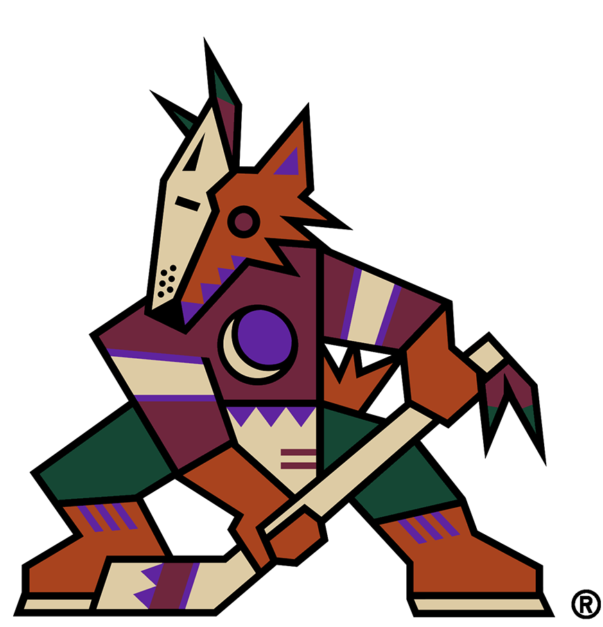

Ah, got it. Thanks!Here's the original version of the Kachina logo that was in use before 2003; note the negative space between the leg and stick and between the hand, leg and tail;
And here's the version that's been in use on throwbacks since the 2003 rebrand; note how those spaces are completely black.
The draft hat is using the original version of the logo and not the one that's been in use on throwbacks since 03, because the outline between the leg and stick is clearly visible;

