
You are using an out of date browser. It may not display this or other websites correctly.
You should upgrade or use an alternative browser.
You should upgrade or use an alternative browser.
More options
Edit prefix
Qward
Because! That's why!
Back in Black
All Sports would be great if they were Hockey

BonkTastic
ಠ_ಠ
You can see it has a felt "C"
The Bruins Winter Classic jersey was felt, and it was amazing.
Qward
Because! That's why!
The Bruins Winter Classic jersey was felt, and it was amazing.
Just had a 10 minute argument with an ex (who is a Sens fan) about how cool it was they were using felt. She complained about "old" jerseys. I told her to go get a stadium series jersey and buzz off.
damianthesensfan
Alfie!!!
Lets be orgional here, i really hope this isnt a reverse of our 3rd jersey now. If its a true haritage jersey its gotta be full barber poll. How hard is that to mess up. Im already worried from that pic. To be hoesnt im not expecting much now, when i had really high hopes.
What could be more exciteing its seening our origonal white jersey redone. Theres a possabillity, seeing only white.
What could be more exciteing its seening our origonal white jersey redone. Theres a possabillity, seeing only white.
Qward
Because! That's why!
QuattroFTW
Registered User
It would be really nice too if it said Senators or Ottawa in cursive like the Minnesota jerseys.
danielpalfredsson
youtube dot com /watch?v=CdqMZ_s7Y6k
- Aug 14, 2013
- 16,575
- 9,269
You can see it has a felt "C"
Blue Jackets third has a felt crest.
I assume the grey/silver is in reference to the Silver Sevens.
I wouldn't want every jersey to have a felt crest, but for something different, I'd like to see one on this jersey.
I'd be a bit disappointed if the "O" is used as the crest. I want some variety. Obviously you want a consistent crest/brand image with the home and away jerseys, but there's no reason for a third jersey and a special jersey to have the same crest. It's just anti climatic.
The way that Spezza and Karlsson describe the jersey, I'd put my money on the crest being the updated 2D logo with an altered color scheme. The whole, it's something new but something old points to a barber pole jersey with a modern crest.
Also, they show a Senator's team picture in the hype video with a "SENATORS" baseball style word mark across the chest. Almost like the one the Wild have on their third jersey.
I really hope they don't go with a word mark on this jersey. Aside from rare cases, I absolutely hate word marks on hockey jerseys. The best thing about hockey jerseys is that they have the massive colorful crest right in the center.
Fandlauer
Registered User
Qward
Because! That's why!
Blue Jackets third has a felt crest.
I assume the grey/silver is in reference to the Silver Sevens.
It is in grey scale to hide the colours.
and "Silver Seven" was just a nick name for a team that won the cup one year. Not the 1915 team which these jerseys are supposed to be based.
saskriders
Can't Hold Leads

SensPerpetualRebuild
Yelnats Puc
- Jul 31, 2009
- 398
- 129
Looks like the inverse of the current third jersey. The comments about the colour scheme and the fact that the pic is in black and white suggests the heritage white. I'm guessing it will be a one game wonder like most outdoor game jerseys. I doubt they'd be allowed to wear heritage white ever again. Since Jerk Store is very quiet, he's probably involved. Given the success of his first jersey, he should be!
Back in Black
All Sports would be great if they were Hockey
I'd be VERY upset if they used this silly 2D logo!
I'd be a bit disappointed if the "O" is used as the crest.

Back in Black
All Sports would be great if they were Hockey
Here's the Leak we've been waiting for, look closely on top!
https://lh3.ggpht.com/-7NE59k4a1bE/...orsBringBackTheSenatorsPosterSensTownBlog.JPG
https://lh3.ggpht.com/-7NE59k4a1bE/...orsBringBackTheSenatorsPosterSensTownBlog.JPG
CanadianHockey
Smith - Alfie
Here's the Leak we've been waiting for, look closely on top!
https://lh3.ggpht.com/-7NE59k4a1bE/...orsBringBackTheSenatorsPosterSensTownBlog.JPG
Nope, it's probably just a white version of the heritage.

Qward
Because! That's why!
Here's the Leak we've been waiting for, look closely on top!
https://lh3.ggpht.com/-7NE59k4a1bE/...orsBringBackTheSenatorsPosterSensTownBlog.JPG
The old picture in the poster is actually a picture of the OAAA (Ottawa Amateur Athletic Association) team nicknamed the "Generals" in 1895.
They didn't become the "Senators" until they joined the NHA around 1910.
PoutineSp00nZ
Electricity is really just organized lightning.
Nope, it's probably just a white version of the heritage.
Make these jerseys along with the black ones the permanent home and away immediately.
Back in Black
All Sports would be great if they were Hockey

Stonewall
Registered User
- Jan 14, 2013
- 2,398
- 50
Here's the Leak we've been waiting for, look closely on top!
https://lh3.ggpht.com/-7NE59k4a1bE/...orsBringBackTheSenatorsPosterSensTownBlog.JPG
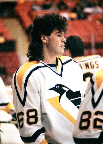
I love these shoulders, Pens and Panthers used to have the same kind.

salomonster
Registered User
I like the extra stripes on that version.
That would be a real nod to the cup finals vs the millionaires, Ottawa's jersey has the world champs crest for that series (super boss!).
I like he Jerk store pure whites over the vintage. Too much beige...
Pure whites would be very nice.
That would be a real nod to the cup finals vs the millionaires, Ottawa's jersey has the world champs crest for that series (super boss!).
I like he Jerk store pure whites over the vintage. Too much beige...
Pure whites would be very nice.
Ad
Upcoming events
-
-
-
 Gold Medal 2024 IIHF WORLD CHAMPION - PICK ONLY ONE TEAMWagers: 7Staked: $36,600.00Event closes
- Updated:
-
-