2018-19 3rd Jerseys

blood gin

Registered User
Jan 17, 2017
4,174
2,203
I don't like the concept of 3rd jerseys but the black and orange is fine with Philly. I just hope they don't go overboard/overkill because they wore the black way too much from the late 90's up through 2009 or so. Got away from their orange identity
 

blood gin

Registered User
Jan 17, 2017
4,174
2,203
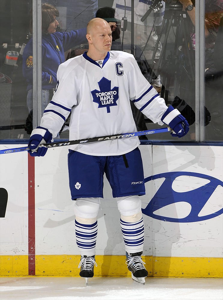
TML will probably be the best one. Every jersey they make is great.

ummm...no
Mats-Sundin.jpg
 

blood gin

Registered User
Jan 17, 2017
4,174
2,203
Edmonton's is nice. At least it's not some stupid Tim McFarlane flying manhole cover or whatever that was. Total garbage
 

LeafsLegendAkiBerg

The original great 8
Oct 12, 2006
3,982
2,084
While that design was not the best in the history of Leafs jerseys, it's still better than these jerseys.


I genuinely like the Fisherman now in a so bad it's good kind of way. I'd take it any day over the NY alternate jerseys they have.

The Boston one is gross though. Hideous striping, goofy happy bear logo.
 
  • Like
Reactions: LeafsNation75

Zenos

Registered User
Oct 4, 2009
2,190
2,407
Something is very wrong with that shade of blue. That's not even the darker version of Oilers blue they seemed to wear in the late 80s. That has like a gross green/grey hue to it. Bad. Sad!

The oilers never changed their colours in the 80's. I've put an '86 Nike Kurri next to a '90 CCM Ranford side by side and they're nearly the exact same shade.
The only significant colour change came in 1996 with the introduction of the entirely new navy/copper/red scheme.
 

La Bamba

Tier 2 Fan
Aug 23, 2009
9,435
5,860
The oilers never changed their colours in the 80's. I've put an '86 Nike Kurri next to a '90 CCM Ranford side by side and they're nearly the exact same shade.
The only significant colour change came in 1996 with the introduction of the entirely new navy/copper/red scheme.
Correct me if I'm wrong but didn't the Oilers change the shade of the orange/blue in 1981? The blue from 1979-1981 looks a bit darker and the orange looks brighter.

Edmonton Oilers - The (unofficial) NHL Uniform Database
 

Kranix

Deranged Homer
Jun 27, 2012
18,206
16,242
The oilers never changed their colours in the 80's. I've put an '86 Nike Kurri next to a '90 CCM Ranford side by side and they're nearly the exact same shade.
The only significant colour change came in 1996 with the introduction of the entirely new navy/copper/red scheme.

Well, in certain pictures I guess the lighting makes the 80s jerseys look darker. Either way, that new tone is ghastly.
 

Zenos

Registered User
Oct 4, 2009
2,190
2,407
Correct me if I'm wrong but didn't the Oilers change the shade of the orange/blue in 1981? The blue from 1979-1981 looks a bit darker and the orange looks brighter.

Edmonton Oilers - The (unofficial) NHL Uniform Database

Could certainly be. I've never actually seen the jerseys in question side by side. I think most of the discrepancy is simply advances/changes in photography. Generally speaking, all coloured jerseys look darker in old photographs (habs, leafs, isles, flyers), but in real life, they've actually changed very little over time.
 
  • Like
Reactions: La Bamba

Whaleafs

“The Leafs are mulch again”
Mar 24, 2017
1,348
2,068
HFX
Tampa jacked the Leafs colors, so Toronto should do the same back to them for their 3rd.

s-l225.jpg
 

SUBdrewgANS

Let's Go Pens!
Dec 4, 2007
14,593
2,928
Abington, PA
www.drewklevan.com
Here is what I don't get about the Ducks. They still use the old logo on a shoulder patch.
uMdbk9q.gif

GO BACK TO IT.

This patch is ugly as hell though. The oval is a bad shape. The type on this is stretched and poorly kerned. That S touching the K.. cringeworthy.

Just go with the emblem in the center and we're good. Not great, but good.
 
  • Like
Reactions: Honour Over Glory

Red Dread

Registered User
Oct 19, 2011
1,175
391
Maryland
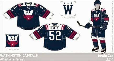
Found this from a Caps fansite, NovaCaps, where they were proposing concept fan art for Capitals' alternate jersey.
unis.jpg


I'd personally switch to red as the primary color and the "W" logo w/ Capitals wordmark as the primary, weagle as shoulder patches, but I really like the basic template myself.
 
Last edited:

Barry Amsterdam

Nättias Dänielstrom
Apr 2, 2013
5,468
4,822
Found this from a Caps fansite where they were proposing concept fan art for Capitals' alternate jersey.

unis.jpg

I'd personally switch to red as the primary color and the "W" logo w/ Capitals wordmark as the primary, weagle as shoulder patches, but I really like the basic template myself.
Those are beautiful that logo looks great too
 

Ad

Upcoming events

Ad

Ad