explore
I was wrong about Don Granato and TNT
- Jun 28, 2011
- 3,752
- 3,434
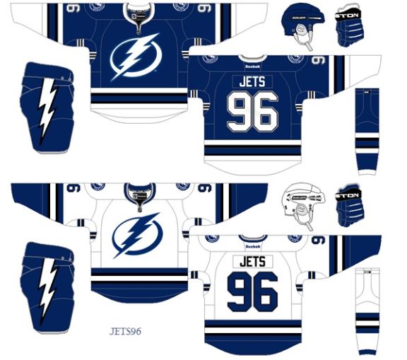
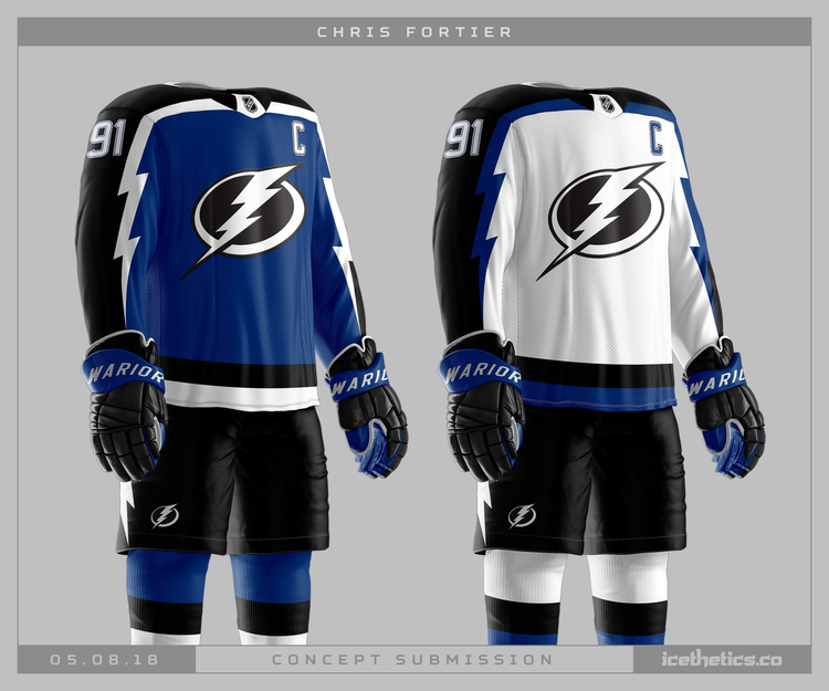
Tampa Bay has never had a good uniform. The best ones were/are merely "meh". They need a full-scale change... colours, logo, everything.
They look like the generic cereal version of the leafs.