LeafsNation75
Registered User
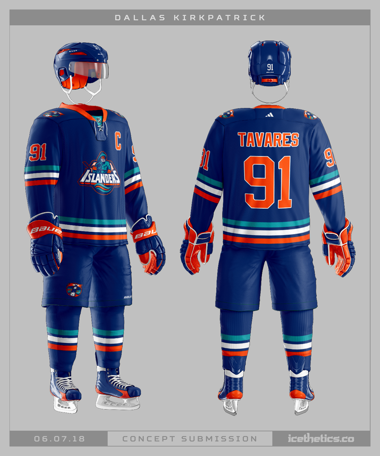
That's correct, although with their Stadium Series jersey I would have went with a blue logo instead of the white logo given it's design.All the jerseys after the rbk edge were great including the winter classics, stadium series and st pats


 Apparently not you.