
JFleegs
Registered User
Tried to make a quick mock up if Tampa bay decided to mix current with retro for the third

Personally, I'm a big fan of baby blue. Can't wait!As long as the Jets ain’t coming out with baby blue jerseys I’ll be fine... Oh wait...
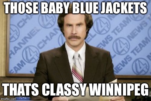
Tried to make a quick mock up if Tampa bay decided to mix current with retro for the thirdView attachment 125637
What are they consciously trying to push Tavares away? Tavares takes one look at them, f*** this!These guys just cannot design a jersey to save their damn lives.

I don't really think many fans are calling for those. Personally i always hated them. Caps are always red, white, and blue to me.Jerseys are such a weird thing and this is why i think it's important that teams don't get too crazy and switch up logos/color schemes too often. Everyone loves original 6 team jersey because they don't switch them up ever and their fans never long for something they used to have.
I always think about how Washington introduced their current jerseys back in 07 and everyone fell in love with them because they were retro and now that they've had them for a while lot's of people miss the old black and blue ones with the eagle on them.
Edmonton finally went back to their retro colours and now i find myself kind of missing the copper and blue.....
The old coyotes jerseys were considered some of the ugliest in the league and now most people love them because they aren't there anymore.
Does anybody really prefer the current Kings jerseys to the old black and grey ones? or even the purple and gold?
The Dallas stars? anybody missing their old jerseys yet?
Old Sens jerseys? >> current Sens jerseys.
People liked Tampa Bays new logo / color scheme now they miss their original logo / color scheme
I like teams like Colorado/San Jose who have kept the same color scheme logo since entering the league and i hope they never rebrand / change.
I don't really think many fans are calling for those. Personally i always hated them. Caps are always red, white, and blue to me.
I don't really think many fans are calling for those. Personally i always hated them. Caps are always red, white, and blue to me.
I’d agree. The old blue/bronze look was nice enough for an expansion team or something, but it wasn’t in line with the Capitals identity. As soon as they went back to the reds, they seemed “right” again.
Tried to make a quick mock up if Tampa bay decided to mix current with retro for the thirdView attachment 125637
*Looks at current rosters*Looks like the Oilers and Islanders had a merger.
Agreed the Caps look better now than they were before. That said, I never hated the 90s look for them, and I actually liked this look for the jersey.I don't really think many fans are calling for those. Personally i always hated them. Caps are always red, white, and blue to me.
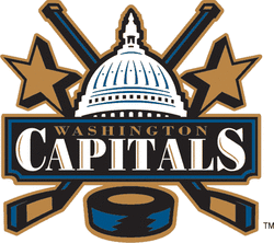
Agreed the Caps look better now than they were before. That said, I never hated the 90s look for them, and I actually liked this look for the jersey.
Modernize that a bit in the current colors, and I think it could have worked. I know its busy, but as a large logo on the front of a hockey jersey, I thought it looked good.
It reminds me a little of the old Raleigh IceCaps logo.If they were to re-do it, I’d suggest making the Capitol dome an outline behind the crossed sticks.

What a brutal colour scheme.It reminds me a little of the old Raleigh IceCaps logo.
I sincerely hope the oilers simply make a navy version of their "classic" blue jersey and just leave it be for a while.
Seriously, we've already gone down the road of copper, red, and navy-blue and then back again to the original royal and orange, only to ditch the royal again in favour of navy.
They need to just pick one colour-scheme and stick to it.
Why mess with a classic?

