
InTkachukWeTrust
Registered User
- Nov 10, 2013
- 1,810
- 736

Andys new pads have significant amount of black and gold, doesn't really seem to suit our current jersey sets? Something to this, or random coincidence?
Its been done before

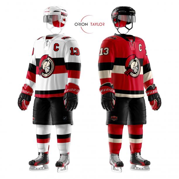
I don't like this logo, but I like the jersey design:

Can't stand that silly "modern 2D", but the rest is ACES. Maybe use the original 2d?I don't like this logo, but I like the jersey design:
Can't stand that silly "modern 2D", but the rest is ACES. Maybe use the original 2d?

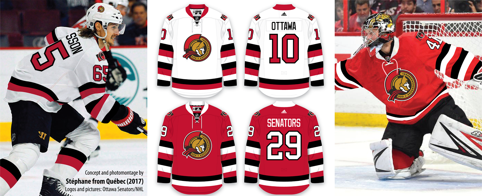
quickly shoved the old logo on and I think it looks pretty good
Nice job. That logo is a thousand times better. It’s like good vs bad.quickly shoved the old logo on and I think it looks pretty good
It’s from the Scanlan article from yesterday Scanlan: After an awful year, meet the two people charged with winning back the Ottawa Senators fan base. Le collectif doesn’t have anything to with them though afaik.is Le Collectif Design about to pull another jersey? whats that tweet about?
It’s from the Scanlan article from yesterday Scanlan: After an awful year, meet the two people charged with winning back the Ottawa Senators fan base. Le collectif doesn’t have anything to with them though afaik.
Both Andy and Condons new pads have significant amount of black and gold, doesn't really seem to suit our current jersey sets? Something to this, or random coincidence?
Andy's new pads
Condon's new pads:
I think that concept is gorgeous. I think they'd have to tweak the logo and add a thicker white border to make it pop from the red jersey but I think both are really lice looking jerseys that would look good worn (by fans) and on TV.quickly shoved the old logo on and I think it looks pretty good
quickly shoved the old logo on and I think it looks pretty good
I hope they go with the 2D. We’ll see in a week.

