
According to reddit users this survey was sent to a random and small amount of Sens Insider subscribers, not STH's.So attendance and season tickets are going down and they’re only asking for advice from the few current customers they still have?
How ****ing stupid is this organization?
2017 New Logo/Jersey News And Concepts | Part 3 |
- Thread starter DrunkUncleDenis
- Start date
You are using an out of date browser. It may not display this or other websites correctly.
You should upgrade or use an alternative browser.
You should upgrade or use an alternative browser.
Icelevel
During these difficult times...
- Sep 9, 2009
- 24,798
- 5,004
I’d even be ok with the newer silver Os. Even though they may not fit as well with the others. Hell I’d be ok with anything on the third if we went to the 2d again.
Not that hard.
Sens of Anarchy
Registered User
- Jul 9, 2013
- 65,259
- 49,890

great1
Registered User
Inspiration from an AHL team? and theirs still looks much better.

Que
What?
solidprospect
Borveetzky
- Sep 30, 2017
- 4,422
- 1,274
montysens
Registered User
danielpalfredsson
youtube dot com /watch?v=CdqMZ_s7Y6k
- Aug 14, 2013
- 16,575
- 9,269

If we're going with the 2D logo, I'd prefer something new like Jerk Store's alternate design pictured above. It also fits in with this team's "United In Red" branding. I'm not keen on the idea of going back to a straight copy of one of the old jerseys.
Either....
Red =O= Home/White =O= Away/Black 2D Third
or
Red 2D Home/White 2D Away/Black =O= Third
L'Aveuglette
つ ◕_◕ ༽つ
1. Is it even a competition?
2. Awesome tweet.
I made that joke a few posts up....
Nac Mac Feegle
wee & free
- Jun 10, 2011
- 34,888
- 9,306
hmmmm......anyone tried the heritage jersey, but replacing the O with an S (of the same style)?
I love the heritage jerseys, but I wish there was a way to make the O look like an O instead of a zero. Using an S feels like it might be cartoonishy supermanish, but I'd have to see it to tell for sure.
I love the heritage jerseys, but I wish there was a way to make the O look like an O instead of a zero. Using an S feels like it might be cartoonishy supermanish, but I'd have to see it to tell for sure.
Que
What?
I made that joke a few posts up....
No joke. 2D all the way. O looks like a zero.
hmmmm......anyone tried the heritage jersey, but replacing the O with an S (of the same style)?
I love the heritage jerseys, but I wish there was a way to make the O look like an O instead of a zero. Using an S feels like it might be cartoonishy supermanish, but I'd have to see it to tell for sure.
You could try to put the S inside the O but I'm sure Ohio State would have a few words with us...
Back in Black
All Sports would be great if they were Hockey
If we're going with the 2D logo, I'd prefer something new like Jerk Store's alternate design pictured above. It also fits in with this team's "United In Red" branding. I'm not keen on the idea of going back to a straight copy of one of the old jerseys.
Back in black baby, that red ship has sailed........
danielpalfredsson
youtube dot com /watch?v=CdqMZ_s7Y6k
- Aug 14, 2013
- 16,575
- 9,269
Back in black baby, that red ship has sailed........
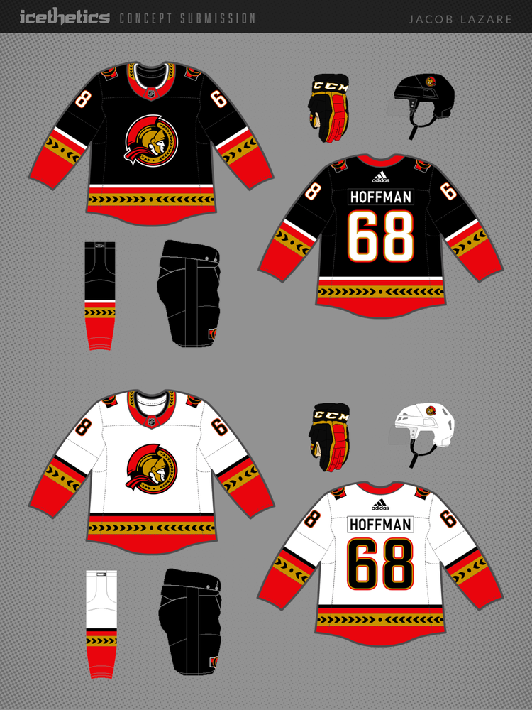
Given some of the previous sentiment in this thread about the updated 2D logo, I don't expect this concept to be popular here, but I like it a lot. I've always loved that old third jersey. If I recall, Daniel Alfredsson was a big fan of them as well. Maybe we can wear these after his ownership group buys the team...
Sens of Anarchy
Registered User
- Jul 9, 2013
- 65,259
- 49,890
Sens of Anarchy
Registered User
- Jul 9, 2013
- 65,259
- 49,890
Not a bad idea .. I actually like the red 3B over the black 1A.. I would make the black A the 3rd jerseyA.
Get the O's away now... so if I could I'd switch the 3rd A with the 3rd B.
DrakeAndJosh
Intangibles
A instantly becomes one of the best sets in the league. We currently have probably the worst set in the league. No brainer money maker here but of course we won’t do anything. I’m on a Melnyk boycut but I’d probably spend on a new jersey if they made it well.
Daffy
Registered User
- Jun 10, 2010
- 3,736
- 1,923
Get rid of the 3D garbage. And get rid of the O. 2D all the way. It's not even close.
Tnuoc Alucard
🇨🇦🔑🧲✈️🎲🥅🎱🍟🥨🌗
- Sep 23, 2015
- 8,058
- 1,918
A instantly becomes one of the best sets in the league. We currently have probably the worst set in the league. No brainer money maker here but of course we won’t do anything. I’m on a Melnyk boycut but I’d probably spend on a new jersey if they made it well.
You could take a chance on a knockoff from China...
Ottawa Senators Jersey

they have the "Ugly Sweater" too !
Nac Mac Feegle
wee & free
- Jun 10, 2011
- 34,888
- 9,306
1. B
2. A
3. D
They all look good....except for the alternate jersey in the B row. Too much red.
DrakeAndJosh
Intangibles
I think I'd like the white 2d with a white stripe instead of black at the bottom, anyone else agree with that?
Peptic Balcers
Registered User
Given some of the previous sentiment in this thread about the updated 2D logo, I don't expect this concept to be popular here, but I like it a lot. I've always loved that old third jersey. If I recall, Daniel Alfredsson was a big fan of them as well. Maybe we can wear these after his ownership group buys the team...
I usually find the white version of jerseys boring, but ouchie wowie me likey dat
Back in Black
All Sports would be great if they were Hockey
You know how I feel about that 2d kiddy crest , but those are some nice jersey's.
, but those are some nice jersey's.
Given some of the previous sentiment in this thread about the updated 2D logo, I don't expect this concept to be popular here, but I like it a lot. I've always loved that old third jersey. If I recall, Daniel Alfredsson was a big fan of them as well. Maybe we can wear these after his ownership group buys the team...
Last edited:
Ad
Upcoming events
-

-
 Victoriaville Tigres @ Drummondville Voltigeurs - Game 1Wagers: 1Staked: $25.00Event closes
- Updated:
-
 Game 2 Belleville Senators @ Toronto Marlies -Belleville Senators leads series 1-0Wagers: 2Staked: $40.00Event closes
- Updated:
-
-
Game 1 W-B/Scranton Penguins @ Lehigh Valley Phantoms - Lehigh Valley Phantoms leads series 1-0Wagers: 4Staked: $180.00Event closes
- Updated: