Tsujimoto
Registered User
- Jan 23, 2006
- 2,702
- 1,538
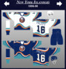
I liked it, except for the BUFFALO on the hem stripes.I think I'm the only person that liked the red butter knives jersey.
I liked it, except for the BUFFALO on the hem stripes.I think I'm the only person that liked the red butter knives jersey.
Can somebody explain to me why we are celebrating our 50th anniversary in 19-20 even though we celebrated our 40th anniversary in 10-11?
That still doesn't explain the change from '10-'11.I think it's because it depends on what you're celebrating - the number of years there has been an NHL franchise in Buffalo or the number of seasons played. Recall that 2004-05 season was wiped out from the standpoint of play, but the franchise was still in existence
1970-71 First year of franchise and first season of play
1971-72 2nd
1972-73 3rd
1973-74 4th
1974-75 5th
1975-76 6th
1976-77 7th
1977-78 8th
1978-79 9th
1979-80 10th year of franchise and 10th season of play
1989- 90 20th year of franchise and 20th season of play
1999-2000 30th year of franchise and 30th season of play
2003 -04 24th year of franchise and 24th season of play
2004-05 25 year of franchise and did not play
2005-06 26th year of franchise and 25th season of play
2009-10 40th year of franchise and 39th season of play
2010-11 41st year of franchise and 40th season of play
2019-20 50th year of franchise and 49th season of play
2020-21 51st year of franchise and 50th season of play
Golisano still owned the team then, didn't he?That still doesn't explain the change from '10-'11.
Yes. The change in ownership was my first thought but I wound up making my snarky comment about the team being baffling instead. It makes sense as part of why the thinking's different but it's just cheesy celebrating the 50th nine years after the 40th. Maybe they don't want it getting in the way of the big Feb '21 celebration of 10 great years under the Pegulas.Golisano still owned the team then, didn't he?
That still doesn't explain the change from '10-'11.
Yes. The change in ownership was my first thought but I wound up making my snarky comment about the team being baffling instead. It makes sense as part of why the thinking's different but it's just cheesy celebrating the 50th nine years after the 40th. Maybe they don't want it getting in the way of the big Feb '21 celebration of 10 great years under the Pegulas.
Being that the 1st anniversary would've been '71-'72, wouldn't the 40th anniversary have been '10-'11? I imagine that is as much what they were celebrating as it technically being their 40th season.It might seem cheesy celebrating the 50th nine years after the 40th. But is is cheesy to celebrate the 50th anniversary fifty years after the founding of the franchise? I can't speak for the 2010-2011 except to say that it was factually the 40th season of play because of the 04-05 lockout. At the same time, on 2010-2011 the team was in its 41st year of existence. I can only assume that in 2010 - 2011 the team celebrated its 40th season of play and that in 2019-2020, the Sabres are celebrating 50 years as an NHL franchise.
I would love this, the goat head with the royal blue and gold colorsBlue and gold goat for me.

I'm pro blue and gold all day, and I still think there's a way to do a gold third jersey well, as horrible as our last attempt was, that said:
To the extent there is an appetite to bring back the black/red oddity in some fashion, I would be interested to see what they could do with a black and gold third jersey concept
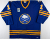
Does anybody know or recall why the Sabres modified their logo in the late 1970s/early 1980s to what you see in the Perreault jersey from the 1979-80 season? It's similar but clearly different than the original, and then they revert back to the original sometime in the 1980s. I've never come across any information about what led to the changes.
View attachment 245775
Awesome.This is simply due to manufacturers error and sloppy execution, the team itself never changed the official logo. This was pre computers and digital digitizing so the variance from year to year is akin to making a copy of a copy of a copy etc... Plus they switched from Rawlings to Maska (CCM).
The most noticeable change are these early 80's Maska jerseys where the Bison looks like a ghost and the swords are more spaced apart at the hilts.
Oddly CCM and Maska are the same company and same factory, and by the mid-80's the crest was much better and closer to the actual logo you would see in print materials.
Possible leak!