
White Out 902
I'm usually right.
Man, the Coyotes hit a f***ing home run with their jerseys. Minnesota too.
Real waste of an opportunity for TNSE. Having cash flow problems? Sell a whiteout 90’s style jersey as a means to say, “when we’re able to get back together, we’ll celebrate the whiteout in downtown Winnipeg like never before”. Would have sold like mad.
I think the Aviator logo is brilliant. That subtle jet in the T is *chef's kiss*It's better than the aviator for sure. At least the logo is good.
I did a super duper rough job with this. It looks too much like Washington, but I still prefer it over the ones we gotWould've loved to have seen a 90s reverse retro jersey with the primary blue and red being switched. Maybe someone can Photoshop that? Imagine an all red jersey with white stripes, blue outlines, and blue pantsView attachment 376557
I still want to see a decent take on a whiteout jersey someday.
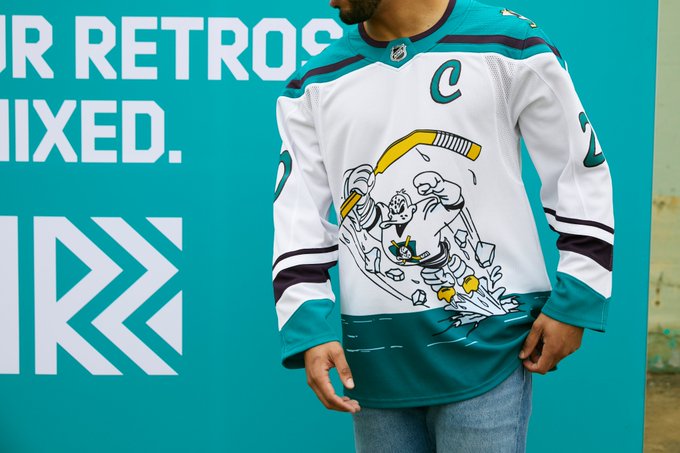
Side note: Jets honour old Winnipeg team, Minnesota honours old Minnesota team, but Colorado and Carolina dress up in the corpse of another city's team. I would have felt weird going thrashers for this, but only because during the dark era, seeing Arizona skating in Jets jerseys would have induced bile.
i think there's some wiggleroom but not nearly as much input as you thinkYes, I'm aware. But you don't seriously think this was done without consultation right? Like, they just emailed Mark Chipman and TNSE a final draft and said "hey this is cool right?"
probably because Ottawa, Calgary, Edmonton, St Louis, Habs (home) all are red heavy and in our "region"I really dislike the lighter blue used as the accent colour on the letter/numbers. It looks fine on the logo but looks really out of place elsewhere.
I also don't get why there's such an aversion to using red.
This is exactly how I wear my jerseys so it's nice to see this. Also nice to see some slim women modelling them as that's what I am, as well as the ladies wearing the proper jerseys rather than some weird fitted women's version.
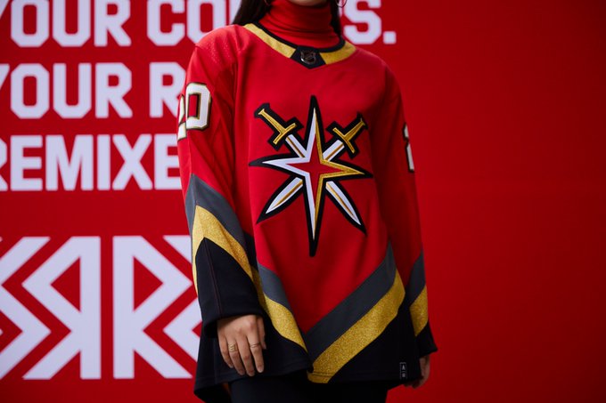
It took me a while to figure out what team this even is...I THINK it's Vegas? How could Vegas even have a retro jersey? This is just weird.Jets...It's OK... needed just a bit of colour in there somewhere. Nothing I'll ever buy, but it could have been a lot worse.
The worst IMO:
I just think ugly Vancouver Canucks when I look at this for some reason.
No, the speculated front runner, before fans inundated TNSE with feedback, was Polar Bears and Falcons.
Falcons isn't bad, but the fact these bozos were considering anything but Jets demonstrates bad taste.
I don't really care about your speculation. Mark Chipman himself said they were considering Bears not Polar Bears.
the red and blue mocks are so much better than the greys

I have to say when looking at it zoomed in it's not bad. I just wonder what they will look like on the ice during play.Zoomed in:View attachment 376502
It took me a while to figure out what team this even is...I THINK it's Vegas? How could Vegas even have a retro jersey? This is just weird.

I agree. I would argue that our retro reverse jersey is the worst one in the entire league.
