Proposal: Rebrand!!

WhatTheDuck

9 - 20 - 8
May 17, 2007
23,182
15,716
Worst Case, Ontario
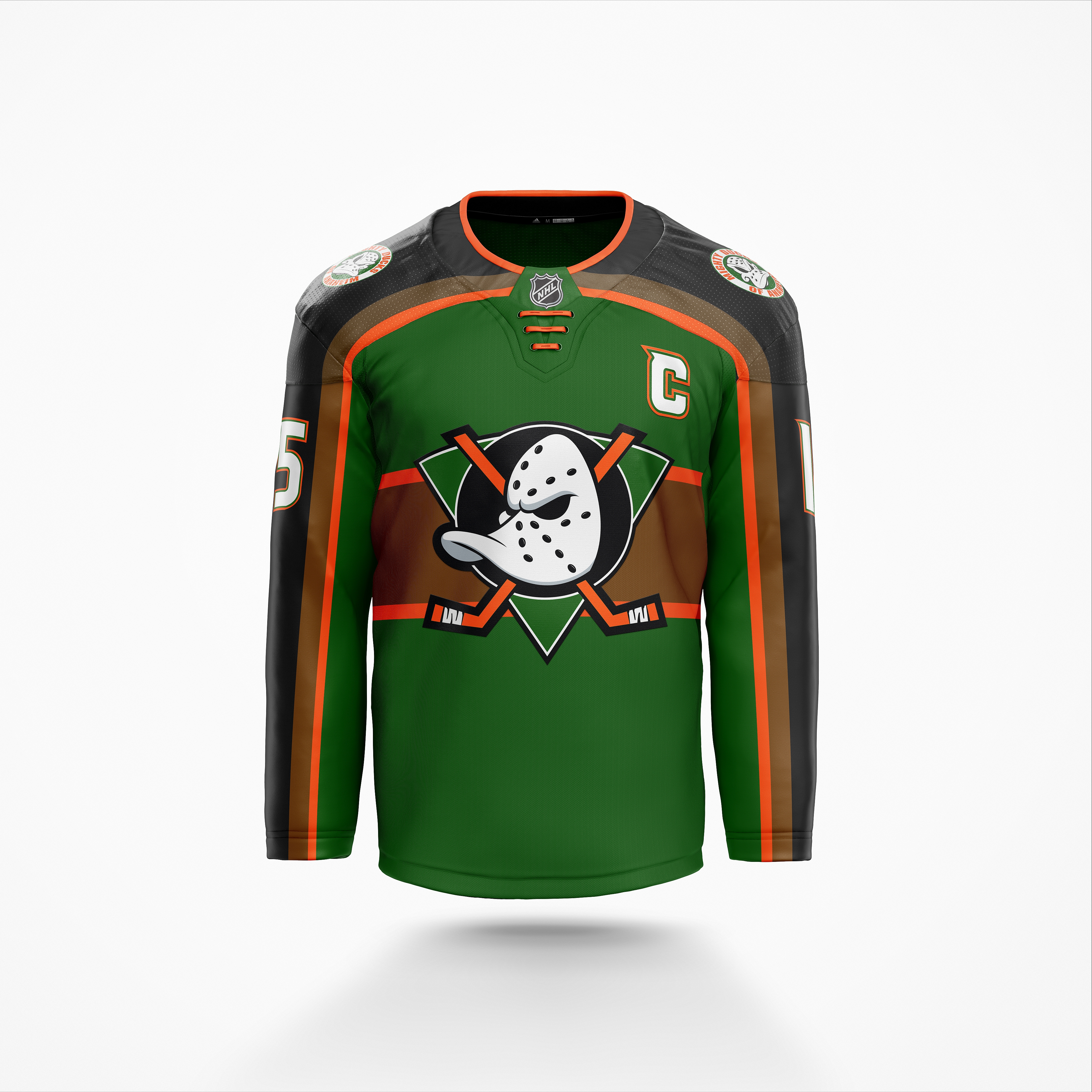
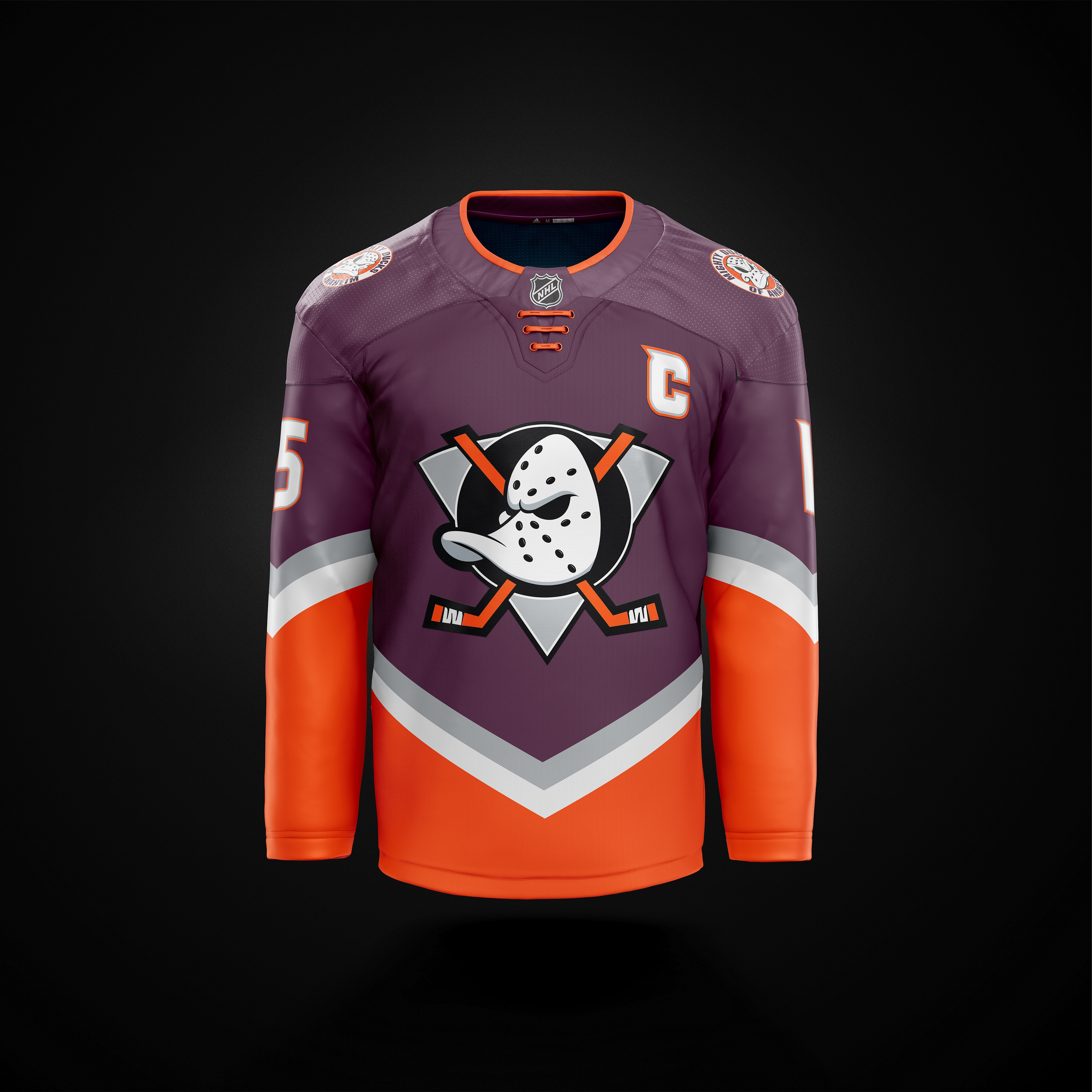
I just toyed around a bit with the eggplant/burnt orange color scheme I posted a while ago and came up with a new type of design. As the owners seem to want to have orange as one of the major colors, I removed liquorice from the color scheme and made it focus on the orange more.

Home:
redesign_mightyducks_4bkfs.jpg


Away:
redesign_mightyducks_e5kpz.jpg


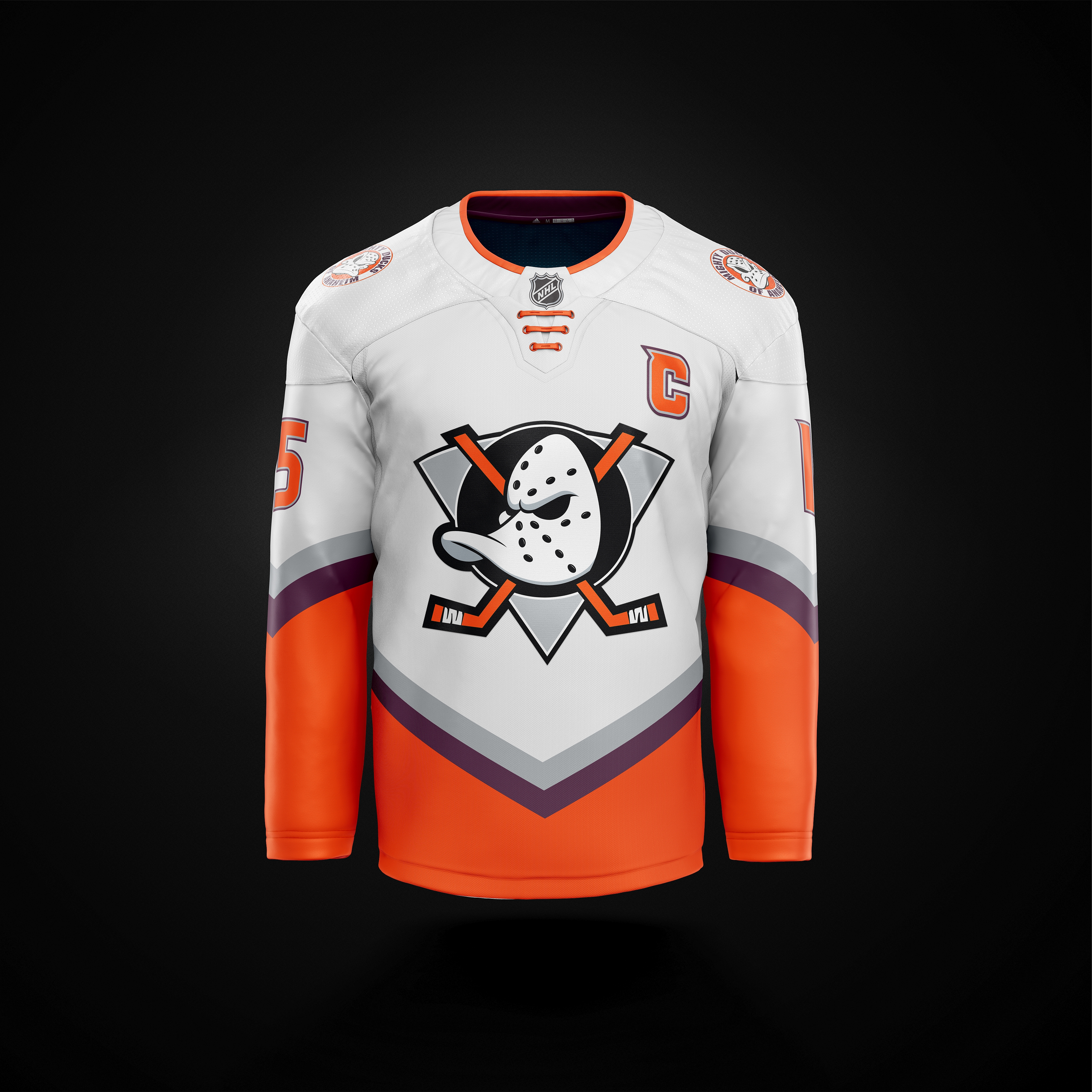
Shoot away. I think these would be rather unique not only in color scheme, but in jersey design as well. I do remember Calgary having a similar pattern some 20-ish years ago, but I decided for the sleeves to have the opposite direction in the edges as the main torso.

I think an important aspect in getting these colors to complement each other is ensuring that the brightness is toned down, in particular the orange needs to be a darker colour. Just my opinion
 

Dryish

Nonplussed
Dec 14, 2015
1,603
2,199
Hki Metro
I must be the only person around these parts who thinks the combination of orange and eggplant, or any purple for that matter, is just an absolute abomination that shouldn't be flown anywhere. Those mockups genuinely make me sick and I'd have to consider my fandom if those were the colours the team embraced.
 

Quack Shot

Registered User
Nov 14, 2010
4,529
1,936
SoCal
I must be the only person around these parts who thinks the combination of orange and eggplant, or any purple for that matter, is just an absolute abomination that shouldn't be flown anywhere. Those mockups genuinely make me sick and I'd have to consider my fandom if those were the colours the team embraced.

Agreed, that color combo is ugly
 

MMC

Global Moderator
May 11, 2014
48,336
39,325
Orange County, CA
I must be the only person around these parts who thinks the combination of orange and eggplant, or any purple for that matter, is just an absolute abomination that shouldn't be flown anywhere. Those mockups genuinely make me sick and I'd have to consider my fandom if those were the colours the team embraced.
No I hate it too, it’s cool for VT but doesn’t fit our brand at all.
 
  • Like
Reactions: Dryish

DuckRogers10

Registered User
Feb 3, 2016
774
436
Cypress, CA
Thankfully or should I say hopefully the original logo won't be our primary ever again. I know I'm in the minority but I've always hated the original logo. The current gets way to much hate.
 
  • Like
Reactions: Kalv

Ad

Upcoming events

  • Inter Milan vs Torino
    Inter Milan vs Torino
    Wagers: 5
    Staked: $2,752.00
    Event closes
    • Updated:
  • Metz vs Lille
    Metz vs Lille
    Wagers: 3
    Staked: $354.00
    Event closes
    • Updated:
  • Cádiz vs Mallorca
    Cádiz vs Mallorca
    Wagers: 2
    Staked: $240.00
    Event closes
    • Updated:
  • Bologna vs Udinese
    Bologna vs Udinese
    Wagers: 3
    Staked: $265.00
    Event closes
    • Updated:
  • Clermont Foot vs Reims
    Clermont Foot vs Reims
    Wagers: 1
    Staked: $15.00
    Event closes
    • Updated:

Ad

Ad