Proposal: Rebrand!!

Anaheim4ever

Registered User
Jun 15, 2017
8,869
5,440
It does IMO, I'd rather not lift the color scheme from the Cleveland Browns though.

90
Yeah i don't want the Ducks to look like the Cleveland Browns but the shade of brown that the San Diego Padres use i like that color.
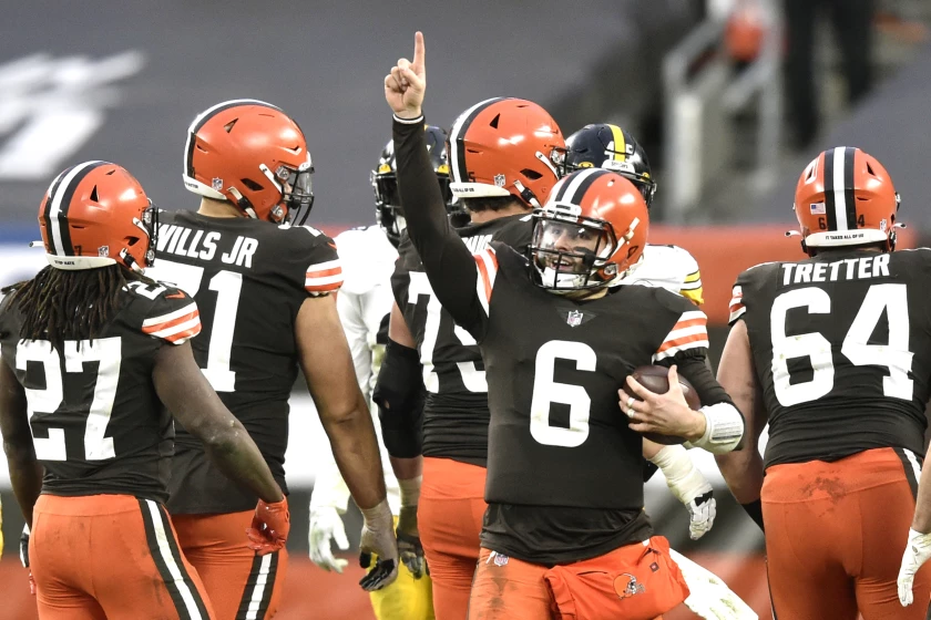
If the Ducks had brown jerseys they would be the only team with them.
 

Hockey Duckie

Registered User
Jul 25, 2003
17,547
12,455
southern cal
0916-stevenreeves-ana.png


39b53e21b03ea03a0aefb66e33e4a72f.jpg


aee2997096187799f3159cf6a0b6fdf5.jpg


That is other jersey concepts have seen when using google

When I was creating my own design way back when, I had the foot flipped upside down to make the A for Anaheim on the pant instead of the shield crest shown in the above concept. It was black pants with orange font. Orange webbed foot seemed only logical.
 

SmokeyDuck

Registered User
Jul 27, 2010
3,233
910
Anaheim, CA
Perhaps make the stripe between the orange stripes grey and the bottom left triangle black. I think just the two colors might be too plain imo.
 

GermanRocket7

Fire Newell Brown yesteryear!
Sponsor
Nov 7, 2008
1,246
1,318
I don't really like any of these.

Some ideas:

1. The orange needs to be fiercer and more red-ish. A burnt orange such as International Orange (Golden Gate Bridge, #F04A00) would make the contrast much better.
2. The grey-ish/black-ish parts need to be redone in a different color. The way they are now, they are way too busy and distracting from the actual theme of the jersey. Maybe use a real black-ish tone such as Licorice (#1A1110)??
3. The color tones need to be redone for the logo. Use the colors mentioned above.
4. The lower orange stripe ought to be a light grey-ish or even white tone. You might experiment with tones along Timberwolf (#D9D6CF) or Seasalt (#F7F7F7).
5. The eggplant script on the shoulder logo should be done in the orange variation you use. That way, the shoulder patches become more vivid, less flat and distinguish themselves from the rest of the section.
 

Boo Boo

Registered User
Jan 31, 2013
2,133
2,257
If the ducks released any of the jerseys in this thread I would own way more jerseys. You’re all crushing it with the mock ups
 
  • Like
Reactions: Kariya 9

GermanRocket7

Fire Newell Brown yesteryear!
Sponsor
Nov 7, 2008
1,246
1,318
I just toyed around a bit with the eggplant/burnt orange color scheme I posted a while ago and came up with a new type of design. As the owners seem to want to have orange as one of the major colors, I removed liquorice from the color scheme and made it focus on the orange more.

Home:
redesign_mightyducks_4bkfs.jpg


Away:
redesign_mightyducks_e5kpz.jpg


Shoot away. I think these would be rather unique not only in color scheme, but in jersey design as well. I do remember Calgary having a similar pattern some 20-ish years ago, but I decided for the sleeves to have the opposite direction in the edges as the main torso.
 
  • Like
Reactions: WhatTheDuck

Kalv

Slava Ukraini
Mar 29, 2009
23,587
11,177
Latvia
I just toyed around a bit with the eggplant/burnt orange color scheme I posted a while ago and came up with a new type of design. As the owners seem to want to have orange as one of the major colors, I removed liquorice from the color scheme and made it focus on the orange more.

Home:
redesign_mightyducks_4bkfs.jpg


Away:
redesign_mightyducks_e5kpz.jpg


Shoot away. I think these would be rather unique not only in color scheme, but in jersey design as well. I do remember Calgary having a similar pattern some 20-ish years ago, but I decided for the sleeves to have the opposite direction in the edges as the main torso.
Certainly looks interesting (and good). But made me wonder if the bottom is not taking away too much of the main color (eggplant, white). And what color would the pants be. Orange would look weird I think. And Black would fall out of picture.
 

Ad

Upcoming events

Ad

Ad