
Proposal: Rebrand!!
- Thread starter wraparound
- Start date
You are using an out of date browser. It may not display this or other websites correctly.
You should upgrade or use an alternative browser.
You should upgrade or use an alternative browser.
Tony O
Registered User
- May 31, 2011
- 249
- 91
Eggplant and orange with Mighty Ducks logo please and thanks
/cdn.vox-cdn.com/uploads/chorus_image/image/69092555/usa_today_15754980.0.jpg)
icethetics concepts | Fun with the Mighty Ducks

Terry Yake
Registered User
- Aug 5, 2013
- 26,826
- 15,312
yeah, it's embarrassing that they won the cup wearing those atrocious sweatersI understand that teams change jerseys for sales, but I've always felt that if you win a cup in a jersey that should just be your permanent look. Except for us. Good lord those were the ugliest jerseys to ever lift the cup.
i think it's safe to say a good chunk of the fanbase would welcome a return to the old logo and colors. doubt it happens under the samuelis though, considering the rebrand happened under their watch
wraparound
Registered User
- May 17, 2014
- 704
- 365
this would absolutely work with some pops of jade. anyone up for making a mockup?Eggplant and orange with Mighty Ducks logo please and thanks
Ducks in a row
Go Ducks Quack Quack
Ducks regular colors and logo is boring. Go back to Mighty Ducks jersey or if you want something different use different colors and a logo of a Duck instead of a webbed foot.
Anaheim4ever
Registered User
- Jun 15, 2017
- 8,869
- 5,440
Well a lot of us are now old myself included and a lot of the fanbase is now younger and doesn't remember being made fun of for the Ducks having Disney Jerseys.
I remember being laughed at with comments from people saying "ur team is a Disney gimmick" or "Ducks are disney joke that'll never win the cup, ever".
I remember being laughed at with comments from people saying "ur team is a Disney gimmick" or "Ducks are disney joke that'll never win the cup, ever".
405Entrance
Registered User
- Feb 8, 2020
- 852
- 594
If we go back to our OG colors I guarantee you the team jerseys are top ten in the league in sales
- Nov 7, 2008
- 1,247
- 1,318
I can only reiterate my original designs for reverse retro jerseys I designed back when the return of the Wild Wing was announced.
Still think this would fit much better for a rebrand that doesn't want to become a complete throwback to the original jerseys, while incorporating the original design and color scheme.
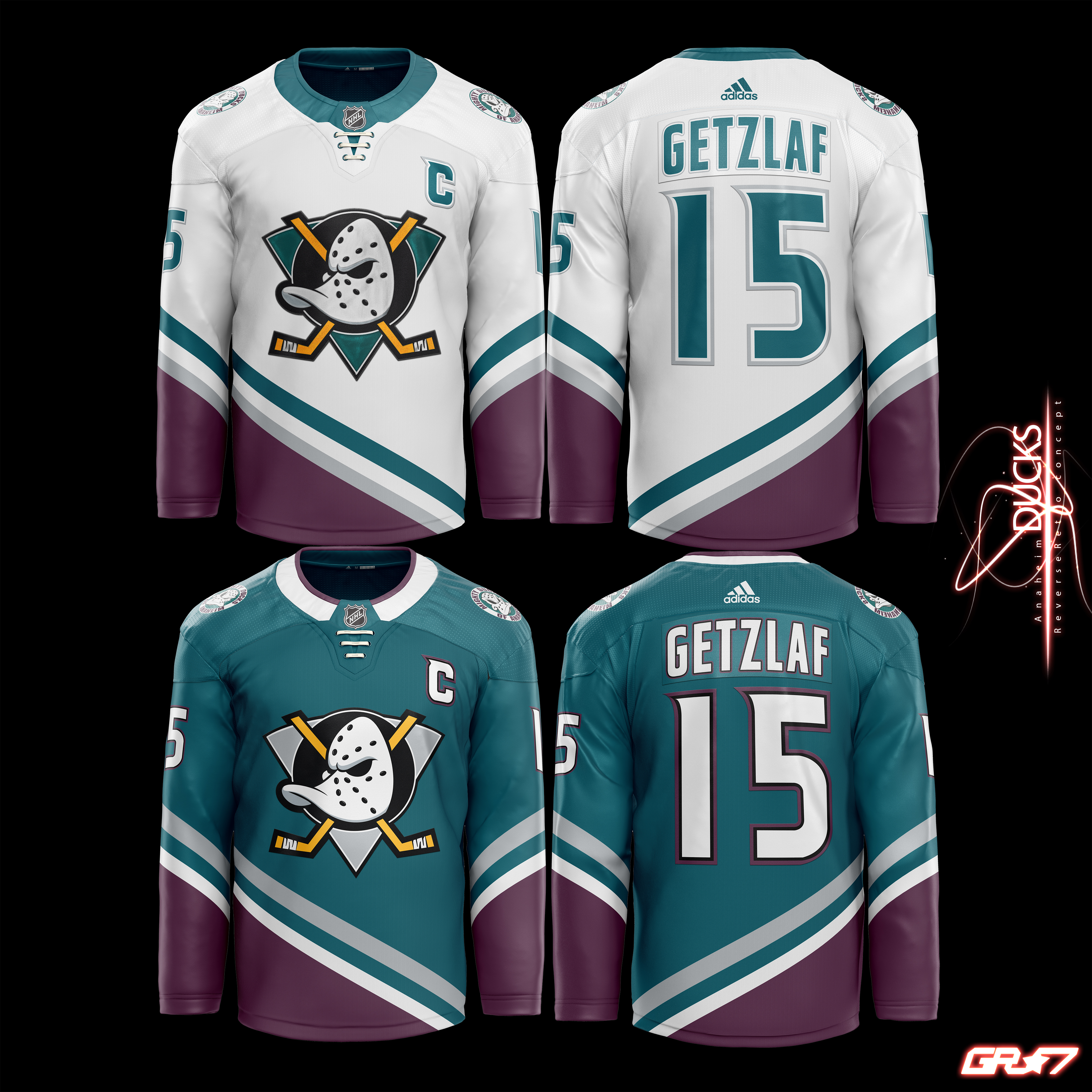
Still think this would fit much better for a rebrand that doesn't want to become a complete throwback to the original jerseys, while incorporating the original design and color scheme.
wraparound
Registered User
- May 17, 2014
- 704
- 365
where do I signI can only reiterate my original designs for reverse retro jerseys I designed back when the return of the Wild Wing was announced.
Still think this would fit much better for a rebrand that doesn't want to become a complete throwback to the original jerseys, while incorporating the original design and color scheme.
Vipers31
Advanced Stagnostic
Our 25th anniversary 3rds were wonderful. Those as away jerseys, add a white version, kthxbye.
gunnergunther
Registered User
- Jul 3, 2010
- 759
- 827
Our current black is the ugliest home jersey in the league. Its way too busy, makes me think of some kid designing something with clips art.
Our 25th anniversary 3rds were wonderful. Those as away jerseys, add a white version, kthxbye.
I have two of those, love them, I get a lot of compliments when I wear them. It’s funny, I own two classic eggplants I got like 10 years ago, 2 - 25th anniversary, one orange retro, and one reverse retro. I don’t own any of their regular jerseys, I just hate them. I’m ok with the Duck foot as shoulder patches but not in the middle of the jersey.
I also got a lot of compliments on the reverse retro as well, which has grown on me.
Vaakou
Registered User
Quack Shot
Registered User
Those were ugly.Bring back the 2014 stadium series jerseys.
View attachment 447593
Unfortunately, I agreeOur current black is the ugliest home jersey in the league. Its way too busy, makes me think of some kid designing something with clips art.
lwvs84
Registered User
I can only reiterate my original designs for reverse retro jerseys I designed back when the return of the Wild Wing was announced.
Still think this would fit much better for a rebrand that doesn't want to become a complete throwback to the original jerseys, while incorporating the original design and color scheme.
Wow, should have stolen those designs when I was coming up with jerseys for my team
anezthes
Registered User
- Mar 20, 2014
- 4,453
- 2,471
The current colours and logo are fine, IMO.
The original colours and logo were perfect.
The problem, again IMO, is the design of the jersey. There's an overabundance of stripes and they don't add or tie anything together. It's just sort of there, in all kinds of different colours, and it's just visual noise.
Whomever designed 'em lacked basic knowledge of design fundamentals. There's no way they were made by professional designers.
Opak
Registered User
- Nov 28, 2014
- 6,543
- 1,684
I can only reiterate my original designs for reverse retro jerseys I designed back when the return of the Wild Wing was announced.
Still think this would fit much better for a rebrand that doesn't want to become a complete throwback to the original jerseys, while incorporating the original design and color scheme.
The eggplant needs to be the main color though. Otherwise it looks too much like a Sharks jersey.
The Midnight Burrito
True Fan
I like our current kit. I loved the original home jerseys, white and jade. The road eggplants were utterly disgusting and were rightly criticized.
anezthes
Registered User
- Mar 20, 2014
- 4,453
- 2,471
The road eggplants were utterly disgusting
Burrito, you're breaking my heart! And you're going down a path I cannot follow!
Ducks DVM
sowcufucakky
Time to embrace the wild wing 3rd jersey in the current colors, with the alternate being the current logo and uniform in eggplant and jade. That’ll show mister Jfresh who knows fashion.
The Midnight Burrito
True Fan
I'm sorry, I formed this opinion in my teens so it's unbreakable now. And that eggplant jersey is the first jersey I ever bought!Burrito, you're breaking my heart! And you're going down a path I cannot follow!
The Midnight Burrito
True Fan
Time to embrace the wild wing 3rd jersey in the current colors, with the alternate being the current logo and uniform in eggplant and jade. That’ll show mister Jfresh who knows fashion.
I wish I had a barf cannon, I'd shoot it at you.
- Jul 25, 2012
- 39,956
- 34,948
Those are actually really good looking jerseysI can only reiterate my original designs for reverse retro jerseys I designed back when the return of the Wild Wing was announced.
Still think this would fit much better for a rebrand that doesn't want to become a complete throwback to the original jerseys, while incorporating the original design and color scheme.
HunterDuck
Registered User
The Samuelis are too stubbornly in love with the ugly ass duckfoot logo, sadly.