Pittsburgh Penguins presents new white Diagonal reverse retro 4th jersey

How do you rate the new jersey?


  • Total voters
    102
  • Poll closed .

ColePens

RIP Fugu Buffaloed & parabola
Mar 27, 2008
107,023
67,649
Pittsburgh
I like funky colors and designs so i love St Louis, Washington, Phoenix, and New Jersey.

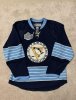
This Pittsburgh one is abhorrent, I can't describe in words how much i hate it.

Without any background info - I immediately hated it.

But then I read into what they were trying to do and I sorta understood it. They were trying to do a reverse retro. So to be 100% fair, they should have actually used the gray robo pigeon and made our whole jersey grey. Or done a full yellow Pigeon. That would have fit the context of what they were trying to do.

This jersey looks like a really cheap knockoff.
 
  • Like
Reactions: Lesky

Mr. T

Registered User
Feb 15, 2003
3,718
903
Or perhaps some commemorative pukka shell and trucker chain wallet nights?

Oh, they've got a whole "Divorced Dad" promo night planned. One lucky father will be on the JumboTron between periods playing a game where he tries to get his kids to talk to him again.
 
  • Like
Reactions: HandshakeLine

Ugene Magic

EVIL LAUGH
Oct 17, 2008
54,339
18,768
Pittsburgh
I like it. Looks clean to me.

It's nice, like it's, nice for other people to waste their money on it.

This is the best version to ever come out. My eyes and jaws dropped to the floor when it made its entrance.

img-277383-f.jpg


This is clearly a piece of shit... From the collar down to the material.
Adidas.

thumb.aspx
 

Mr. T

Registered User
Feb 15, 2003
3,718
903
Some that I love:
- Whalers (Canes): Gray jerseys.. I love them.
- Boston: Because pop our logo on it and it was our keystone jersey
- Avs: My GOODNESS that is sexy. Nordiques 4 lyfe
- Montreal: Reminds me of Central Pittsburgh days. f***in beauty on the flip color.
- Minnesota: Hot damn.
- SJ: Once again.. gray. I love it.


And let's face it. We see A LOT of 90s love out there in Anaheim, Columbus, Washington, Buffalo, Tampa, etc. It's not for me but it will look sexy on ice.

That Minnesota one is a work of art. I love it.

The Pens jerseys look fine. Not bad at all.
 
  • Like
Reactions: Ugene Malkin

EightyOne

My posts are jokes. And hockey is just a game.
Nov 23, 2016
12,697
12,034
I hate when the NHL mandates bull like this

Spending energy on making teams build dumb unis

When they could you know train the referees to call correct penalties
 
  • Like
Reactions: The Old Master

HandshakeLine

A real jerk thing
Nov 9, 2005
47,994
31,976
Praha, CZ
Oh, they've got a whole "Divorced Dad" promo night planned. One lucky father will be on the JumboTron between periods playing a game where he tries to get his kids to talk to him again.

Is this the one where if he or she makes a shot from the defending blueline, they pay 30% of his or her back alimony, plus a free handle of Evan Williams?
 

orby

Registered User
Jun 16, 2013
6,750
5,364
Erie, PA
www.youtube.com
Minnesota, Arizona (just because of the crazy colors), LA, Colorado and Washington are my favorites. New Jersey and St. Louis are fun too.

The diagonal Pens jerseys are okay but a bit plain in white - I don't know what they really could have done with the "reverse" theme that was more exciting - maybe a black version of the original Robo Penguin jerseys - but it's kind of just ordinary IMO. I do prefer it to the yellow jerseys.
 
  • Like
Reactions: Dennis Reynolds

ColePens

RIP Fugu Buffaloed & parabola
Mar 27, 2008
107,023
67,649
Pittsburgh
It's "reverse" retro. They're not doing retro. Though yes a black one would be nice to match

That was my misunderstanding at first. Now I see the idea of what they are doing. And to be fair... fine. It sells. It makes revenue for NHL.

And if you are a fan of hockey, revenue is a big thing to keep the cap going. So you SHOULD celebrate it.
 
  • Like
Reactions: Hungamania

ColePens

RIP Fugu Buffaloed & parabola
Mar 27, 2008
107,023
67,649
Pittsburgh
Minny and the Devs two of my favorites. New Jersey should go red/green full time. The red and black is sooooo boring. Just like many versions of their team I guess.

Something about the Devils being green would be strange, though. I agree it looks better.
 

Pens x

Registered User
Oct 8, 2016
16,236
8,031
I like the jersey; I certainly don’t love or or hate it.

I would have liked to do their 2011 winter classic jersey in white or black, with at least two less stripes. Change the blues to black and yellow.

or robo Penguin in white:
upload_2020-11-16_23-47-31.jpeg


Also, I don’t think many here cared to read about what reverse retro means....
 

Attachments

  • upload_2020-11-16_23-45-38.jpeg
    upload_2020-11-16_23-45-38.jpeg
    158.9 KB · Views: 3

Varan

Registered User
Nov 27, 2016
6,467
4,771
Toronto, Ontario
I think I’m the only one who finds these decent. The color and shadows on the lettering and font makes it stick out, which is cool
 

Ad

Upcoming events

Ad

Ad