Man, these designs really are all over the map in terms of quality. It'll be interesting to see if any of these stick around longer term, because for each one that deserves to be immediately forgotten, there's one that would at least make a good full-time alternate.
My rankings...
Tier 1 - Awesome jerseys I hope to see more than a couple times.
Qulorado - Was there any doubt? White alternates usually won't score highly, but seeing that Nordiques look just makes me happy and it looks ridiculously good in Colorado's color scheme.
Los Angeles - While this isn't perfect, this blends the two good Kings looks in a way that may finally get me to buy a Kings jersey. I may damn well be overrating these simply because of what the Kings normally wear being so...powerfully lame.
Minnesota - This is all about the color scheme and North Stars for me. The North Stars had one of my favorite looks of any team in any sport ever, largely because of green & gold/yellow being one of my favorite color schemes. Seeing one of my favorite logos in a better color scheme on a jersey base that I loved is just fantastic. I always wished the Wild had went with this color scheme.
New Jersey - Green. f*** yeah.
Tier 2 - These are good jerseys, but not necessarily great or better than what they're throwing back to or what the team normally has.
Boston - I like gold jerseys and that these are just a gold version of the jerseys the Bruins wore for a good while. Having white as the bottom sleeve stripe bothers me more than it should, though, and is an unfortunate byproduct of giving jerseys the inverse treatment.
Carolina - The only thing preventing these from being tier 1 is the color. Gray outright sucks for a jersey color...which is a shame because I need the Whalers aesthetic is more appealing to my eyes than heroin to a junky.
Montreal - This jersey could have been made at any point in my lifetime and been considered a damn good alternate, even if there's little change beyond the order of the colors.
Tier 3 - Fun bad.
Anaheim - Listen, I'll take almost anything in this color scheme compared to the old one, even if it involves Wild Wing flying out of the ice. The originals were truly atrocious, but fell in the 'so bad they're good' camp to some. To me these are almost too stupid to insult, which makes them almost endearing.
Arizona - I'm a damn sucker for the kachina look and that doofy coyote head is enough to bump this up a spot, but these are throwing back to an alternate that I always found considerably lesser than the normal kachina jerseys and this is no different. I won't complain about there being a little more purple in the league, even momentarily, either...but again, these are a pale comparison to the standard kachina jerseys IMO.
Tier 4 - Indifference - These jerseys are not the worst choice that could have been made, but they weren't the best either. These are designs that don't really inspire a reaction out of me at all.
Calgary - I didn't really know where to put this one and didn't want to give it a tier of its own. Despite my disdain for bfbs (black for blacks sake) I didn't completely hate these when they were new...but I'll always be disappointed when I see the Flames in anything other than red, gold, and white and the horsehead logo most certainly looks like a logo designed in 1998. Aside from my personal preferences, though, it's hard for me to say this is a bad jersey, especially compared to some of the ones Calgary has worn. Just a jersey that very much looked like a jersey of its era.
Chicago - They certainly look clean, so I won't call them bad...but I also have a weird fondness for barber-pole jerseys, so using a throwback without it's most distinctive element results in a jersey that just kinda exists.
Edmonton - Swapping the blue and orange on a very good white jersey results in an alternate that is almost identical to their normal whites (which are one of the better road jerseys in the league IMO), but with even more orange from a team that desperately needs to tone down the f***ing orange.
Florida - I never liked the logo on its own, but it did look pretty cool on a jersey and it pops nicely against navy. I like it better than the jerseys that are being thrown back to, but that means little coming from me considering I have the complete opposite of fondness for the 90s Panthers.
Ottawa - Simple and mostly fine, but Ottawa has never looked better in red than black or white and this is no different.
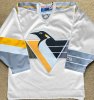
Pittsburgh - It's a color swap of a jersey I was mostly indifferent about as a kid (even as a tiny lil' Penguins fan I hated the logo and jersey change and only liked these in comparison to hating the whites and what would eventually replace these), which results in a jersey I'm mostly indifferent about as an adult. No need to keep these around longer than necessary, but I'm ridiculously thankful that the robopigeon is nowhere to be seen. Throwing back to anything but that is a major win in my book. The skating penguin always looks a little weird without the triangle, but I'll take that awkward thing on the sleeves over the worst logo in league history.
Tampa Bay - The Lightning have never had a jersey score above a 5/10 from me, and this is no different...though I do like blue better than black as the primary color.
Tier 5 - Normal bad.
Buffalo - I hated the jerseys that are being thrown back to, so getting the color scheme right this time around does little to alter my opinion. Having 'BUFFALO' in that terrible late 90s font in the hem striping is just painful. At least it's using the good color scheme this time...I never want to see the Sabres in red or black ever again.
Nashville - My love of gold/yellow jerseys has made me love Nashville's newer look and even had me kinda like their mustard alts that everyone hated...but that tolerance ends on this one. Having silver sleeves atop yellow...yeah, I really don't like that combination. It works great with blue and horribly with silver. The silver always looked terrible. These are significantly lesser than their normal jerseys IMO, even if they're far from the worst of this bunch.
NY Rangers - I'm apparently in the minority, but I never liked the Lady Liberty logo or jerseys and find the continued lack of striping to be its fatal flaw. Making the sleeves one consistent color (plus elbow stripes) coupled with no hem striping makes this look like a practice jersey with elbow stripes added so they can justify charging double.
Philadelphia - The fact that I like the way the Flyers look now always surprises me considering how much I hated the way they looked when I was younger, so throwing back to that is inherently going to make them look worse in my eyes. The sleeves bug me too.
San Jose - Gray sucks as a jersey color, nothing new there.
Vancouver - My hard and fast 'no gradiants ever' rule is in play here, even when it's colors I love instead of shitty dark 90s colors like the jerseys these are based on...there was so much fun bad that they could have thrown back to that I don't really get the decision to go with this.
Tier 6 - Awful
Columbus - Throwing back to a lame/bad jersey and flipping the colors like this results in a dreadful and pointless jersey. Columbus doesn't have anything good to throw back to, but they could have had some fun and made a fun bad fauxback involving that dumb bug or something, rather than just swapping the colors to make a jersey that was unloved in its time look considerably worse.
Dallas - You forgot to finish it. These are both considerably worse than the look that they're throwing back to and the normal jerseys Dallas wears. There was fun to be had here and they opted for bland.
Detroit - I almost want to score this a DNF. I've insulted more than a few jerseys by calling them practice jerseys before, but these are some practice-ass practice jerseys.
St. Louis - Part of me wants to rank these dead last, but at least an ounce of effort was put into this. Red utterly destroys that color scheme. How great the Blues are capable of looking always makes me that much madder when red shows up. They were hideous in the 90s, so making it even more prevalent now only makes it that much worse.
Toronto - This is a weird one that I'm dropping down a tier for being confused about what it's throwing back to. Taking the template from one era and the logo from another results in something that just looks off. There's also the blue logo on a blue jersey thing that feels weird from a team that's always used white logos on blue and blue logos on white. This could and should have been better.
Vegas - If you like red this is probably fine. I despise the color and am not fond of that alternate logo in the first place.
Washington - Throwing back to one of the worst of the 90s redesigns and showing why keeping the original color scheme wouldn't have worked with those jerseys is a weird flex, but okay. Feels like this would have been the perfect time to finally introduce a blue alternate for the first time in team history, instead of going with a third red jersey for them to choose from.
Winnipeg - What the f*** is this shit? This is what happens when you use every crayon in the box to color something.
Tier 7 - The Islanders Didn't Even Try
NY Islanders - They didn't even try.
Honestly I feel like the glut of mediocre to awful jerseys here is worth it just for the few great ones that may stick around. I can't imagine many of these sticking around beyond whatever Adidas & the NHL's plan for these are, but hope a few of them get promoted to normal alternate...or get Minnesota to ditch the Christmas colors and pair that green with something it looks great with again.

")