OT: Official Jersey and Merch Thread IV
- Thread starter AchtzehnBaby
- Start date
You are using an out of date browser. It may not display this or other websites correctly.
You should upgrade or use an alternative browser.
You should upgrade or use an alternative browser.
Back in Black
All Sports would be great if they were Hockey
Icelevel
During these difficult times...
- Sep 9, 2009
- 24,797
- 5,004
L'Aveuglette
つ ◕_◕ ༽つ

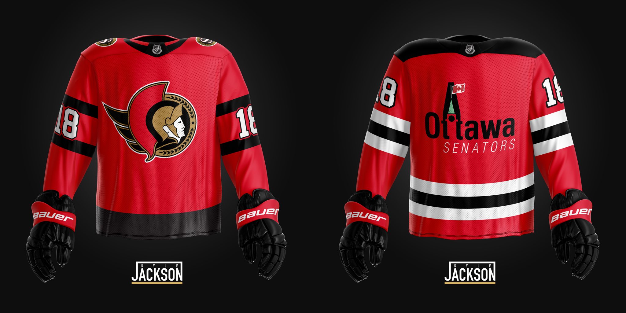
Mock ups
Crazy how this mock up is so much better than the official retros. Having the black stripe at the very bottom as well as the white numbers makes a huge difference and this should be obvious to anyone whose actual job it is to design these things.
FormentonTheFuture
Registered User
- Sep 29, 2017
- 7,761
- 3,732
The point is it’s a reverse retro, so moving the stripe down would not be a replica of the jersey it is trying to replicate. The jerseys aren’t supposed to looked great, it’s just supposed to be a reversal of colours from old jerseys. The Parliament logo also made no sense for this campaign, because it was never a real jersey they woreCrazy how this mock up is so much better than the official retros. Having the black stripe at the very bottom as well as the white numbers makes a huge difference and this should be obvious to anyone whose actual job it is to design these things.
The Parliament logo also made no sense for this campaign, because it was never a real jersey they wore
tbf.... Vegas used a concept from another Vegas team.
so we coulda try something different.
could almost argue the same for the Wild.... but whatever.
but at the end, i dont care.... i really dont mind this red jersey.
its just that the black is much cooler.
FormentonTheFuture
Registered User
- Sep 29, 2017
- 7,761
- 3,732
For sure, black is way better. The sens definitely didn’t want to introduce another jersey at this timetbf.... Vegas used a concept from another Vegas team.
so we coulda try something different.
could almost argue the same for the Wild.... but whatever.
but at the end, i dont care.... i really dont mind this red jersey.
its just that the black is much cooler.
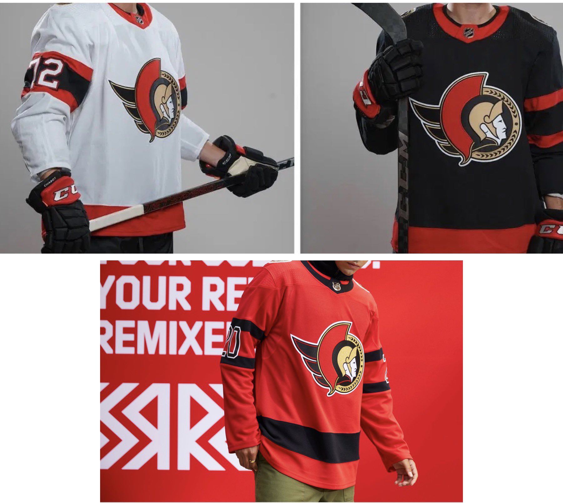
Our updated set in case it hasn't been posted yet


L'Aveuglette
つ ◕_◕ ༽つ
The point is it’s a reverse retro, so moving the stripe down would not be a replica of the jersey it is trying to replicate. The jerseys aren’t supposed to looked great, it’s just supposed to be a reversal of colours from old jerseys. The Parliament logo also made no sense for this campaign, because it was never a real jersey they wore
You keep saying the jerseys aren't supposed to look good like that's a thing.
Pretty sure aside from the novelty ones like the Ducks, teams wanted them to look good if a bit outside the norm.
Also, there is no rule that it had to be perfectly reversed. Plenty of the jerseys made extra changes to fit the style.
Boud
Registered User
- Dec 27, 2011
- 13,569
- 6,995
I have no issues with the jersey, I actually think it's very nice. Obviously we all have preferences, I think the numbers on the sleeves could've been white or even a red version of the O would've been nice but bottom line it's a special edition jersey and I think it'll look good once we see them on ice.
I think having the new 2D jerseys kinda took away from this one but when I look at other team versions I feel like ours is pretty good looking.
Sharks, Detroit, Dallas, Habs and more look straight bad.
I think having the new 2D jerseys kinda took away from this one but when I look at other team versions I feel like ours is pretty good looking.
Sharks, Detroit, Dallas, Habs and more look straight bad.
FormentonTheFuture
Registered User
- Sep 29, 2017
- 7,761
- 3,732
They’re supposed to be a bit gimmicky and adidas came up with designs at least to start. To me the sens jersey is fine, if they changed the striping and numbers to match the current jerseys then it’s not really reverse retro. It’s only for a year anywayYou keep saying the jerseys aren't supposed to look good like that's a thing.
Pretty sure aside from the novelty ones like the Ducks, teams wanted them to look good if a bit outside the norm.
Also, there is no rule that it had to be perfectly reversed. Plenty of the jerseys made extra changes to fit the style.
Back in Black
All Sports would be great if they were Hockey
Back in Black
All Sports would be great if they were Hockey
I don't hate these (with the red on the crest), knowing it's a NHL wide thing, but honestly it looks like something you got from Zellers, Walmart, etc...
Also, they could have used the original crest being Retro!!!!!

Also, they could have used the original crest being Retro!!!!!
Last edited:
TheDebater
Peace be upon you
Like, what looks tougher???
View attachment 376613
The above black Tkachuk, or the red Tkachuk below?
View attachment 376612
You purposefully picked the women's jersey didn't you.
saskriders
Can't Hold Leads
Lol. I do think that it is ideal for an Ottawa team to have a primarily black jersey as the home, white as the away, and red as an alternate. I do think that all the jerseys would look better if they had all three though. My favourite centurion jersey is definitely the late 90s black with white and red stripes.
Back in Black
All Sports would be great if they were Hockey
You purposefully picked the women's jersey didn't you.
Word has it, that's how they are perceived around the League!

edguy
Registered User
Just a fair warning I've tried ordering from this site before and it never came. reached out to them they said they would send another package, and it never came either.
Buyer beware
Back in Black
All Sports would be great if they were Hockey
Jersey's are 30% on the NHL Shop/Fanatics (Yes, you can get Adidas jerseys there too)... I just bought myself a White Adidas Tkachuk jersey!
Ottawa Team Shop also has a "Spend $100, get 50% off" but not worth it in the end. I'm guessing they "Give" you the code after you purchase a jersey? I wanted a Black Stuetzle jersey but after everything was said and done, it was over $340 (Tax and shipping)... If anyone has more details on that deal, let me know. Thanks!
Ottawa Team Shop also has a "Spend $100, get 50% off" but not worth it in the end. I'm guessing they "Give" you the code after you purchase a jersey? I wanted a Black Stuetzle jersey but after everything was said and done, it was over $340 (Tax and shipping)... If anyone has more details on that deal, let me know. Thanks!
saskriders
Can't Hold Leads
Who should I get on my Reverse Retro?
Off limits are:
Tkachuk (saving for a USA jersey)
Dadanov (saving for a Russia)
Balcers (saving for a Latvia)
Stuetzle (on a new one)
Zub (on a new one)
I'm leaning Batherson, Chabot, or Galchenyuk.
Off limits are:
Tkachuk (saving for a USA jersey)
Dadanov (saving for a Russia)
Balcers (saving for a Latvia)
Stuetzle (on a new one)
Zub (on a new one)
I'm leaning Batherson, Chabot, or Galchenyuk.
Boud
Registered User
- Dec 27, 2011
- 13,569
- 6,995
Who should I get on my Reverse Retro?
Off limits are:
Tkachuk (saving for a USA jersey)
Dadanov (saving for a Russia)
Balcers (saving for a Latvia)
Stuetzle (on a new one)
Zub (on a new one)
I'm leaning Batherson, Chabot, or Galchenyuk.
Batherson would look nice.
Chabot is a classic, a lot of people have it though.
Lowkey Murray could be a decent get
Ad
Latest posts
-
HF Habs: U18 World Men's Hockey Championship, April 25-May 5
- Latest: WeThreeKings
-
-
-


