MrInvidious
Registered User
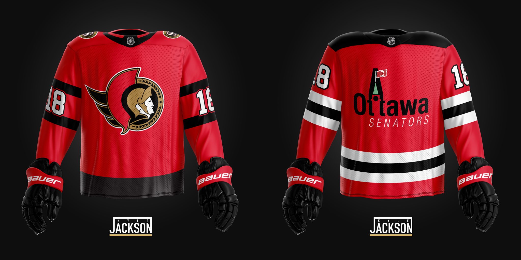
I would prefer this. These new jerseys have been a slam dunk. A red version would be an easy layup.I think in Ottawa's case, we have already "gone retro" with the 2D jersey.
I think they will simply reverse the black and red and give us a red jersey with black stripes along with a basic 2D logo.