League News: NHL Talk - (News n' Scores n' Stuff) - 2020 TDL Edition - Vol. 8

Status
Not open for further replies.

usiel

Where wolf’s ears are, wolf’s teeth are near.
Sponsor
Jul 29, 2002
14,995
3,783
Klendathu
www.myspace.com
I suspect it will be MacKinnon that wins. Panarin probably should win it but the team success wasn't quite there and historically that hurts.

Six games a day starting less than two weeks from now. Let's go!

Still wondering if all these games are like when the playoffs comes which makes the nhl gamecenter pretty useless. But yeah that amount of games in one day after all this time sounds like xmas to me.
 

tenken00

Oh it's going down in Chinatown
Jan 29, 2010
9,906
10,147
I suspect it will be MacKinnon that wins. Panarin probably should win it but the team success wasn't quite there and historically that hurts.

Six games a day starting less than two weeks from now. Let's go!

Let's go!
 

hb12xchamps

Registered User
Dec 23, 2011
8,860
5,535
Pennsylvania
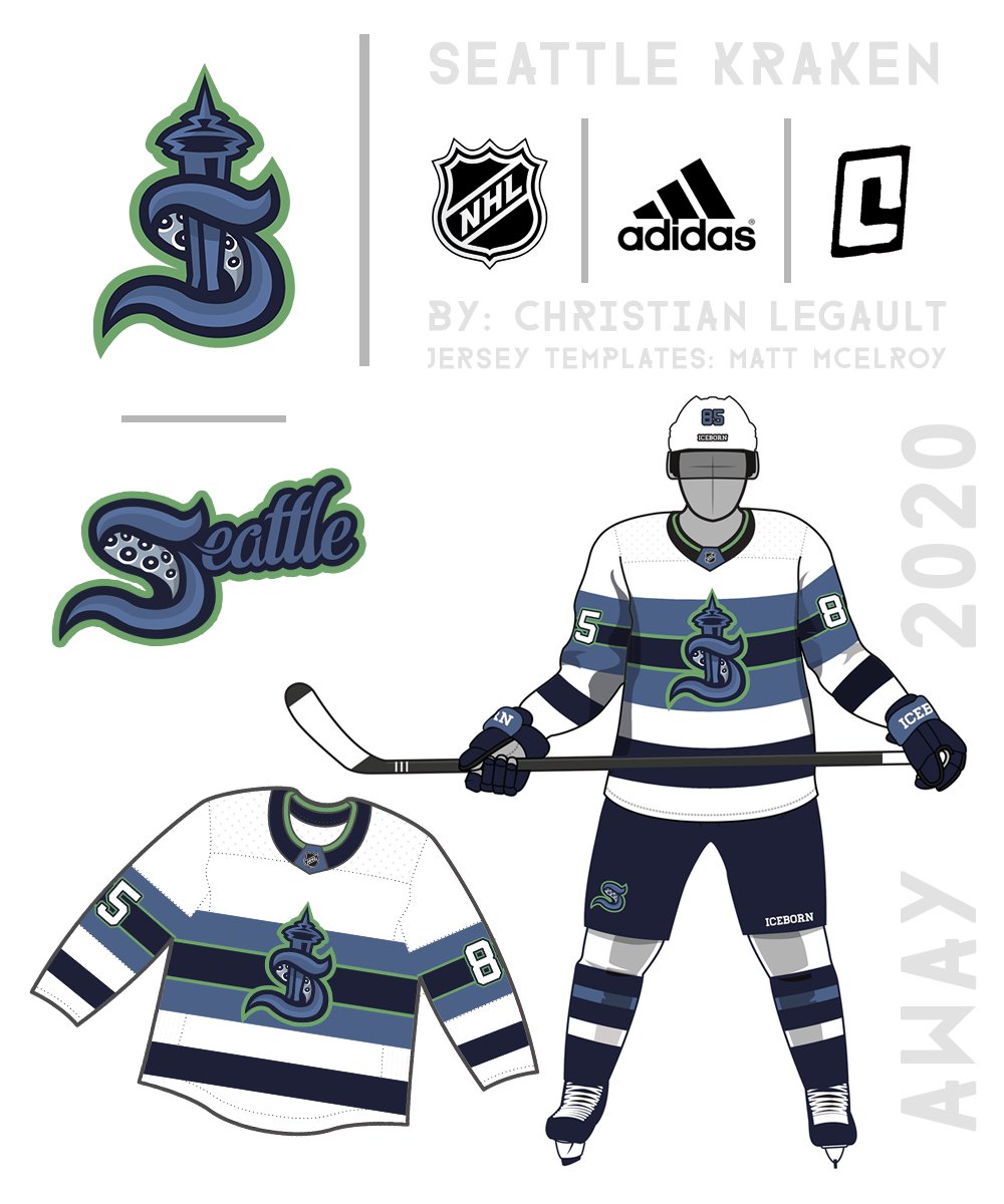
Someone pointed out that the “S” logo looks like the S kids used to draw with the 3 lines back in elementary and middle school and I can’t unsee that now
 

tenken00

Oh it's going down in Chinatown
Jan 29, 2010
9,906
10,147
Seeing just the "S" on the front as the logo kinda makes me think the "W" weagle would look better than I thought on front of a Caps jersey after the initial shock goes away.
 

Melkor

Registered User
Jul 22, 2012
5,251
2,450
Auckland, New Zealand
The name is easily the best in the entire NHL. Couldn't have chosen a better one. The logo is very good although would have loved something more aggressive but like the idea behind that S looking like some oceanic monster. Jerseys are fine but not quite up to the level of logo and name. Wanted something more original. Overall I'd say they've done a respectable job in picking a right color scheme and name.
 

Team SWOLEvechkin

Registered User
Oct 4, 2019
57
37
Great reveal video(s), cool logo, didn't step too much on the toes of our neighbors to the North. Seattle having a crack problem is not great for potential nicknames, which just means their marketing dept. needs to get ahead of messaging. Almost all the people I have spoken to like the logo, name, and video (including skeptical folks in Seattle). And for those Caps folks on the West Coast, a Seattle and Vancouver b2b is very achievable (couple hours drive difference).

Also, if somehow Oshie ends up there, there needs to be an Oshie's 11 fan club.
 

txpd

Registered User
Jan 25, 2003
69,649
14,131
New Bern, NC
Seriously? He's one of the best in the business... where is he going? Can't imagine the person they replace him with being anything other than a (major) downgrade.

From my reading it appears that ownership didnt offer him a contract. He is working for NBC only for now. My guess is that with Rick Peckham retiring after the playoffs, Forslund will end up in Tampa
 
  • Like
Reactions: AlexBrovechkin8

usiel

Where wolf’s ears are, wolf’s teeth are near.
Sponsor
Jul 29, 2002
14,995
3,783
Klendathu
www.myspace.com
That was my favorite name choice so that is cool. Logo on the jersey is nice also not totally sure about the secondary colors though.
 

Eirikrautha

Registered User


Personally not a fan of the jerseys. They look a little to close to the generic jerseys you get when you create an EA Sports expansion franchise

Kraken? Oooooookay...

The "S" logo is uninspired. There are so many cool ways to have an imposing tentacled monster holding hockey sticks, etc., that to just use an "S" is about the most pedestrian choice out there. It's "s"afe, I guess, and in today's climate maybe that's the best you can hope a corporation can do. Maybe they can change it to an "L" if they don't follow the "Golden Knights Miracle First Season" plan...
 

Hivemind

We're Touched
Oct 8, 2010
37,115
13,639
Philadelphia
I was a fan of the way the S wound around the Space Needle in this concept art. Was hoping they'd go in a similar direction.
DXQIF42XUAMl1f4


Ultimately the logo and design is solid. Jerseys should look nice, kinda bummed not to see a real life one in the video. And finding out the Space Needle is still incorporated into the secondary logo anchor is cool (kinda like the Capitol/Washington Monument in the Weagle).
 
  • Like
Reactions: searle

Corby78

65 - 10 - 20
Jan 14, 2014
11,779
7,992
Ramstein Germany
Kraken? Oooooookay...

The "S" logo is uninspired. There are so many cool ways to have an imposing tentacled monster holding hockey sticks, etc., that to just use an "S" is about the most pedestrian choice out there. It's "s"afe, I guess, and in today's climate maybe that's the best you can hope a corporation can do. Maybe they can change it to an "L" if they don't follow the "Golden Knights Miracle First Season" plan...

thats exactly why I like it. New but basic and they stayed away from a cartoon character with a stick. This isn’t HS
 

txpd

Registered User
Jan 25, 2003
69,649
14,131
New Bern, NC
This stuff is heavily researched and market tested. The market must like it. Its their metro and their team. I dont like it but i dont really like Seattle either. Still flashing back to the Seattle Supersonics
 

hb12xchamps

Registered User
Dec 23, 2011
8,860
5,535
Pennsylvania
I’m just surprised they didn’t incorporate green into the color scheme. Green has always been a color used in branding for all their teams (Sonics, Seahawks, Sounders). There’s also not a lot of green in the NHL color schemes besides Dallas and Minnesota. Guess they just wanted to stand out a bit with their personal branding in the city
 

g00n

Retired Global Mod
Nov 22, 2007
30,676
14,845
Just noticed the inside dark space of the S is a tentacle. Nice.

The green/monster thing will probably happen eventually.
 
Status
Not open for further replies.

Ad

Upcoming events

Ad

Ad