New Blouses Unveiled

BackToTheBrierePatch

Justice for Cricket
Feb 19, 2003
66,290
24,688
Concord, New Hampshire
I really don’t give a f*** who they used to unveil those “new” sweaters. I think pretty much everyone got the hell out of dodge once the season ended.
The blacks are a non starter for me. Just NO.
Everything else is a big woopdie f***ing doo.
 

Striiker

Earthquake Survivor
Jun 2, 2013
89,762
155,875
Pennsylvania
Did they really not realize that the black stripe at the bottom of the jerseys would blend into the pants and just make it look like the jerseys are short?

Looks stupid as f***.
 

DancingPanther

Foundational Titan
Sponsor
Jun 19, 2018
32,100
70,044
Hey look, now they're recycling the jerseys of the all the former players they hired into major leadership roles this offseason. Purest Flyer move yet
 
  • Haha
Reactions: Ironmanrulez

Rebels57

Former Flyers fan
Sponsor
Sep 28, 2014
76,781
123,381
Did they really not realize that the black stripe at the bottom of the jerseys would blend into the pants and just make it look like the jerseys are short?

Looks stupid as f***.

That's actually how it was on the 90's era jersey too. Doesn't bother me, but I do think it would look better raised with an orange stripe underneath.
 

Svechhammer

THIS is hockey?
Jun 8, 2017
24,116
88,631
Did they really not realize that the black stripe at the bottom of the jerseys would blend into the pants and just make it look like the jerseys are short?

Looks stupid as f***.
I actually think it has the opposite effect. Having that much unbroken color on the front above the hem stripe makes it seem longer than it was before.
 

Rich Nixon

No Prior Knowledge of "Flyers"
Jul 11, 2006
15,000
19,043
Key Biscayne
My only two jerseys are a blank CCM 90s away and a Lindros pre-captaincy CCM home. Looking directly at them and it's just hilarious that they took that perfect template and went "WE CAN MAKE IT DIFFERENT THO!" Seriously just put the piping on, fix the numbers and socks, and be done with it.
 

Ghosts Beer

I saw Goody Fletcher with the Devil!
Feb 10, 2014
22,619
16,426
My only two jerseys are a blank CCM 90s away and a Lindros pre-captaincy CCM home. Looking directly at them and it's just hilarious that they took that perfect template and went "WE CAN MAKE IT DIFFERENT THO!" Seriously just put the piping on, fix the numbers and socks, and be done with it.
And it was so obvious this was going to happen.

They were going to meddle. It's almost inevitable when teams introduce new jerseys.

"Hey, we'll have callbacks to different eras of Flyers uniforms! The monotone black sleeve numbers from '67. The contrasting nameplate from the early 70s and the last 10 years! An orange that's closer to the '84-'97 jerseys! But we'll eliminate the piping so it's different, too!"

Ugh. The Flyers' uniform shouldn't be a Frankensteined quilt of prior jerseys. It should be cohesive.

They had it. There was a reason the '84-'97 jerseys were classics. But whoever was in charge of design couldn't resist the urge to F with a good thing to make it THEIRS.

The new white jerseys I can live with. It's the orange jerseys with the white sleeves and monotone black numbers that are particularly appalling.

Those black sleeve numbers need an orange outline or, if they're going to be monotone, then they should be orange monotone.

It also doesn't make sense for both jerseys that the numbers on the back are outlined but the sleeve numbers are not. Again, incohesive.

Sigh.
 

Ghosts Beer

I saw Goody Fletcher with the Devil!
Feb 10, 2014
22,619
16,426
After 24 hours, I thought maybe the sleeves would look better.

Nope. What a waste of a great base.
I saw a photoshop where someone put in the black trim around the chest & arms, & it instantly looked better.

The black arm numbers without trim still detracted from the overall look, though.

Can’t get over how incredibly stupid these decisions were.
 
  • Like
Reactions: Redpath

Redpath

Registered User
Sep 30, 2011
3,236
4,830
I saw a photoshop where someone put in the black trim around the chest & arms, & it instantly looked better.

The black arm numbers without trim still detracted from the overall look, though.

Can’t get over how incredibly stupid these decisions were.

As great as the real 80's/90's jerseys are, I actually don't mind the lack of black shoulder/chest piping for this reboot. But the solid arm numbers are just unforgivable.
 
  • Like
Reactions: Ghosts Beer

Ghosts Beer

I saw Goody Fletcher with the Devil!
Feb 10, 2014
22,619
16,426
As great as the real 80's/90's jerseys are, I actually don't mind the lack of black shoulder/chest piping for this reboot. But the solid arm numbers are just unforgivable.
The lack of black/shoulder chest piping isn’t a dealbreaker, though the photoshop with it added did look better.

And I actually don’t mind the white on orange sleeve numbers without piping.

It’s the black on white sleeve numbers without piping that are a travesty. Just an awful look.
 
  • Like
Reactions: Redpath

Redpath

Registered User
Sep 30, 2011
3,236
4,830
The lack of black/shoulder chest piping isn’t a dealbreaker, though the photoshop with it added did look better.

And I actually don’t mind the white on orange sleeve numbers without piping.

It’s the black on white sleeve numbers without piping that are a travesty. Just an awful look.

On another note, it is strange that there is not one single picture, neither on Twitter, Instagram, or the Flyers website, of the back of the new home jersey. Just a few partial glimpes of it during the promo video. How do you launch new jerseys without showing that?
 

Jack Straw

Moving much too slow.
Sponsor
Jul 19, 2010
24,571
25,888
New York
Other than some of the Winter Classic stuff, these are the only nice uniforms the Flyers have ever had (the black versions of these were ok too). The others all suck. Even these would have been better if there was no space between the stripes on the socks, same as the sleeves. But they never listen to me.

lindros02.jpg
images.jpeg
 

TCTC

Registered User
Mar 25, 2013
13,118
9,593
And it was so obvious this was going to happen.

They were going to meddle. It's almost inevitable when teams introduce new jerseys.

"Hey, we'll have callbacks to different eras of Flyers uniforms! The monotone black sleeve numbers from '67. The contrasting nameplate from the early 70s and the last 10 years! An orange that's closer to the '84-'97 jerseys! But we'll eliminate the piping so it's different, too!"

Ugh. The Flyers' uniform shouldn't be a Frankensteined quilt of prior jerseys. It should be cohesive.

They had it. There was a reason the '84-'97 jerseys were classics. But whoever was in charge of design couldn't resist the urge to F with a good thing to make it THEIRS.

The new white jerseys I can live with. It's the orange jerseys with the white sleeves and monotone black numbers that are particularly appalling.

Those black sleeve numbers need an orange outline or, if they're going to be monotone, then they should be orange monotone.

It also doesn't make sense for both jerseys that the numbers on the back are outlined but the sleeve numbers are not. Again, incohesive.

Sigh.
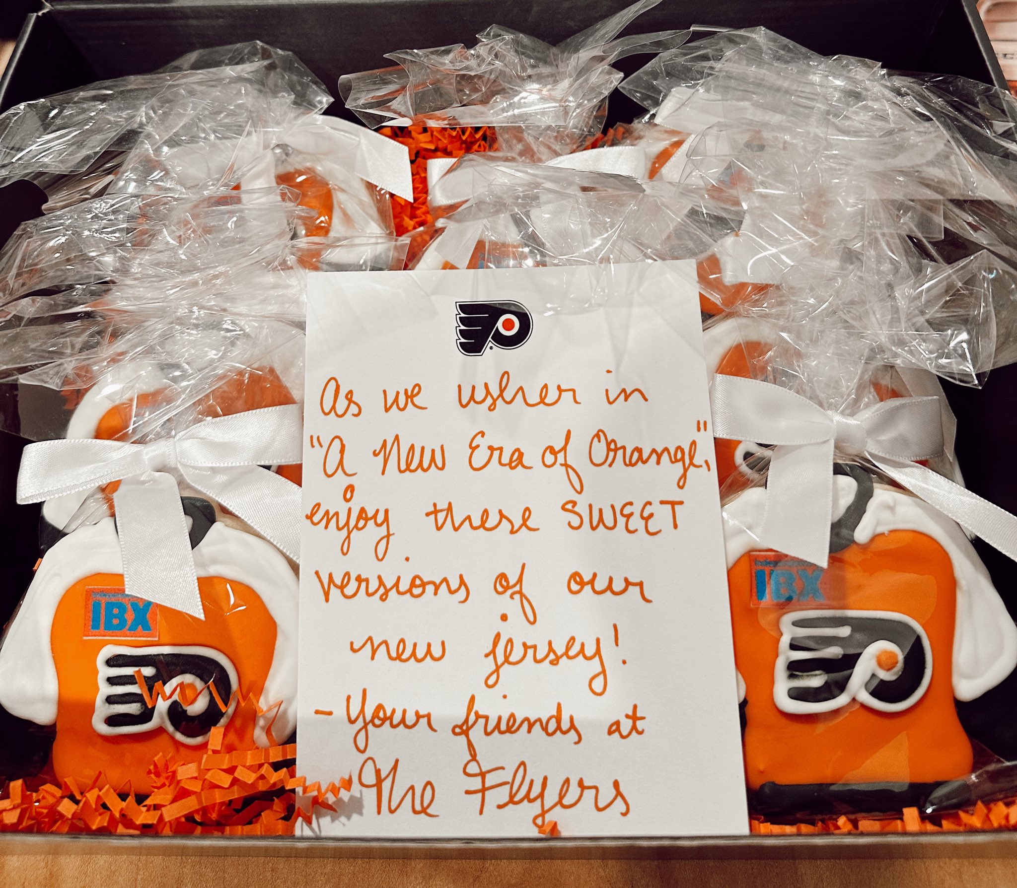
You could say they played it safe, but I prefer that over trying something new and ending up with the jerseys we had during the Reebok Edge era. Those were the worst in franchise history.

Totally agree on the sleeve numbers on the home jersey though. They should be orange.
 

Ghosts Beer

I saw Goody Fletcher with the Devil!
Feb 10, 2014
22,619
16,426
You could say they played it safe, but I prefer that over trying something new and ending up with the jerseys we had during the Reebok Edge era. Those were the worst in franchise history.

Totally agree on the sleeve numbers on the home jersey though. They should be orange.
If they made even that small fix, & changed the black sleeve numbers to orange, it would make a big difference.
 
  • Like
Reactions: TCTC

Curufinwe

Registered User
Feb 28, 2013
55,805
42,881
I found my old Leclair jersey in the back of the closet. It’s not a game jersey, but I think it still looks good.

 
  • Haha
Reactions: PDX Flyer

Ad

Upcoming events

  • USA vs Sweden
    USA vs Sweden
    Wagers: 3
    Staked: $1,050.00
    Event closes
    • Updated:
  • Finland vs Czechia
    Finland vs Czechia
    Wagers: 1
    Staked: $200.00
    Event closes
    • Updated:
  • Augsburg vs VfB Stuttgart
    Augsburg vs VfB Stuttgart
    Wagers: 1
    Staked: $500.00
    Event closes
    • Updated:
  • Frosinone vs Inter Milan
    Frosinone vs Inter Milan
    Wagers: 1
    Staked: $150.00
    Event closes
    • Updated:
  • Alavés vs Girona
    Alavés vs Girona
    Wagers: 1
    Staked: $22.00
    Event closes
    • Updated:

Ad

Ad