
News Article: Incoming Sens president needs to tackle stale centurion logo
- Thread starter slamigo
- Start date
You are using an out of date browser. It may not display this or other websites correctly.
You should upgrade or use an alternative browser.
You should upgrade or use an alternative browser.

Pierre from Orleans
Registered User
- May 9, 2007
- 26,484
- 18,136
So, Ottawa Centurions eh?
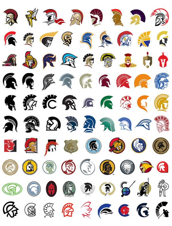
If they really want to keep the centurion then they could integrate that with the 0 perhaps.
Have the big 0 with a centurion helmet on it

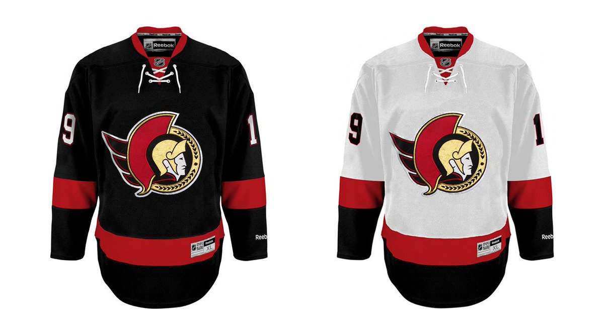
I like how the article even contained a pic of Jerkstore's latest vision for a jersey. I like it a lot.


I think this would look great with an "O" on the front too!
Caeldan
Whippet Whisperer
- Jun 21, 2008
- 15,459
- 1,046
I think this would look great with an "O" on the front too!
That jersey needs the gold laurel trim to separate the white and black.
Otherwise it's just a Devils template with the 2D logo stuck on
I wonder if there would be a way to incorporate the gold laurels with something that makes it clear this is the Ottawa Senators (or at least the Ottawa hockey club of the NHL) but something that is not a centurion...
I mean my order is still:
2d logo
O jerseys
Current '3d' logo
I mean my order is still:
2d logo
O jerseys
Current '3d' logo
UnHappyDude
Fire Dorion
- Jan 11, 2011
- 2,128
- 175
I like how the article even contained a pic of Jerkstore's latest vision for a jersey. I like it a lot.
Never liked the O jersey. The bar was set so low with the diagonal SENS that anything would be better.
I like what is pictured above the best, although I would like a new 2D logo. People just want the old one because they are afraid the sens will botch it.
18Hossa
And Grace, Too
- Oct 12, 2012
- 6,625
- 252
That jersey needs the gold laurel trim to separate the white and black.
Otherwise it's just a Devils template with the 2D logo stuck on

They're red, white, and black?? If anything he just swapped a few colours around and added the black shoulder yoke to his other 2D design
GrantLemons
Church of FYOUS
Lenny the Lynx
Registered User
aragorn
Do The Right Thing
- Aug 8, 2004
- 28,620
- 9,131
The nicest jersey of them all for my money is still the one "Slamingo" has shown. 
I have often thought that they should either try & place a gold "S" in the middle of the "O" or maybe as you suggest try & place an "O" around the centurion. Of all the centurions above I like the first one, top left & the two centurions we have already used.
I think this would look great with an "O" on the front too!
I have often thought that they should either try & place a gold "S" in the middle of the "O" or maybe as you suggest try & place an "O" around the centurion. Of all the centurions above I like the first one, top left & the two centurions we have already used.
Emerica
Registered User
- May 29, 2010
- 10,959
- 6,269
To me, it's pretty simple. The =0= is a bit too boring for everyday use. So you roll with these as the everydays (perhaps adding our current =0= shoulder patches to it), and the black =0= for the third jersey:

The red one with the 2D and black yoke isn't my favourite, but a good alternative if we once again insist on sticking with red (which makes no sense... let MTL be red, TOR blue, and us black).
This would be one if not the prettiest set of jerseys in the league.
Iamtheliquor*
Registered User
- Dec 15, 2015
- 217
- 0
To me, it's pretty simple. The =0= is a bit too boring for everyday use. So you roll with these as the everydays (perhaps adding our current =0= shoulder patches to it), and the black =0= for the third jersey:
The red one with the 2D and black yoke isn't my favourite, but a good alternative if we once again insist on sticking with red (which makes no sense... let MTL be red, TOR blue, and us black).
And then this unique beaut for the upcoming outdoor game:

If we insist on going with the =0= for everyday home and away, I want to see the off-white changed to a pure white for both the light and dark jerseys.. it looks shockingly good:

Those 2D black and white would be the best in the league hands down. Really don't understand what management and marketing has been doing these past few years. The 3D logo was stale a longggggggg time ago.
Caeldan
Whippet Whisperer
- Jun 21, 2008
- 15,459
- 1,046
They're red, white, and black?? If anything he just swapped a few colours around and added the black shoulder yoke to his other 2D design
They're similar enough that it's all I can see, especially if you stop scrolling the devils jersey at the start of the black of the sleeve.
If we have a red primary jersey, imo it needs to have gold trim to set our colours apart from the 1000 other teams that go red black white. Also think it works on black primary as well.
Back in Black
All Sports would be great if they were Hockey
I wonder if there would be a way to incorporate the gold laurels with something that makes it clear this is the Ottawa Senators (or at least the Ottawa hockey club of the NHL) but something that is not a centurion...
Back in Black
All Sports would be great if they were Hockey
Sensations is still carying every sens jersey from '92 on (except for the white Heritage). They even have the "correct crest" for the red/white/black jerseys from 1995 & 1997
http://nhluniforms.com/Senators/SenatorsNEW.html
Unfortunately the 92' black jerseys still have the WRONG laurels on the crest instead of the Ottawa Senators writing.
http://nhluniforms.com/Senators/SenatorsNEW.html
Unfortunately the 92' black jerseys still have the WRONG laurels on the crest instead of the Ottawa Senators writing.
L'Aveuglette
つ ◕_◕ ༽つ
Take my money, Eugene. Make it happen.
Honestly these are the best out there. With a few very minor design touches added they should be the jerseys moving forward.
Hutz
Registered User
- Sep 7, 2007
- 5,070
- 262
Honestly these are the best out there. With a few very minor design touches added they should be the jerseys moving forward.

I still prefer these, the white stripes add a je ne sais quoi to the uniform.
DrunkUncleDenis
Condra Fan
- Mar 27, 2012
- 11,820
- 1,682
So ugly.
I still prefer these, the white stripes add a je ne sais quoi to the uniform.
I agree with you. That said, if they don't end up adding the white but still go with a black 2D, I'll still be happy as a pig in ****.
PeterSidorkiewicz
HFWF Tourney Undisputed Champion
Ignoring the 2d for a second, which shirt would you rather wear? I always thought our 3D logo merch just looks terrible.


Erik Alfredsson
Beast Mode Cowboy!
- Jan 14, 2012
- 13,099
- 5,154
I still prefer these, the white stripes add a je ne sais quoi to the uniform.
I agree, those are the nicest uniforms we've had. That being said, even if they go with the one without the white, it'll still be a great jersey set.
DrunkUncleDenis
Condra Fan
- Mar 27, 2012
- 11,820
- 1,682
Ignoring the 2d for a second, which shirt would you rather wear? I always thought our 3D logo merch just looks terrible.
Ya, easily the =O=. It's not close.
Proust*
Registered User
- Dec 8, 2010
- 4,506
- 4
I still prefer these, the white stripes add a je ne sais quoi to the uniform.
The best by far. I love the white jersey too.
Timeless.
DrunkUncleDenis
Condra Fan
- Mar 27, 2012
- 11,820
- 1,682
The best by far. I love the white jersey too.
Timeless.
IMO, realistically, I don't see them going back to the exact design pictured. It needs to be a little bit different for people who already own the older jerseys to really want to go out and buy one (even if the cut is different). I expect the black ones are fairly rare these days, but I'm sure tons of fans own the white one already.
I'm not saying I want them to alter it (I think it's gorgeous too), but I'd expect them to do something like what was posted earlier, with the simplified cuffs.
Ad
Upcoming events
-
 Game 4 Providence Bruins @ Hartford Wolf Pack - Hartford Wolf Pack leads series 2-1Wagers: 2Staked: $49.00Event closes
- Updated:
-
Game 4 Belleville Senators @ Cleveland Monsters - Cleveland Monsters leads series 2-1Wagers: 2Staked: $125.00Event closes
- Updated:
-
Game 5 Syracuse Crunch @ Rochester Americans - Series tied 2-2Wagers: 2Staked: $1,100.00Event closes
- Updated:
-
 SEMIFINAL GAME 2 - Minnesota @ Toronto - Toronto leads 1-0Wagers: 2Staked: $170.00Event closes
- Updated: