
News Article: Incoming Sens president needs to tackle stale centurion logo
- Thread starter slamigo
- Start date
You are using an out of date browser. It may not display this or other websites correctly.
You should upgrade or use an alternative browser.
You should upgrade or use an alternative browser.
Jorge Garcia
Registered User
- Dec 9, 2004
- 2,787
- 634
Am I the only one on these boards who likes the current logo?
Could be.
Am I the only one on these boards who likes the current logo?
It's not bad but I think it's time for a change. It fit with the times but the times they are a changing.
danielpalfredsson
youtube dot com /watch?v=CdqMZ_s7Y6k
- Aug 14, 2013
- 16,575
- 9,269
Am I the only one on these boards who likes the current logo?
It's not my favourite, but I don't hate it.
My favourite jerseys are the 1997 dark jerseys with the black/white/red 2D logo but at the same point I am not sure I like the idea of moving backwards. Seems counter progressive just to adopt a jersey of a bygone era. Just let it be. Maybe bring it out for outdoor games once every few years. Give these guys on the roster a jersey and a look that they can make important by winning hockey games.
Either come up with something completely new, or just go with a red heritage home/pure white heritage away.
Yeah it seems contradicting to say don't live in the past by adopting a jersey from a closed era while suggesting the "heritage" jersey become the full time look, but the heritage is more of a homage to the early Senators teams and not the exact same sweater/jersey that those teams wore. The Sens didn't just come out in wool barperpole sweaters that looked exactly the same as the ones the early 1900s Sens wore.
Erik Alfredsson
Beast Mode Cowboy!
- Jan 14, 2012
- 13,054
- 5,055
It's not my favourite, but I don't hate it.
My favourite jerseys are the 1997 dark jerseys with the black/white/red 2D logo but at the same point I am not sure I like the idea of moving backwards. Seems counter progressive just to adopt a jersey of a bygone era. Just let it be. Maybe bring it out for outdoor games once every few years. Give these guys on the roster a jersey and a look that they can make important by winning hockey games.
Either come up with something completely new, or just go with a red heritage home/pure white heritage away.
Yeah it seems contradicting to say don't live in the past by adopting a jersey from a closed era while suggesting the "heritage" jersey become the full time look, but the heritage is more of a homage to the early Senators teams and not the exact same sweater/jersey that those teams wore. The Sens didn't just come out in wool barperpole sweaters that looked exactly the same as the ones the early 1900s Sens wore.
Seems like a rather unique look on the discussion. Is there any particular reason you feel that way? I mean for me it just boils down to a nice jersey is a nice jersey.
danielpalfredsson
youtube dot com /watch?v=CdqMZ_s7Y6k
- Aug 14, 2013
- 16,575
- 9,269
Seems like a rather unique look on the discussion. Is there any particular reason you feel that way? I mean for me it just boils down to a nice jersey is a nice jersey.
I'm just not a fan of a team being stuck with a look that is already associated with a previous era that the book has already been closed on. It is different for teams like DET/MTL/CHI where they've never changed their jerseys and by never ever changing their jerseys they become larger than life. But those are the exceptions to the rule.
I think it is a disservice to fans and players that instead of giving them their own look and the responsibility that comes with making that jersey/logo important by succeeding and in turn defining the era of the team they are currently participating in, they get given a look that the book has been closed on for decades. It's like saying "this team isn't good or interesting so please wear the jerseys you wore when I was a kid so that I can fantasize about that team and the way it made me feel when I was 12". It was fine for Alfie night, because that night is all about fantasizing about and respecting things that happened in the past, but I think going back to a dead jersey from a different era both from a marketing perspective it is lazy, and from the perspective of a fan emotionally investing in a team it is lame and uncreative.
If they are going back to the 2D, at least do a full new jersey design like the popular red one that gets retweeted. But still, I'd like to see them just leave the 2D logo in the past. The Heritage design is new enough that there's still room to explore a red home jersey/white away jersey as the main set, and as the big marketing and branding change that'll help define the team as they move forward to being a competent playoff squad lead by an older captain Erik Karlsson.
Keep in mind, that if this team is successful, whatever branding or look they move on to, if they keep it for as long as they've kept the past jerseys they've had that'll be the look that defines one of the biggest stars we've ever had Erik Karlsson's career if he stays with the Senators and if the team is even remotely successful. That is the jersey people will imagine Karlsson and other stars like Stone in when they are thinking back to them (hopefully) winning the Stanley Cup. That's a big responsibility as far as a jersey design goes and I think it does the team a disservice to not give them an opportunity to have their own logo, brand, and look that they can define and make important by winning with it on because fans want them to wear a design that other players who are now out of the game already got to define.
HavlatMach9
streamable 3rah1
on the mainboard when the topic of ugly jersey's come up, fans of other teams say the same things as us, that we had the perfect design alreadyI mean for me it just boils down to a nice jersey is a nice jersey.
Langdon Alger
Registered User
- Apr 19, 2006
- 24,777
- 12,914
on the mainboard when the topic of ugly jersey's come up, fans of other teams say the same things as us, that we had the perfect design already
We did, and then we ****ed it up for no reason.
Beville
#ForTheBoys
Larionov
Registered User
Am I the only one on these boards who likes the current logo?
I'm with you - I like the current logo far better than the original 2D version. Frankly I don't get the love for the old 2D logo - if you look at it objectively it was pretty weak. Now, I like the old uniform design overall better, as I can take or leave our current Reebok inspired design, but as for the logo itself the 3D version is far more professional looking. #ConfessYourUnpopularOpinions
Icelevel
During these difficult times...
- Sep 9, 2009
- 24,797
- 5,004
Just roll with both the Heritage jerseys, the off-white and the 3rd.
makes 1000% sense to me
great1
Registered User
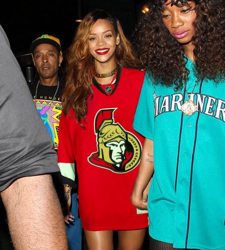

Photo Edit Credit: Matty Go Sens on twitter
Somehow I don't think Rihanna would have any interest in the red home jersey
I have never been a fan of the whole Centurian logo schtick. It always felt amateur hour trying to put an "edge" on the name Senators.
I really like the Senators name and it's history but it is a branding challenge. IF they came up with a new great logo I wouldn't mind but the time to do it is with the new rink opening when there will be a lot of excitement and interest in the team.
The bigger problem is trusting them to get a logo rebranding right. The current guys would end up with a snarling Beaver or something equally stupid. Maybe the new CEO will be better, but it's hard to have much faith.
coladin
Registered User
- Sep 18, 2009
- 11,814
- 4,500
I hate to say this but maybe even a name change is needed.
How about "Rough Riders"?
danielpalfredsson
youtube dot com /watch?v=CdqMZ_s7Y6k
- Aug 14, 2013
- 16,575
- 9,269
I have never been a fan of the whole Centurian logo schtick. It always felt amateur hour trying to put an "edge" on the name Senators.
I really like the Senators name and it's history but it is a branding challenge. IF they came up with a new great logo I wouldn't mind but the time to do it is with the new rink opening when there will be a lot of excitement and interest in the team.
The bigger problem is trusting them to get a logo rebranding right. The current guys would end up with a snarling Beaver or something equally stupid. Maybe the new CEO will be better, but it's hard to have much faith.
I could be conflating two unrelated things, but Bruce Firestone originally wanted Sens games to have a larger than life experience and feel to them. To be like "Disney Land". He wanted the security and staff to dress like centurion guards or something.....Paraphrasing so I might be off. But I think that's where the centurion identity came from.
CTC
Registered User
- Oct 9, 2014
- 469
- 152
My issue with the older 2d logo is that it's too big on the jersey, the wings stick out and gives the front an odd look when you're sitting. I have two of them and when it comes to actually wearing one, I prefer the Heritage O completely.
The O is what I want them to work around. Get rid of the helmet logos and make it more about Ottawa then it is about Senators. IMO.
The O is what I want them to work around. Get rid of the helmet logos and make it more about Ottawa then it is about Senators. IMO.
Langdon Alger
Registered User
- Apr 19, 2006
- 24,777
- 12,914
DanyHeatley
Registered User
- Dec 6, 2016
- 1,364
- 790
Emerica
Registered User
- May 29, 2010
- 10,927
- 6,211
Am I the only one on these boards who likes the current logo?
Don't mind it but would rather have us go back to the 2D. Still don't hate it.
aragorn
Do The Right Thing
- Aug 8, 2004
- 28,572
- 9,085
Am I the only one on these boards who likes the current logo?
I like it but on the other hand I care more about the product on the ice than the logo.
Photo Edit Credit: Matty Go Sens on twitter
Somehow I don't think Rihanna would have any interest in the red home jersey
Those are two nice jerseys.

Or Renegades.How about "Rough Riders"?

Adele Dazeem
Registered User
I have skipped through the thread and apologize if I'm repeating a point. The name Senators conjures up an image of stuffy old men sleeping. The antithesis of the vibrant, vigorous image one might prefer for a sports team.
Are you saying we should change the team's name?
Do Make Say Think
& Yet & Yet
- Jun 26, 2007
- 51,167
- 9,909
Am I the only one on these boards who likes the current logo?
It's fine.
We should strive for better and that the Heritage jersey is so popular and well liked in surveys should be enough for the team to look at a rebranding.
DrunkUncleDenis
Condra Fan
- Mar 27, 2012
- 11,820
- 1,682
To me, it's pretty simple. The =0= is a bit too boring for everyday use. So you roll with these as the everydays (perhaps adding our current =0= shoulder patches to it), and the black =0= for the third jersey:

The red one with the 2D and black yoke isn't my favourite, but a good alternative if we once again insist on sticking with red (which makes no sense... let MTL be red, TOR blue, and us black).
And then this unique beaut for the upcoming outdoor game:

If we insist on going with the =0= for everyday home and away, I want to see the off-white changed to a pure white for both the light and dark jerseys.. it looks shockingly good:

The red one with the 2D and black yoke isn't my favourite, but a good alternative if we once again insist on sticking with red (which makes no sense... let MTL be red, TOR blue, and us black).
And then this unique beaut for the upcoming outdoor game:
If we insist on going with the =0= for everyday home and away, I want to see the off-white changed to a pure white for both the light and dark jerseys.. it looks shockingly good:
Ad
Upcoming events
-

-
 Victoriaville Tigres @ Drummondville Voltigeurs - Game 1Wagers: 1Staked: $25.00Event closes
- Updated:
-
 Game 2 Belleville Senators @ Toronto Marlies -Belleville Senators leads series 1-0Wagers: 1Staked: $15.00Event closes
- Updated:
-
-
Game 1 W-B/Scranton Penguins @ Lehigh Valley Phantoms - Lehigh Valley Phantoms leads series 1-0Wagers: 3Staked: $125.00Event closes
- Updated: