Speculation: Caps General Discussion (Coaching/FAs/Cap/Lines etc) - 2020 Offseason Pt. 3

Status
Not open for further replies.

txpd

Registered User
Jan 25, 2003
69,649
14,131
New Bern, NC
I know the first two pictures are historic franchises but they're not really that great.

The Red Wings Jersey is the worst of all the O6 teams.

I guess its just a taste thing. I like the Tigers, Yankees, Red Sox, Dodgers, Bears, Packers, NY Rangers, Montreal, Red Wings and so on. A good classic uni for a long time team rather than teams like the Astros who are constantly chasing the trend.
 

Random schmoe

Random fan with their own opinions
Sponsor
Feb 13, 2019
925
971
It must be hard being with a team that prides itself on its Rock the Red.

It must be hard to not understand that my appreciation for a team's jerseys has no bearing on my appreciation for the team.
 

txpd

Registered User
Jan 25, 2003
69,649
14,131
New Bern, NC
It must be hard to not understand that my appreciation for a team's jerseys has no bearing on my appreciation for the team.

No...not at all. I am just saying that if you hate red, it must take away from the experience. Hey, I used to race cars with a sponsor that painted the car and made me wear really bright yellow. I dont wear yellow. So, I loved the job and hated the yellow.

p658180134-4.jpg
 

tenken00

Oh it's going down in Chinatown
Jan 29, 2010
9,906
10,147
The alternate red is so much better to me. It's the only one I'd ever actually consider buying.

The road white is much better. Wish they'd reintroduce a blue.

That's what they are saying about the 3rd Jersey alternates. The alternate red 70's look is out. And the new 3rd's will look something around this in navy blue:

My #ALLCAPS source also tells me that the current throwback thirds are out, while a new blue jersey nearly identical to my concept from earlier this year is in.


Ridley Simon

HFBoards Sponsor
Sponsor
Feb 27, 2002
18,354
9,326
Marin County — SF Bay Area, CA
I love them all. Their jerseys, that is.

but look who is talking, LOL.

my favourites will always be the jerseys I grew up with in the late 70’s through early 90’s....but I now appreciate them all.

as an aside, I did not like the new colours and screaming Eagle when they were intro’d...but I now have a fond appreciation for them. In fact, I place them over the current uni’s now, as I’m kinda over them. They are still fine. But def show as being dated, for my eye.

PS — I’d personally like to see them flip the Blue and Red for a game, with the old initial jerseys. I know it would look like the Rangers a lot (blanche), but it would close that last loop on the options. Red pants, Blue jerseys. Just for a game or 2.

but of course, that’s all just me talking.
 
  • Like
Reactions: ArmadilloThumb

CapitalsCupReality

It’s Go Time!!
Feb 27, 2002
64,737
19,606
I love them all. Their jerseys, that is.

but look who is talking, LOL.

my favourites will always be the jerseys I grew up with in the late 70’s through early 90’s....but I now appreciate them all.

as an aside, I did not like the new colours and screaming Eagle when they were intro’d...but I now have a fond appreciation for them. In fact, I place them over the current uni’s now, as I’m kinda over them. They are still fine. But def show as being dated, for my eye.

PS — I’d personally like to see them flip the Blue and Red for a game, with the old initial jerseys. I know it would look like the Rangers a lot (blanche), but it would close that last loop on the options. Red pants, Blue jerseys. Just for a game or 2.

but of course, that’s all just me talking.

Have you met a Caps jersey you didn't like? ;)
 

ArmadilloThumb

Registered User
Apr 20, 2018
541
396
The Capitals jersey has 70's all over it, even if only because that's where we know it came from

Not true at all. The wordmark font is a 70s style (and a good one) but the rest of the jersey is a mashup of motifs from 1935 and 1941.

That's why the original jerseys should always and forever be the primary home and away. Have at the 3rd and 4th with whatever (and personally the only one that is any good is the Stadium Series blue caps)

I might consider buying another jersey (but only the Made in Canada version) if and only Ted makes the originals the primary. When this franchise ignores the deep rich roots those jerseys have - deeper that any of the 1967 teams, it's a sadly missed opportunity.

And changing classic jerseys our because they are bad luck is nuts, and not following science. If original six teams did that all of them would be in stupid focus-grouped cartoon jerseys because they had some down years.

The white from 1935:

Americans07.png


The white from 1941:

Canadiens16.png
 
Last edited:

Random schmoe

Random fan with their own opinions
Sponsor
Feb 13, 2019
925
971
No...not at all. I am just saying that if you hate red, it must take away from the experience. Hey, I used to race cars with a sponsor that painted the car and made me wear really bright yellow. I dont wear yellow. So, I loved the job and hated the yellow.

I actually stopped going to games a couple of years ago in large part because I don't enjoy the experience as much as I used to.
 

capsdom86

Registered User
May 28, 2015
42
34
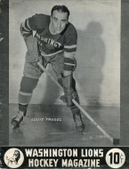
wait - Washington had a minor league hockey team? Called the Lions?
wikipedia for the win. learn something every day. too bad there aren't better images of how their logo and sweaters looked.

Anyway, ok with the reverse retros - never a big fan of the 90s era colors or logos for same reasons many have already cited - weird font, crooked zig zag line, but these still look kind of good with the red, white, and blue.
 

Random schmoe

Random fan with their own opinions
Sponsor
Feb 13, 2019
925
971
because of the red or because of the game production?

Game production.

Disliking the jerseys and subsequent focus on Red is just bonus.

Editing to add clarity:
I don't like the jerseys or color schemes. I ALSO don't like the game production. Two things that are fundamentally different aspects, but overlap in their usage.
 
Last edited:

Random schmoe

Random fan with their own opinions
Sponsor
Feb 13, 2019
925
971
That's what they are saying about the 3rd Jersey alternates. The alternate red 70's look is out. And the new 3rd's will look something around this in navy blue:

My #ALLCAPS source also tells me that the current throwback thirds are out, while a new blue jersey nearly identical to my concept from earlier this year is in.

The blue may not be bad, but there is a huge difference between an artists depiction and how it looks "IRL" as the kids say. (Do kids actually say that anymore?)

The "reverse retro red" in that needs to go the way of Reirden.
 
  • Like
Reactions: tenken00

tenken00

Oh it's going down in Chinatown
Jan 29, 2010
9,906
10,147
The blue may not be bad, but there is a huge difference between an artists depiction and how it looks "IRL" as the kids say. (Do kids actually say that anymore?)

The "reverse retro red" in that needs to go the way of Reirden.

The Capitals' case is interesting because the word mark is the primary logo. Both the 70s initial version and the current jersey word mark style. Other than the "screaming eagle" and the Capitol Dome shield, there is no other logo used as the primary jersey image. Not even the Weagle.

There's little else in Caps' jersey history to use for retro looks. But that also means that there are many possibilities to go in new directions in the future.
 
Last edited:

ArmadilloThumb

Registered User
Apr 20, 2018
541
396
There's little else in Caps' jersey history to use for retro looks. But that also means that there are many possibilities to go in new directions in the future.

And I'll clarify that if we had the original white and red as primary (with the correct larger font wordmark that the originals have), I'm very open to creative options for the 3rd and 4th. There have been some fantastic fan concepts created and I think that's a way to make everyone happy.

Making the originals go away is very minor league, and says the organization does not want to build a cohesive fan loyalty (e.g. let's focus group and target only what young fans might want).
 
  • Like
Reactions: tenken00

txpd

Registered User
Jan 25, 2003
69,649
14,131
New Bern, NC
Game production.

Disliking the jerseys and subsequent focus on Red is just bonus.

Editing to add clarity:
I don't like the jerseys or color schemes. I ALSO don't like the game production. Two things that are fundamentally different aspects, but overlap in their usage.

No. I get it. The Caps are cutting edge leaders in game production. They owned the league award for that til Vegas arrived. I went to 2 Caps playoff games at Carolina last time and couldnt wait to get out of the arena. It was brutal
 

Corby78

65 - 10 - 20
Jan 14, 2014
11,779
7,992
Ramstein Germany
That's what they are saying about the 3rd Jersey alternates. The alternate red 70's look is out. And the new 3rd's will look something around this in navy blue:

My #ALLCAPS source also tells me that the current throwback thirds are out, while a new blue jersey nearly identical to my concept from earlier this year is in.


The white shoulders makes that sweater 10x better.
 

Carltons Cup

Let's Do This..
Feb 22, 2018
2,897
4,684
So, I'm born and raised in Toronto and moved to Annapolis in the mid 1990's. I'm first and foremost a Leafs fan, then the Caps.

I was at the grocery store today and a guy came up to me asking if I was Leafs fan (because I was wearing my Leafs face mask). We started chatting and it turns out that he's the Caps equipment manager. That in itself was pretty cool. He obviously has some inside info and believes there will be a 48-50 game season starting in January. What's even more cool is that he asked if I wanted to take a couple of pictures with his FRIGGIN Stanley Cup Ring!!

I thought this forum would appreciate it. The ring is the size of a golfball....
stanley cup ring 1a.jpg
stanley cup ring 2a.jpg
 
Status
Not open for further replies.

Ad

Upcoming events

Ad

Ad