It would be a one off. Like the Stadium Series in BlueRocking the Red with a blue uniform is dumb.
Speculation: Caps General Discussion (Coaching/FAs/Cap/Lines etc) - 2020 Offseason Pt. 3
- Thread starter Calicaps
- Start date
You are using an out of date browser. It may not display this or other websites correctly.
You should upgrade or use an alternative browser.
You should upgrade or use an alternative browser.
- Status
- Not open for further replies.
So we lose Pittsburgh and C-Bus and add Boston and Buffalonot a big fan of those divisions
- Feb 13, 2019
- 922
- 960
Back the Blue. Bang the blue.
The arena can change from a red theme to a blue. Including a light for special circumstances. A blue light special if you will.
I should sleep.
The arena can change from a red theme to a blue. Including a light for special circumstances. A blue light special if you will.
I should sleep.

txpd
Registered User
It would be a one off. Like the Stadium Series in Blue
Ok....take the biggest regular season event you have and confuse your brand. Its like your country music station playing dance music. But ok
Point is, they did it. Blue.Ok....take the biggest regular season event you have and confuse your brand. Its like your country music station playing dance music. But ok
txpd
Registered User
Point is, they did it. Blue.
yea....boo. The only time Ov should be in blue is in the Merc.Benz
tenken00
Oh it's going down in Chinatown
- Jan 29, 2010
- 9,895
- 10,130
yea....boo. The only time Ov should be in blue is in the Merc.Benz
The most iconic image of Ovie - the Goal - was in blue.
Edit: actually scratch that. The most iconic image of Ovie now is of him lifting the Cup.
HTFN
Registered User
- Feb 8, 2009
- 12,266
- 10,898
They're called the Capitals...Ok....take the biggest regular season event you have and confuse your brand. Its like your country music station playing dance music. But ok
You think people are going to be particularly confused by the colors when they're still red, white, and blue, and the thing's got stars and the Washington monument on the front of it? Correct me if I'm wrong but "Rocking the Red" is just a stupid marketing term they used when they moved to the RBK jerseys, I see no real reason to let it hold you back over a decade later with another manufacturer.
Capitals have more going for their brand than wearing the color red at all costs.
txpd
Registered User
They're called the Capitals...
Correct me if I'm wrong but "Rocking the Red" is just a stupid marketing term they used when they moved to the RBK jerseys.

Last edited:
HTFN
Registered User
- Feb 8, 2009
- 12,266
- 10,898
How do you cut out 3/4 of a post and still miss the point?
Rock the Red isn't some decades old tradition, at least not yet, it was a half catchy slogan that accompanied the switch back to red, white, and blue. You can still strongly encourage a red gameday presence, like they already do, or other teams would with a white out, but you don't need to be bound to the color through your entire run of merchandise (as already demonstrated in those pictures). You don't see a bunch of people wearing away jerseys here, there's no reason to suddenly expect that they'd get confused and start bringing the blue ones.
The Capitals brand is rooted in American/D.C. iconography, including but not limited to the color red. The Rock the Red slogan probably should have died a while ago, but regardless of that it definitely shouldn't impact the team's ability to wear something different a handful of times a year. You can keep saying Rock the Red all you want for regular home games and make the alternate games Red, White, and Blue nights. You can do whatever you want, because what you're adhering to is basically just how they spread the word that people should start wearing new red Reebok jerseys instead of bringing all their old black and blue shit to home games.
Last edited:
txpd
Registered User
All of this.How do you cut out 3/4 of a post and still miss the point?
Rock the Red isn't some decades old tradition, at least not yet, it was a half catchy slogan that accompanied the switch back to red, white, and blue. You can still strongly encourage a red gameday presence, like they already do, or other teams would with a white out, but you don't need to be bound to the color through your entire run of merchandise (as already demonstrated in those pictures). You don't see a bunch of people wearing away jerseys here, there's no reason to suddenly expect that they'd get confused and start bringing the blue ones.
The Capitals brand is rooted in American/D.C. iconography, including but not limited to the color red. The Rock the Red slogan probably should have died a while ago, but regardless of that it definitely shouldn't impact the team's ability to wear something different a handful of times a year. You can keep saying Rock the Red all you want for regular home games and make the alternate games Red, White, and Blue nights. You can do whatever you want, because what you're adhering to is basically just how they spread the word that people should start wearing new red Reebok jerseys instead of bringing all their old black and blue shit to home games.
Plus @txpd — there’s that old saying “variety is the spice of life”
LOL
txpd
Registered User
Corby78
65 - 10 - 20
There is something to be said with consistency when branding. The switch to blue/gold was awful. Having said that switching a primary and secondary color around for a once in a while deal isn’t a big deal. I grew up loving the red/white caps well before anyone thought to yell “rock the red”
Blue and BRONZE my man. Get it rightThere is something to be said with consistency when branding. The switch to blue/gold was awful. Having said that switching a primary and secondary color around for a once in a while deal isn’t a big deal. I grew up loving the red/white caps well before anyone thought to yell “rock the red”
Hivemind
We're Touched
It's an alternate jersey. Alternate jerseys can alternate from primary schemes. Nobody is going to confuse a blue alternate for getting rid of the red branding.
HTFN
Registered User
- Feb 8, 2009
- 12,266
- 10,898
I don't disagree with general brand consistency, but there's no reason you can't keep things fresh within the parameters you've set for yourself and they aren't trotting out a highlighter orange alternate like they think this is the Premier League. An inversion of the normal colors does no more to ruin the brand than my blue Winter Classic sweatshirt does, or any of the other blue gear you can probably get right now.There is something to be said with consistency when branding. The switch to blue/gold was awful. Having said that switching a primary and secondary color around for a once in a while deal isn’t a big deal. I grew up loving the red/white caps well before anyone thought to yell “rock the red”
edit: that was meant more in agreement than it probably sounds.
- Feb 13, 2019
- 922
- 960
If they're going to use a Red theme across their presentation, the slogan makes sense.
To me, the entire expanse of the marketing and presentation feels a bit like some college freshman's final exam. Simplistic and lazy. I don't have anything better though, it's not my forté.
For the record though, it seems to work well for them. So my opinion really doesn't mean shit on the subject.
To me, the entire expanse of the marketing and presentation feels a bit like some college freshman's final exam. Simplistic and lazy. I don't have anything better though, it's not my forté.
For the record though, it seems to work well for them. So my opinion really doesn't mean shit on the subject.
Last edited:
- Feb 13, 2019
- 922
- 960
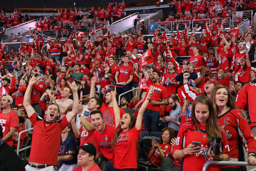
In the interest of fairness and objectiveness, and being in a better mood generally... I looked at more pictures of the Caps reverse retro and hate it less.
I still have a fundamental dislike of red as the base color, but the red I'm seeing is better than the one I saw initially.
Additionally, the colored stripes with the solid blue at the bottom help provide some colors that I prefer in a nice contrasting way.
The screaming eagle is better than the weagle and the Capitol dome, but still the lower tier of their historical logos in my mind.
Maybe it's just me preferring the look that I grew up on, but the stylized word 'Capitals' with stars is still my favorite implementation of a logo for the team.
Top left and bottom right are my favorite logos. On a predominantly white jersey.
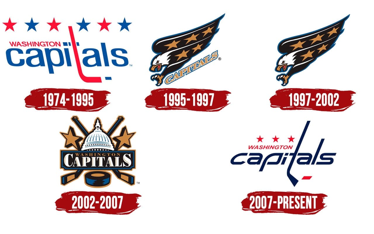
Meaningless opinions? I got em in spades. Now get off my lawn.
I still have a fundamental dislike of red as the base color, but the red I'm seeing is better than the one I saw initially.
Additionally, the colored stripes with the solid blue at the bottom help provide some colors that I prefer in a nice contrasting way.
The screaming eagle is better than the weagle and the Capitol dome, but still the lower tier of their historical logos in my mind.
Maybe it's just me preferring the look that I grew up on, but the stylized word 'Capitals' with stars is still my favorite implementation of a logo for the team.
Top left and bottom right are my favorite logos. On a predominantly white jersey.
Meaningless opinions? I got em in spades. Now get off my lawn.
ovikovy817
Registered User
An Ovie vs Crosby matchup in the SCF? A possibility this year? NHL and the refs need to push it as far as they can.
Rayquaza64
McMichael>McDavid
Because it's the offseason.
man, choosing which 3 dmen to protect is gonna be hard
tenken00
Oh it's going down in Chinatown
- Jan 29, 2010
- 9,895
- 10,130
man, choosing which 3 dmen to protect is gonna be hard
I am slowly reaching to the conclusion we might have give up a sweetener for Seattle to choose who we pick next year anyways.
Dillon, Orlov, Carlson right? I guess it depends how Siegs does but at this point don’t think it’s too hard of a decision.man, choosing which 3 dmen to protect is gonna be hard
- Status
- Not open for further replies.
Ad
Upcoming events
-
 Pelicans Lahti @ Tappara Tampere - Tappara leads series 2-0Wagers: 2Staked: $15,126.00Event closes
- Updated:
-

-

-
-