DowntownBooster
Registered User
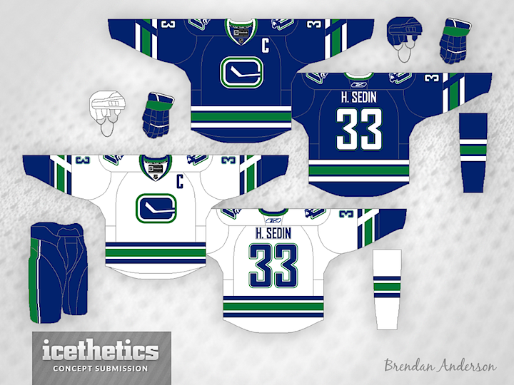
The Canucks classic look can't be beat. It's clean and simple. 

In regards to the new jerseys released, I'm glad they dropped the 'Vancouver' wordmark. That was always the worst part about them because it took away from the orca logo.
The collars look stupid on the new jerseys. Why have part of it wide and another part narrow? In fact all the NHL teams have ridiculous looking collars now. It seems like they lost their minds in designing them. How hard is it to design a decent collar of all things? It was a non-issue up until the 2017-18 season and then it seems like they forgot how simple it's supposed to be.