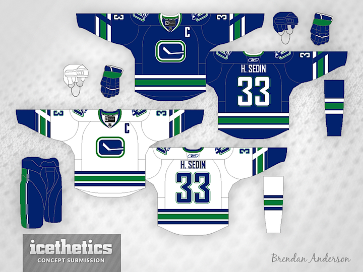
Confirmed with Link: Canucks announce new home, away, alternate jerseys, modified Stick in Rink logo

So what do we think of the new alternates?


  • Total voters
    126

DowntownBooster

Registered User
Jun 21, 2011
3,202
2,414
Winnipeg
The Canucks classic look can't be beat. It's clean and simple. :thumbu:

Canucks05.png


In regards to the new jerseys released, I'm glad they dropped the 'Vancouver' wordmark. That was always the worst part about them because it took away from the orca logo.

The collars look stupid on the new jerseys. Why have part of it wide and another part narrow? In fact all the NHL teams have ridiculous looking collars now. It seems like they lost their minds in designing them. How hard is it to design a decent collar of all things? It was a non-issue up until the 2017-18 season and then it seems like they forgot how simple it's supposed to be.:huh:
 

VanCity15

Registered User
Apr 8, 2013
27
9
Vancouver, BC
I like 'em. The Stick in rink has a 1920's NHL or old Seahawks vibe to it.

The absence of Johnny Canuck is all that matters at the end of the day. **** Johnny Canuck.

Sorry to say, but Canucks fans who hate Johnny Canuck and prefer some marine animal who was inspired by the former Orca Bay ownership don't have a true appreciation for the Canucks' heritage and history. Nothing wrong with a little cartoony. The Penguins have a skating penguin. The Boston Celtics have a leprechaun spinning a basketball on his finger.
D8Uj0dZUwAAPoV2.jpeg.jpg
5564_vancouver__canucks_-primary-1953.png
 
  • Like
Reactions: Chairman Maouth

TruKnyte

On the wagon
Jan 1, 2012
5,939
3,335
Vancouver, BC
Sorry to say, but Canucks fans who hate Johnny Canuck and prefer some marine animal who was inspired by the former Orca Bay ownership don't have a true appreciation for the Canucks' heritage and history. Nothing wrong with a little cartoony. The Penguins have a skating penguin. The Boston Celtics have a leprechaun spinning a basketball on his finger.View attachment 237483 View attachment 237485


I'm not a huge fan of that logo personally. If we did use a Johnny Canuck I would prefer the one the Giants use.
 

PuckMunchkin

Very Nice, Very Evil!
Dec 13, 2006
12,310
9,982
Lapland
Sorry to say, but Canucks fans who hate Johnny Canuck and prefer some marine animal who was inspired by the former Orca Bay ownership don't have a true appreciation for the Canucks' heritage and history. Nothing wrong with a little cartoony. The Penguins have a skating penguin. The Boston Celtics have a leprechaun spinning a basketball on his finger.View attachment 237483 View attachment 237485

Or they just disagree with you.

For me its Spaghetti Plate Skate or nothing.
 

MS

1%er
Mar 18, 2002
53,562
83,929
Vancouver, BC
Sorry to say, but Canucks fans who hate Johnny Canuck and prefer some marine animal who was inspired by the former Orca Bay ownership don't have a true appreciation for the Canucks' heritage and history. Nothing wrong with a little cartoony. The Penguins have a skating penguin. The Boston Celtics have a leprechaun spinning a basketball on his finger.View attachment 237483 View attachment 237485

I have a huge appreciation for Canucks history and am probably the biggest booster here for Phil Maloney to be in the Ring of Honour, as an example.

The Johnny Canuck logo is a dated, ugly, 3rd-rate cartoon which looks like a cheap, bad logo for a minor-league team from the 1950s ... which it is.
 

vanarchy

May 3, 2013
9,111
8,364
The double green on the Stick logo jersey is just wrong.


I know I'm in the minority here but I do not like the green trim. It looks ok on the away jersey sticks out for the wrong reason on the home blues.
I agree. The design they went with actually looks cleaner.
 

mossey3535

Registered User
Feb 7, 2011
13,244
9,697
Yeah the Orca was originally a corporate logo but it has elements that make sense:

-The 'C' for Canucks
-art style reflects the region
-orcas are associated with BC, not any other province in Canada

I think there's a reason the logo has lasted long after Orca Bay sold the team. I grew up with the skate logo, but I don't think it's a modern game-in-game-out logo anymore. Stick-in-rink makes the most sense, but for whatever reason they're not going for it.
 

Bertuzzzi44

Registered User
Jun 26, 2018
3,401
2,980
The changes to the home and away jersey’s are good, but they messed up on the heritage jersey, should’ve kept the no nonsense old school approach..

upload_2019-6-19_12-18-54.png
 

Frankie Blueberries

Allergic to draft picks
Jan 27, 2016
9,142
10,613
Now that basketball is cool again, we should have a third jersey re-imagining of the Grizzlies logo (avoid trademark) for the lols. A grizzly breaking a stick like the Sharks logo would be amazing. Better connection to the city than an Orca at least.
 

Mr. Canucklehead

Kitimat Canuck
Dec 14, 2002
40,335
30,679
Kitimat, BC
Bought one of the new alternates at the Draft. Gotta say, in person and on a person who looks happy to wear it, it looks a lot better. Got a ton of compliments from Canucks fans and other teams' fans on the jersey.

And then one RA staffer who said "nice jersey!" and then paused, looked at it, "nope, I still hate it". :laugh:
 

Zombotron

Supreme Overlord of Crap
Jan 3, 2010
18,330
9,862
Toronto
That seems to be the prevailing notion about the alternate jersey. I stand by my belief that it's an easy fix to turn it into one of the better jerseys in the league
 

WHISTLERNATE

Registered User
Nov 14, 2017
849
505
Bought one of the new alternates at the Draft. Gotta say, in person and on a person who looks happy to wear it, it looks a lot better. Got a ton of compliments from Canucks fans and other teams' fans on the jersey.

And then one RA staffer who said "nice jersey!" and then paused, looked at it, "nope, I still hate it". :laugh:

I think the new 3rd will look even better on the ice with the matching pants and socks. I really like that jersey.
 

Interior Cascadian

Registered User
Apr 2, 2007
1,075
188
Olympia, WA
I do agree that the alternates were better in person, but the rain things on the numbers are dumb and it'd still be way better with some white.
Just a thin white stripe between the two broad green stripes. That's all it would take to balance things out and turn it into a damn good look.
 

The Drop

Rain Drop, Drop Top
Jul 12, 2015
14,873
4,060
Vancouver
Sorry to say, but Canucks fans who hate Johnny Canuck and prefer some marine animal who was inspired by the former Orca Bay ownership don't have a true appreciation for the Canucks' heritage and history. Nothing wrong with a little cartoony. The Penguins have a skating penguin. The Boston Celtics have a leprechaun spinning a basketball on his finger.View attachment 237483 View attachment 237485
How about something completely new?
 

Ad

Upcoming events

Ad

Ad