
Interior Cascadian
Registered User
That’s actually the approximate template I’m hoping Seattle rolls with.Changed a couple things around...

That’s actually the approximate template I’m hoping Seattle rolls with.Changed a couple things around...
Changed a couple things around...
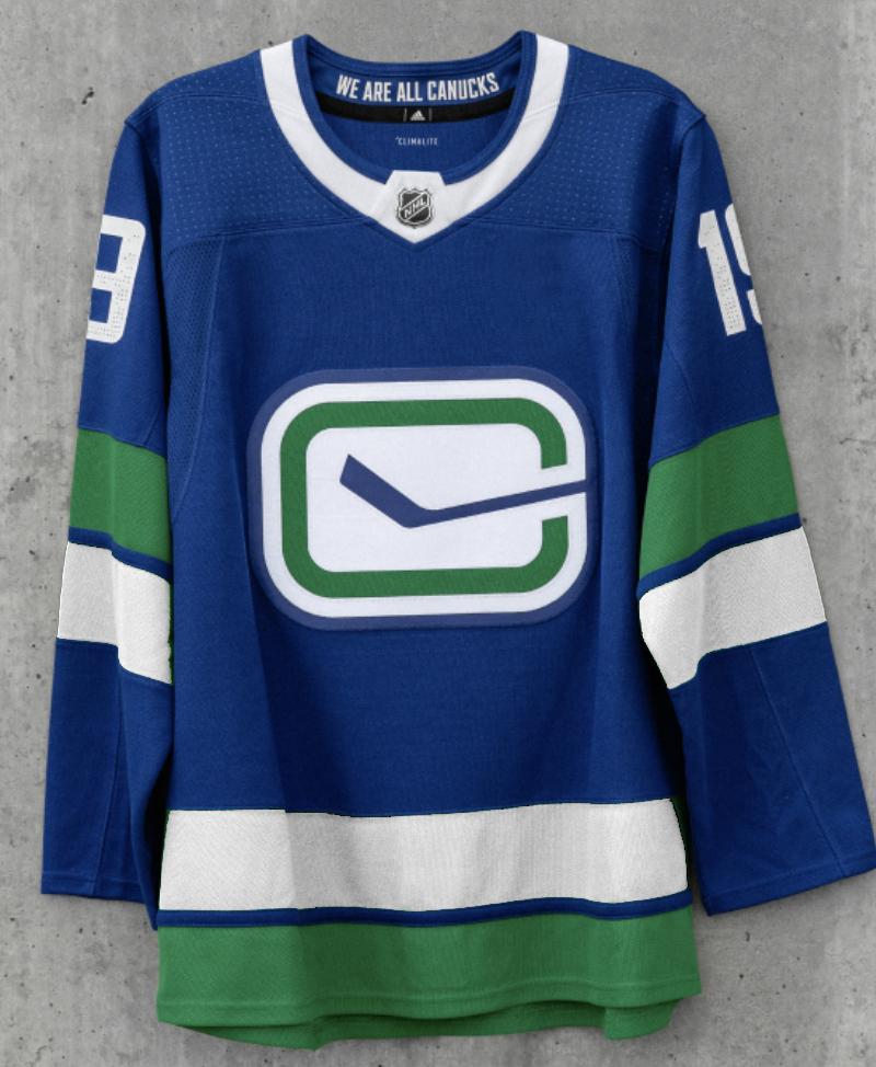
Even if you want less green in the logo than I do (in the eye or fin is a possibility), I would also modify the stripes and collar a teeny bit:
That one was just a consequence of the base image I copied – it wasn’t intentional. (Which goes to show how careless they’ve been... the logo isn’t even standardized in official use). The others though – no! I want green!put the navy in the orca on the home jersey back to what it was before
That one was just a consequence of the base image I copied – it wasn’t intentional. (Which goes to show how careless they’ve been... the logo isn’t even standardized in official use). The others though – no! I want green!
They absolutely created an abomination of the stick in rink . “ we are all Canucks “ on the collar? Really?
Save for the 94 skate jersey the rest are trash. Utter garbage. What did they do to the stick & rink jersey? Who is in charge of these decisions and thought this was a good idea?

Even if you want less green in the logo than I do (in the eye or fin is a possibility), I would also modify the stripes and collar a teeny bit:
That is a much better retro-modern hybrid.I agree they needed to do more tweaking to jersey's. Removing the word mark is a positive but I'm not a huge fan of the orca although I can see they want to have some consistency. Too many different jersey's over the years. I like the alternate logo but the green strips get washed out on the blue. I think would look better like this.
