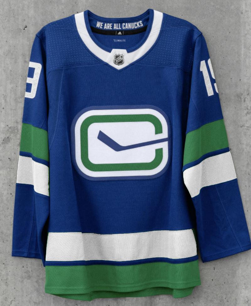
Confirmed with Link: Canucks announce new home, away, alternate jerseys, modified Stick in Rink logo

So what do we think of the new alternates?


  • Total voters
    126

BeardyCanuck03

@BeardyCanuck03
Jun 19, 2006
10,823
410
twitter.com
Getting rid of the Vancouver from the Jersey is an improvement for me, albeit a very small improvement.

Not sure why the outrage on the 3rds. I like the colour choices and green stripes

The thick Green stripes are very different. Each time I look at that jersey I have a differing opinions lol.

I'd like to see them on the ice. I think they will look quite good on the ice.
 

Zombotron

Supreme Overlord of Crap
Jan 3, 2010
18,335
9,869
Toronto
I agree they needed to do more tweaking to jersey's. Removing the word mark is a positive but I'm not a huge fan of the orca although I can see they want to have some consistency. Too many different jersey's over the years. I like the alternate logo but the green strips get washed out on the blue. I think would look better like this.
D89ocfPWkAQDShN.jpg
well that was easy. i think this quick edit drives home the sentiment being expressed here that they were so close, yet so far
 
Last edited:
  • Like
Reactions: mossey3535 and Peen

lawrence

Registered User
May 19, 2012
15,985
6,766
and if it hasnt been said; why is that stupid Agency font on the "vintage" jersey?

The 40th anniversary was done right. The 50th anniversary was not.

Something struck me this morning as I was listening to Bernie Federko talk about the St Louis Blues organisation. . He mentioned how everyone from current members to alumni has so much pride in the blue note. It was clear that they respect their history. The Vancouver Canucks obviously do not given that abomination of a third jersey that they served up for their "50th anniversary". It just turns me off this team even more. When I think of the state of the franchise and the lack of care from this ownership group, it makes me want to find a new team. They dont care, why should I?


well... what do you expect? different polls made by different media outlets, each time it was asked, what would you like on the jersey, options were orca, skate, stick or Johnny Canuck, Johnny Canuck and skate logo was the most popular option and the Orca logo garnered the least votes every time such poll was made.

Jersey was designed by Francesco's liking. not the fans.

I personally do love blue, that particular blue, however I do want to see a different jersey the jersey is pretty much these are without the Vancouver, and a different patch. Nothing more.
 

Zombotron

Supreme Overlord of Crap
Jan 3, 2010
18,335
9,869
Toronto
As long as #53, #40, #6 and #43 get to rock the skate jersey against the NYR with (probably) Kakko*, Chytil, Andersson and Kravtsov...

*Hughes vs. Hughes in a VAN-NYR retro jersey game is fine, too
 

biturbo19

Registered User
Jul 13, 2010
25,643
10,631
I really like 3/4 of them. The exception being the Stick 'n Rink dealio, that looks like some numbskull accidentally sent the version without white piping to press. Like...how do you look at that design and not think it's very blatantly missing some white stripes? It's absolutely awful. Closer to an awful Christmas sweater effort, than a good hockey jersey.
 

carolinacanuck

Registered User
Apr 5, 2007
2,549
92
The Carolinas
The new stick-n-rink logo is great and I'll probly get a hat and shirt. And knowing they went for the heritage look means the sleeve stripes are growing on me. But ya, that new logo is wicked.
 

VC

Registered User
Feb 28, 2002
4,503
203
Vancouver Island
Visit site
The double green on the Stick logo jersey is just wrong.

Even if you want less green in the logo than I do (in the eye or fin is a possibility), I would also modify the stripes and collar a teeny bit:


I know I'm in the minority here but I do not like the green trim. It looks ok on the away jersey sticks out for the wrong reason on the home blues.
 
Last edited:
  • Like
Reactions: Peen and TruKnyte

VanillaCoke

Registered User
Oct 30, 2013
25,230
11,590
Its worse.

An updated version is a good idea, this version is just ugly. They overdid the updating.


I do agree that the white rink is a good thing, but they should have just kept the old logo and swapped colors to get a white rink.
 
  • Like
Reactions: VanCity15

Intangibos

High-End Intangibos
Apr 5, 2010
7,807
3,370
Burnaby
I don't like them. I like the current iteration and if they were going to change I would have preferred the stick in rink logo full as the primary. The whale is a corporate symbol that doesn't represent us anymore.
 
  • Like
Reactions: VanCity15

VanCity15

Registered User
Apr 8, 2013
27
9
Vancouver, BC
All I can say is this: with the exception of the Skate throwback, the Canucks' new uniform set absolutely sucks. It's the 50th anniversary of Canada's 3rd oldest NHL franchise and there's no classic Stick in Rink. No Johnny Canuck. Just the corporate Orca and the bastardized updated Stick in Rink. Bragging about our miserable rainy winters in the jersey number font?? This is not a true Canucks hockey jersey set. This is catering to environmental and politically social special interests groups. The Aquilinis are officially one of the worst ownerships in professional sports.

My new "Canucks, Not Orcas" T-shirt will be ready by Draft Day.
20190615_144510.jpg
 
Last edited:

VanCity15

Registered User
Apr 8, 2013
27
9
Vancouver, BC
It is an improvement. A white stick in a blue rink never made any sense. And the blue logo on blue sweater looked terrible and I say that as an owner of that exact jersey. It’s actually the jersey I wear most but it really needed a white logo.
I disagree. An uninverted Stick in Rink on blue with a white outline stands out. No different than the Islanders and Sabres not inverting their crests on their blues. However, an inverted Stick in Rink looks a lot better with the border around the Rink being white with green in between. I just hate the bastardized Stick in Rink. The original classic was the way to go. The double green stripes are in terrible need of white in between and on the outside. And of course, the full-body Johnny Canuck on the shoulders. Then it would be a true heritage jersey.
van70.png___SQUARESPACE_CACHEVERSION=1285557970107.cf.png
f_9harr3_v6_a_h.jpg.cf.jpg
 

mossey3535

Registered User
Feb 7, 2011
13,326
9,830
PS I hate the Johnny Canuck logo. I feel like it's super generic even though I know it's from the PCHL days. It didn't work for the Islanders either. In fact, any sports logo depicting a cartoon man doing something is usually an utter failure.
 
  • Like
Reactions: Mr. Canucklehead

Ad

Upcoming events

Ad

Ad