2019-2020 Around the League Thread - Part IV

Status
Not open for further replies.

UncleRisto

Not Great, Bob!
Jul 7, 2012
30,982
26,012
Finland
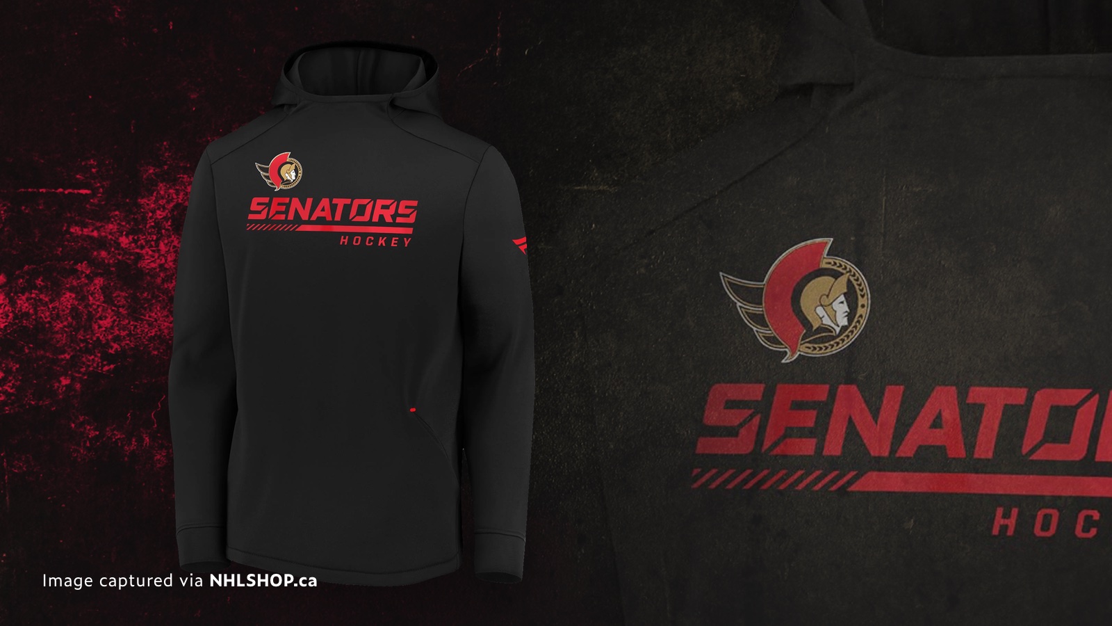
I wish they used the revised 2D logo, but this is still good.

EdOXFQaVAAAP-7o


icethetics.com: Week of leaks might have revealed Ottawa Senators rebrand
 

Northern Avs Fan

Registered User
May 27, 2019
21,970
29,648


Like Makar, Crosby also left practice today. Though I think he was actually practicing before he left, where Makar was just scheduled to practice.
 

S E P H

Cloud IX
Mar 5, 2010
31,138
16,658
Toruń, PL
Yikes, I don't want to put too much thought into a random scrimmage, but my bro watched the Penguins one - which raises the question why are all Kroenke's teams still in the dark age? - and let me tell you Matt Murray looked like a tyre fire in the worst way imaginable. It was 7-0 in the first period to the point they had to change teams because Murray was such a disaster.
 

MarkT

Heretic
Nov 11, 2017
4,019
4,574


Personally I like the dress code in hockey. Players can express themselves when they aren't working, like the vast majority of people.


I think a happy medium would be if they had to wear the suits on game day, but the league also made an effort to let them show their personality the rest of the time.
 

Foppa2118

Registered User
Oct 3, 2003
52,476
31,794


Personally I like the dress code in hockey. Players can express themselves when they aren't working, like the vast majority of people.


Exactly. It has nothing to do with expressing yourself. That's what instagram is for.

It has to do with the appearance of professionalism at a work place that can kind of be lackadaisical in nature if you let it be.

I hate whenever I have to wear a suit but if you paid me multiple millions of dollars, I'm not going to bitch about my employer not letting me wear sweatpants to work to express myself.
 

Cousin Eddie

You Serious Clark?
Nov 3, 2006
40,161
37,363
Contextually, that’s a terrible uniform IMO. Black is not part of our flag plus that « Hockey Canada » logo is a joke.
I didn’t know a hockey jersey was supposed to look like a flag.

Also what’s wrong with the hockey Canada logo?
 

Metallo

NWOBHM forever \m/
Feb 14, 2010
18,463
15,124
Québec, QC
I didn’t know a hockey jersey was supposed to look like a flag.

Also what’s wrong with the hockey Canada logo?
Traditionally flag colors are used. I’m not making this up.

Hockey Canada is a corporate logo (and is ugly). It’s not team Hockey Canada, it’s team Canada.
 

Cousin Eddie

You Serious Clark?
Nov 3, 2006
40,161
37,363
Get them into black and red pads too.

Subban-fishes-the-puck-out-of-his-net-during-the-5-1-Team-Canada-loss-The-Canadian-Press.jpg
Can’t find the photo but when Jake Allen played here (yes there was a Q team on the rock for a few years) he wore the pads pictured below by Pogge except they were black with the thin red trim. My favorite pads ever.
West_Coast_Authentic_Team_Canada_Justin_Pogge_Autographed_Photo-819x1024.jpg
 

MarkT

Heretic
Nov 11, 2017
4,019
4,574
I always found the black Canada jerseys to be lame - like someone trying too hard to be cool. Team Canada should be red and white. It doesn't have to be in the shape of the flag, but those are the national colours (yes, Canadian spelling of the word).

Now, if Seattle is smart, they'll give us a team that's black, purple and green, because this might be one of the best jerseys of all time (other than the words at the bottom) and I want more purple in the NHL:
8b4e2542cf1140b03a7efc2f229c7f36.jpg
 
  • Like
Reactions: SaltySkywalker

UncleRisto

Not Great, Bob!
Jul 7, 2012
30,982
26,012
Finland
Any excuse for you to post Finland winning a medal... :sarcasm: :laugh:
Lost a semi to Sweden though.
Can’t find the photo but when Jake Allen played here (yes there was a Q team on the rock for a few years) he wore the pads pictured below by Pogge except they were black with the thin red trim. My favorite pads ever.
Oh, lol, I thought the Sea Dogs played in St. John's. Close.
I always found the black Canada jerseys to be lame - like someone trying too hard to be cool. Team Canada should be red and white. It doesn't have to be in the shape of the flag, but those are the national colours (yes, Canadian spelling of the word).

Now, if Seattle is smart, they'll give us a team that's black, purple and green, because this might be one of the best jerseys of all time (other than the words at the bottom) and I want more purple in the NHL:
8b4e2542cf1140b03a7efc2f229c7f36.jpg
Oh, the worst Kings jersey of all time, dude. And don't give me the Los Angeles Burger Kings, the 90's jerseys rock. If they were smart, they'd wear the ~1992 threads.

I'd actually really like the rumored powder blue and light red, if they did it properly. You just don't want it to look like a WHL jersey (some stupid RBK style template).
 
Status
Not open for further replies.

Ad

Upcoming events

Ad

Ad