2019-2020 Around the League Thread - Part IV

Status
Not open for further replies.

MarkT

Heretic
Nov 11, 2017
4,019
4,574
Oh, the worst Kings jersey of all time, dude. And don't give me the Los Angeles Burger Kings, the 90's jerseys rock. If they were smart, they'd wear the ~1992 threads.

I'd actually really like the rumored powder blue and light red, if they did it properly. You just don't want it to look like a WHL jersey (some stupid RBK style template).

I guess it's a matter of preference, but I love those Kings jerseys.

What I'm hoping is basically a home jersey that matches one of these:
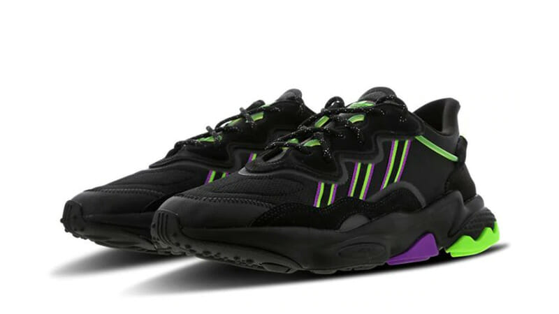
adidas-Ozweego-Black-Purple-Green-FU7418-front.jpg

7e108a92a756565aec38c45df434f795.jpg


I'd be happy with just purple and black, but it's Seattle so I image green has to be in there somewhere.
 

UncleRisto

Not Great, Bob!
Jul 7, 2012
30,985
26,016
Finland
I guess it's a matter of preference, but I love those Kings jerseys.

What I'm hoping is basically a home jersey that matches one of these:

7e108a92a756565aec38c45df434f795.jpg
Oh, these colors would be sweet. So 90's.

If they chose Seattle Sockeye(s), they should basically wear this Pens jersey with red in there. Maybe slightly more green in that blue.

48473323551_77c8882094_b.jpg
 
Last edited:

MarkT

Heretic
Nov 11, 2017
4,019
4,574
There's no light blue team, though, and you suggested black.

Black with purple and green. Hell if I thought it was realistic I'd drop the black.

Even with light blue, the away jersey would still look like a lot of other teams. Plus the idea reminds me of those ugly Atlanta Thrashers jerseys.
 

MarkT

Heretic
Nov 11, 2017
4,019
4,574
Oh, and by the way, I used shoes for my examples because the concept of using black with purple and green highlights is apparently a completely new concept in sports jerseys. Imagine that - a new team with an entirely unique color scheme!
 

Pokecheque

I’ve been told it’s spelled “Pokecheck”
Sponsor
Aug 5, 2003
46,473
29,601
The Flatlands
www.armoredheadspace.com
Because red on black with no accents is my favorite. I just wish San Fran had gone with some matte black helmets to really make it incredible.

I always thought the 49ers had a decent, but just short of great uniform set. I love the gold helmets and pants with red jerseys, but they were just a little too plain. They almost got it right with the update in the 90s but ruined it because it was the 90s and they insisted on throwing in those awful black drop shadows on the numbers and black trim everywhere. They could've tweaked it properly but then just decided to go completely back to the originals.

By themselves, yeah, those jerseys are kinda cool, but they don't make sense with the rest of that uniform set. Kinda wish the Falcons would do something like this.
 

Pokecheque

I’ve been told it’s spelled “Pokecheck”
Sponsor
Aug 5, 2003
46,473
29,601
The Flatlands
www.armoredheadspace.com
FTR the Evolving Wild twins have Pietrangelo for Norris, and Nichushkin for Selke.

The Selke always feels like an award they don't get right a lot of the time. More often than not it's just the guy who scores a lot of points and has a rep for playing good defense.
 
  • Like
Reactions: Avalanche

McMetal

Writer of Wrongs
Sep 29, 2015
14,204
12,325
Red on black with no white accents is my favorite look in a hockey jersey. Especially as an entire uniform.
View attachment 354595
I don't get why that isn't used more, it looks so sharp. I really wanted Vegas to do that. Call themselves the Vegas Blackjacks and go red and black like playing cards. I know the league vetoed any references to gambling during the naming process, but IMO that would have looked really nice.
 
  • Like
Reactions: Cousin Eddie
Status
Not open for further replies.

Ad

Upcoming events

Ad

Ad