
McRobbiezyg
Registered User
- Oct 21, 2007
- 3,075
- 63
Bumping this after an year. Sure hope this is true.
Bumping this after an year. Sure hope this is true.
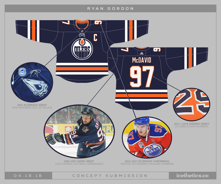
I liked them at first but that striping doesn't work well on an orange jersey, and the navy is too dark. The numbers on the roads are also kind of a mess without a white outline in between.Please be true.
Those orange jerseys are hideous.
I'm guessing as the alternate. iirc teams can't make changes for the first two seasons of the Adidas contract.
The Oilers looked perfect in 2016-17. Go back to those.
Black and orange would look cool. [/heretic]
")
I did a quick colour replacement in Photoshop.


All they need to do is swap the blue and orange around on the current home jerseys.
Disagree. Orange yokes would look out of place on a navy jersey. I also think the current orange is too bright/fluorescent as it is.
Need a Del photoshop to settle this.

Katz’ need to milk the fan base for every expendable dollar they have.I own three of them, but the orange jerseys are the ugliest things ever. How did we go from having one of the nicest jerseys in the league to one of the ugliest?
Years and years ago there was an article on fleury. They asked him why he got rid of his yellow pads. He said a season ticket holder was an eye doctor and told him yellow is one of the colors the human eye can see fastest.I'm still convinced the Hunter orange is half to blame for the home PK trouble.
Kinda knew stuff like this would happen ... now that McDavid is here they need to cash in on the merchandising craze.
And of course in 2018-19 they will have the new "navy blue" third home jersey.
Yeah those look good as hell.