Oilers Darkening blue to navy for jerseys next year

Little Fury

Registered User
Jun 21, 2006
17,831
6,800
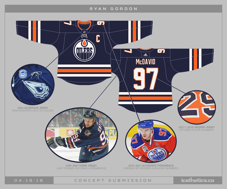
Still not a fan. Contrast is too jarring with all that orange on the yoke and not nearly as much orange anywhere else. I prefer the concept that was on icethetice (posted here by The Messiah).

I like the high contrast, it'd pop on TV. The other concept is just too dark.
 

ujju2

Registered User
Apr 9, 2016
9,630
6,468
Edmonton, AB
I like the high contrast, it'd pop on TV. The other concept is just too dark.

Yeah, On tv that high contrast is very likely to make the blue look black. More than anything though I prefer the original shades, especially the orange. The new orange is garish imo.

Edit: to add, I think the navy that Del used on his mockups is slightly brighter than the actual navy, and he also used the original orange. That's why it looks better than the actual thing. He chose better colours.
 

MessierII

Registered User
Aug 10, 2011
27,690
16,290
CMYa4Sy.jpg
That’d be slick. I liked the Rebok orange ones. I thought the royal blue and the deeper orange went well together but the ones from this year the contrast between the lighter orange and darker blue just doesn’t work. I had this exact debate with my buddy funny enough. I said if they flipped the colours on these it would actually look pretty good.
 
  • Like
Reactions: RebuildTheRebuild

ujju2

Registered User
Apr 9, 2016
9,630
6,468
Edmonton, AB
Current shoulder yokes are too wide for my liking. Need to narrow them up more like to 80's style.

Disagree. I like the wider yoke, especially the Reebok ones. The only issue I have with the yokes on the current jersey is that (maybe partly because of the perforation dot pattern thing) the navy on our jerseys looks dull. It's also due to the really dark shade. I'd love it if it had the colour/texture of Del's mockup earlier. Size-wise I think the 80s narrow yoke actually looked worse than the current size.
 

nexttothemoon

and again...
Jan 30, 2010
29,498
16,689
Northern AB
Go with all white jerseys with a few black stripes (the oily rag look).

Plus with black and white as their new motif... the zebras will go easier on them and more calls will go their way as they'll look like 'em.
 

Drivesaitl

Finding Hyman
Oct 8, 2017
45,641
55,501
Canuck hunting
Still prefer the Royal Blue and orange, but don't mind this concept. I would move the numbers to the sleeves and add a third logo like the Oiler worker from the 06 jerseys.

0418-ryangordon-edm.png
Proud to have that Smyth Jersey. That was the best one ever. Can't stand the Oil Drill bit thing. That was the worst.

But agreed with most that I would like to see the Orange Jerseys go. The only reason the Oilers ever had that was due to a potential deal with Hughes Petroleum market branding which fell through anyway. That was the only reason for that eye hurting hue.
 

Stud Muffin

Registered User
Jan 2, 2014
5,359
921
Manitoba
Proud to have that Smyth Jersey. That was the best one ever. Can't stand the Oil Drill bit thing. That was the worst.

But agreed with most that I would like to see the Orange Jerseys go. The only reason the Oilers ever had that was due to a potential deal with Hughes Petroleum market branding which fell through anyway. That was the only reason for that eye hurting hue.
That is not why they had Orange jerseys, they brought them back for the last year at Rexall.
 

Drivesaitl

Finding Hyman
Oct 8, 2017
45,641
55,501
Canuck hunting
That is not why they had Orange jerseys, they brought them back for the last year at Rexall.

Not sure if you didn't understand my post. In 1972, in the WHA, the Oilers trotted out fairly ugly loud orange uniforms because they were looking for sponsorship or some sort of deal with Hughes Petroleum, who flew that same orange color. That's where the color came from.

I wasn't talking about why they brought the jersey back (marketing gimmick if we're being honest) I was talking about how orange came to be an Original Oilers color.
 
  • Like
Reactions: Stud Muffin

Little Fury

Registered User
Jun 21, 2006
17,831
6,800
Not sure if you didn't understand my post. In 1972, in the WHA, the Oilers trotted out fairly ugly loud orange uniforms because they were looking for sponsorship or some sort of deal with Hughes Petroleum, who flew that same orange color. That's where the color came from.

I remember reading somewhere the Edmonton WHA team was originally going to have green and gold as a colour scheme, but the name and colours were part of Bill Hunter's scheme to get Gulf Oil money (not Hughes).
 

Drivesaitl

Finding Hyman
Oct 8, 2017
45,641
55,501
Canuck hunting
I remember reading somewhere the Edmonton WHA team was originally going to have green and gold as a colour scheme, but the name and colours were part of Bill Hunter's scheme to get Gulf Oil money (not Hughes).

I stand corrected. It was Gulf Oil. I tried to google it but very little on the subject being it was so long ago.

The interesting thing is the inaugural Oilers club was the "Alberta Oilers" (Calgary did not yet have a team) and yes there was some thought to wearing Green and Gold.
 

Faelko

Registered User
Aug 11, 2002
11,875
4,932
Hated the orange jerseys the second I saw them and hate them even more after the season they just had wearing them...fire them into the sun.
 

shoop

Registered User
Jul 6, 2008
8,333
1,911
Edmonton
Proud to have that Smyth Jersey. That was the best one ever. Can't stand the Oil Drill bit thing. That was the worst.

Really? I've got one of those Smyth era jerseys from the picture The Messiah posted and I don't think it aged well.

I like the current oranges but have been holding off to see what the third jerseys will be. If they go with the dark blue I'll get one of those instead.
 
Last edited:

Supermassive

HISS, HISS
Feb 19, 2007
14,612
1,090
Sherwood Park
The new jerseys just don’t quite work, visually. They needed three-color numbers. Aside from that, they’re...okay. The 2016-17 jerseys are the penultimate Oilers jersey. Shame it had to go.
 
  • Like
Reactions: MessierII

MessierII

Registered User
Aug 10, 2011
27,690
16,290
The new jerseys just don’t quite work, visually. They needed three-color numbers. Aside from that, they’re...okay. The 2016-17 jerseys are the penultimate Oilers jersey. Shame it had to go.
I agree our jersey situation was perfect last year. Classic home and aways plus I liked the rebook orange it worked as a 3rd.
 

Oilers in NS

Registered User
Oct 11, 2017
11,947
11,350
Hated the orange jerseys the second I saw them and hate them even more after the season they just had wearing them...fire them into the sun.

I hate them as well. We wear them at start of season and season goes down tubes. Back to whites and blues. We won with them
 

CantHaveTkachev

Legends
Nov 30, 2004
49,705
29,515
St. OILbert, AB
I hate them as well. We wear them at start of season and season goes down tubes. Back to whites and blues. We won with them
like 25 years ago...

the "Blue and white era" Oilers jerseys remind me of the Shayne Corson, Steven Rice Louie DeBrusk-era Oilers, probably cause I'm too young for the Dynasty..

then we lost more games when they brought them back in 2010...

I love the orange home jersey's, but last year's home jerseys with the royal blue and orange
it's my 2nd favorite only to the Ryan Smyth-era "copper and blue rigger" jersey's...those were beauties
 

the4thlinegrinder

Registered User
Jul 25, 2011
1,771
2,260
The Bench
Not really thread worthy so I will ask here. 18-19 is the 40th anniversary for the Oilers joining the NHL. Is there any indication of a patch for next season?
 

Ad

Upcoming events

Ad

Ad

-->