I know not everyone likes shoulder yokes so I won't be too down about that, but I wish they would at least put back the damn waist stripe.
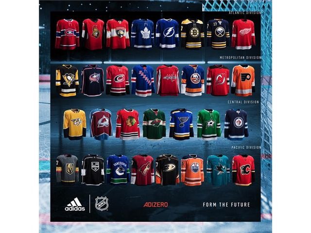
It's hard to tell on the tiny image, but at least they (maybe?) returned symmetry to the elbow stripes (where the previous version omitted the lower thin orange band so that the progression went white-orange-black-white)
I'm kind of disappointed that there really aren't any strikingly different versions there. Some teams have perceptibly changed their design, but there's nothing radical or daring among them.
Vegas isn't great, but they kind of backed themselves into a corner with that color scheme. The gold needed to be lighter or there needed to be more white or something to provide higher contrast between boring black and the very medium gold/grey pairing.