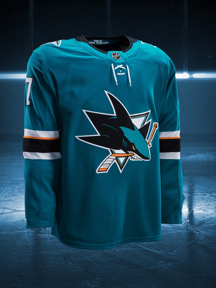
That looks worse than the Reebok version. Collar looks lame, non-functional laces super low on the front, still no waist stripe and still one out of place orange stripe. Yeah, that's a negative Ghost Rider.
These were perfect, wished they would go back to them or create one similar to it with the newer logo:
I love the heritage sweater. Unless the alternate is amazing, I probably won't be buying an Adidas one for a while. Any preview of the numbers? I hate the dotted design that some teams have shown.
We should all praise how much we love these new sweaters. Since the club usually does the exact opposite of what the fans want maybe we'll actually attractive jerseys after 20 years of doo-doo.
Agreed. The 07-13 jersey was an abomination. Worst jersey in franchise history bar none. All the others, including our current one, have been very good.
100% agree, only generation of Sharks jerseys where I don't own a home or away. Only thing good about those jerseys was that they were launched with the new logo, which I personally prefer.
Like the "Sharks Territory" inside the collar, hate the new collar and the laces are too low so it looks dumb. I like the new home shoulder patch. Overall not impressed. Was praying it would have gray or be more like our heritage with the new logo. I expect that those surveys they sent out are for the alternate Jersey we will probably unveil for the 18-19 season. Unless that looks awesome I doubt I will be buying an addidas jersey any time soon.
CoolHockey.com now has the vintage teal CCM sharks jerseys from the 90's and they're fully customizable, so I plan to get a #15 Korolyuk of that and take a break from buying jerseys. In case you aren't familiar with coolhockey, they do full stitching on all names/numbers none of that heat pressing.
Fine with the jersey's and actually like the Golden Knights sweaters. I know not many may like the GK's but I like that the colors are unique to only them.
I like the collar, Sharks Territory & the patches. Looks like it's time for me to get a teal. I have a black Boyle, white Jumbo and a Teal Burns, but the Burns only gets worn maybe once a year, since it's the one my mom won on Fan Appreciation day.
Now, who should it be. Thinking Pav's, maybe Hertl.
I'm starting to like the black on the collar and the "This is Sharks Territory," but something is off about the laces, they look horrible on both old and new. The high collars was one of the few things I liked about the Reeboks, oh well.
This site uses cookies to help personalise content, tailor your experience and to keep you logged in if you register.
By continuing to use this site, you are consenting to our use of cookies.