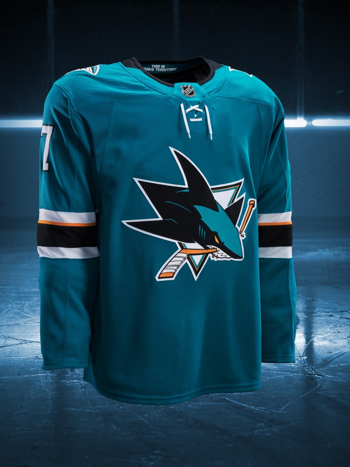
For comparison, here are the old and new ones.
Home:

Away:

I'm starting to like the black on the collar and the "This is Sharks Territory," but something is off about the laces, they look horrible on both old and new. The high collars was one of the few things I liked about the Reeboks, oh well.
With a rounded collar the laces make no sense. The previous versions have a V neck that actually goes down and requires the laces to close it. The laces on the new jerseys are entirely decorative.