
2017 New Logo/Jersey News And Concepts | Part 2 | Disappointment Edition
- Thread starter DrunkUncleDenis
- Start date
You are using an out of date browser. It may not display this or other websites correctly.
You should upgrade or use an alternative browser.
You should upgrade or use an alternative browser.
- Status
- Not open for further replies.

Big Papi
Who's Mel Bridgeman?
t
those would look good, but also nice to change things up, I'd rather save that design for a 3rd jersey (the red one). I don't know of any team that has adopted an outdoor game jersey as a regular jersey.This was such a layup. The work was already done. The red from this mock up would gave been great and we could have transitioned to this format later on for home and away.

PeterSidorkiewicz
HFWF Tourney Undisputed Champion
I haven't seen much. But, my question was honest. 50$ difference with their deal. So I'm curious/
If I were going to buy a new jersey, I would most certainly buy the Adidas jersey over the Fanatics one.
ToastrStutzle
Registered User
MaxTheLimit
Hockey ruins all my personal relationships

FolignoQuantumLeap
Don't Hold The Door
I've heard you'll get one with a preorder and a chance at a platinum version in loot boxes.I think you mean, ' Will there be a SILVER alternate version.'
Fandlauer
Registered User
Why do all the mannequins look like scoliosis sufferers taking a dump?
saskriders
Can't Hold Leads
This was such a layup. The work was already done. The red from this mock up would gave been great and we could have transitioned to this format later on for home and away.
My guess is it is ego driven, ie the creator/designer/decision maker feels like they need to create something original rather than use someone elses work...dont agree with it in this instance but that is my best guess as surely a pro brand wouldn't seemingly be this deaf to its fans.
Do Make Say Think
& Yet & Yet
- Jun 26, 2007
- 51,167
- 9,909
As expected, the jersey is mostly *shrug*.
As usual, people who claimed to have access to privileged information in order to rile the plebe ended up being full of it.
As usual, people who claimed to have access to privileged information in order to rile the plebe ended up being full of it.
danielpalfredsson
youtube dot com /watch?v=CdqMZ_s7Y6k
- Aug 14, 2013
- 16,575
- 9,269
My guess is it is ego driven, ie the creator/designer/decision maker feels like they need to create something original rather than use someone elses work...dont agree with it in this instance but that is my best guess as surely a pro brand wouldn't seemingly be this deaf to its fans.
My only guess is that they wanted to keep a full fledged red heritage jersey in their back pocket for 2 years down the line when we change our home/away to the heritage jersey. Make people buy it twice.
danielpalfredsson
youtube dot com /watch?v=CdqMZ_s7Y6k
- Aug 14, 2013
- 16,575
- 9,269
What's the big difference between the Adidas and Fanatic jerseys?
The Fanatics jersey is Wal-Mart/Giant Tiger quality. Don't buy it. The material is nothing like the actual jersey and it uses screen printed logos. If you're gonna shell out for one of these, pay the extra 50 bucks to get an Adidas version.
18Hossa
And Grace, Too
- Oct 12, 2012
- 6,625
- 252
The original pictures weren't very flattering and these imo look better. People who bought it in person say it also doesn't look as bad in person as it did in the release.

Shruggs Peterson
Registered User
- Mar 1, 2017
- 1,904
- 1,101
They really went for the bare bones treatment on the Habs jersey. It looks like Addidas was afraid to have both teams with stripes running through their logo.
Ser Grogu
Dank farrik
- Aug 6, 2009
- 2,631
- 1,340
The original pictures weren't very flattering and these imo look better. People who bought it in person say it also doesn't look as bad in person as it did in the release.
Better than the current homes.
DJB
Registered User
Meh. The first pick looked horrible. That Karlsson one there isnt that bad i guess.
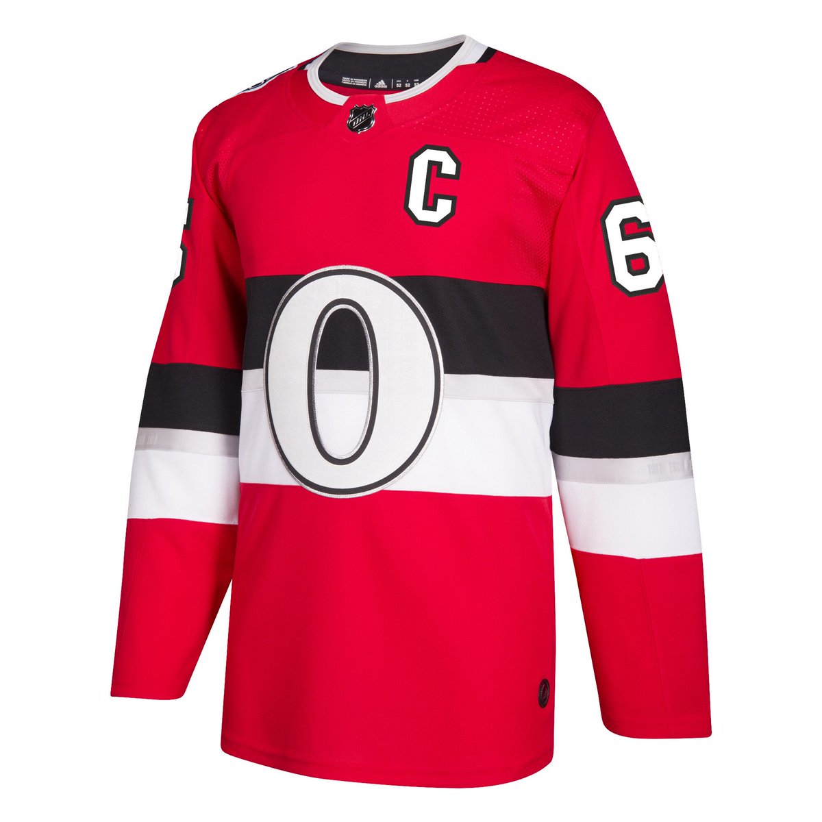
Is that O coloured white or silver? Im colour blind and can't tell
Is that O coloured white or silver? Im colour blind and can't tell
Golden_Jet
Registered User
- Sep 21, 2005
- 22,812
- 11,139
Masked
(Super/star)
L'Aveuglette
つ ◕_◕ ༽つ
You have to wonder why the team didn't have a photo sesh with Karlsson wearing the jersey so they could release those pics instead of the numerous crappy photos they sent out.
Sun God Nika
Palestine <3.
- Apr 22, 2013
- 19,922
- 8,283
Oh my god. I was lined up to drop 200$ on a Hoffman jersey and the team comes out and does this ....wow... ill wait for the new jerseys next season it cant be worse than this
L'Aveuglette
つ ◕_◕ ༽つ
Oh my god. I was lined up to drop 200$ on a Hoffman jersey and the team comes out and does this ....wow... ill wait for the new jerseys next season it cant be worse than this
Sens management: "Hold my beer"
Back in Black
All Sports would be great if they were Hockey
$50 & an Adidas logo on the back of the neck!What's the big difference between the Adidas and Fanatic jerseys?
Masked
(Super/star)
Oh my god. I was lined up to drop 200$ on a Hoffman jersey and the team comes out and does this ....wow... ill wait for the new jerseys next season it cant be worse than this
Too young to remember the SNES jerseys, are ya?
danielpalfredsson
youtube dot com /watch?v=CdqMZ_s7Y6k
- Aug 14, 2013
- 16,575
- 9,269
Seems like the general consensus is lukewarm to negative.
I actually like it. I think people will come around when seeing it as part of a uniform. I don't like it better than a red heritage from the old template with a black O, but it's pretty clear the silver was part of the theme for this outdoor game.
I actually like it. I think people will come around when seeing it as part of a uniform. I don't like it better than a red heritage from the old template with a black O, but it's pretty clear the silver was part of the theme for this outdoor game.
- Status
- Not open for further replies.
Ad
Latest posts
-
 Rumor: 2024 Trade Rumors and Free Agency Thread: Post Deadline
- Latest: AllAboutAvs
-
