18Hossa
And Grace, Too
- Oct 12, 2012
- 6,625
- 252
It's slightly silver.Meh. The first pick looked horrible. That Karlsson one there isnt that bad i guess.
Is that O coloured white or silver? Im colour blind and can't tell
It's slightly silver.Meh. The first pick looked horrible. That Karlsson one there isnt that bad i guess.
Is that O coloured white or silver? Im colour blind and can't tell
Maybe this is like that dress from a couple years ago that took over the internet. They are trying to go viral so they can make money to pay the playersIt's slightly silver.
The red concept being shown here is way too much like the 67s . Sens wouldn’t do that
Not the same at all, I’m referring to the one posted by foligno.I got some bad news for you.....
I got some bad news for you.....
Considering that the 67's got their concept from the original Sens...The red concept being shown here is way too much like the 67s . Sens wouldn’t do that
Too young to remember the SNES jerseys, are ya?
Someone posted this on Twitter as to what our jersey lineup should be, and I think this would work for everybody. Well, except the Sens themselves who seem averse to good taste and profit.

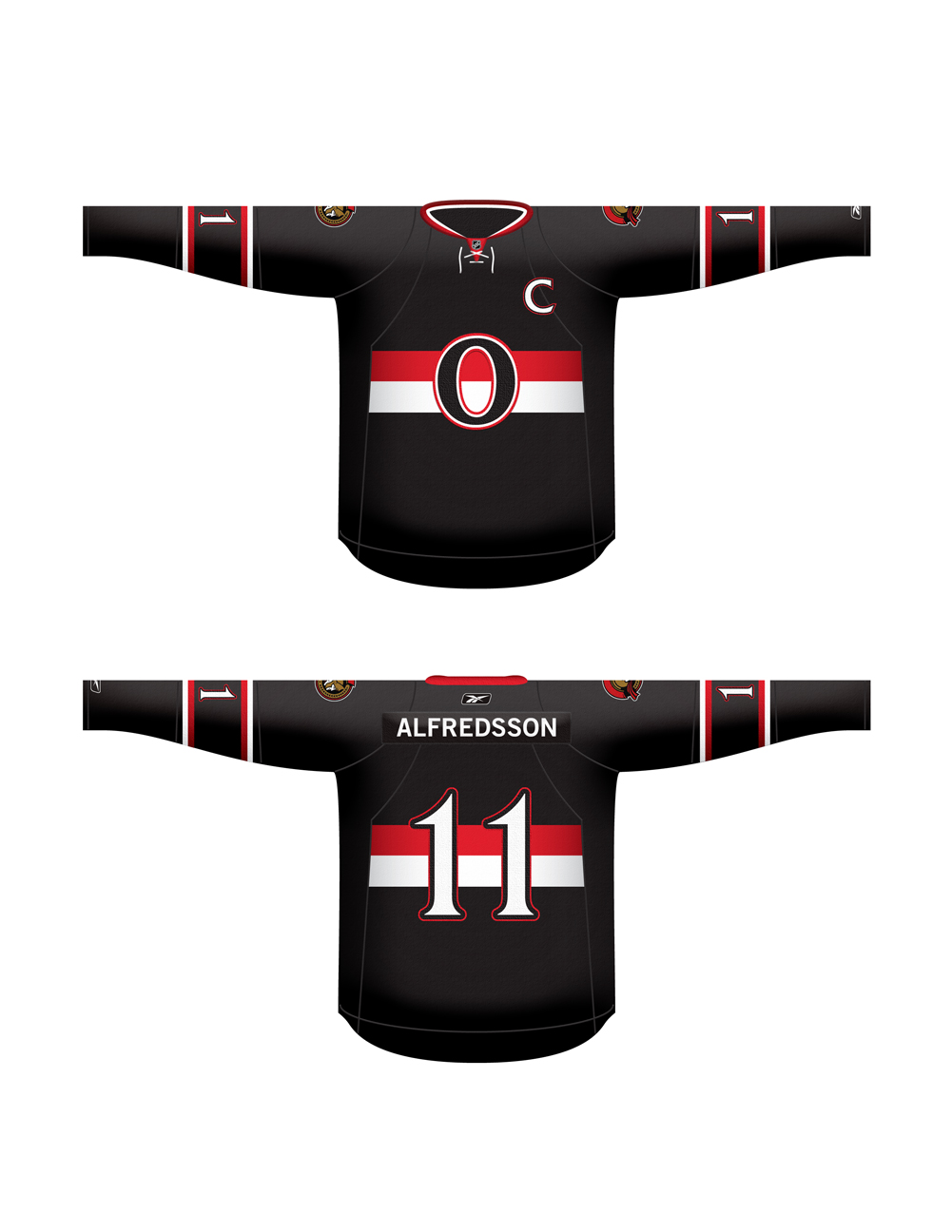
Still think these are the best I've seen, with the =O= as alt. It's a throwback while still having a modern touch to it, and the logo is perfect.

God those are ugly. Sens marketing is just so damn pathetic. I wanted to get a Stone Jersey but this is the third fail in a row. I just can't buy something that looks like a cartoon.
Just to bring these back into the discussion on style and taste
and these
 The Sens really need to consult with Jerkstore more often on jerseys since every design mockup he has done has received fan acclaim.
I hate the Jerkstore 2D mock ups, personally. I like our current jerseys a lot better
He used to be a poster on HF until he ran into some trouble with some Habs fansJerkstore?