
I don't hate the script logo on the keychain. At least it's legible. Hope they can rock it together with an awesome jersey.
Speculation: Winnipeg Jets to get 3rd Jersey next season - with a new logo
- Thread starter Jet
- Start date
You are using an out of date browser. It may not display this or other websites correctly.
You should upgrade or use an alternative browser.
You should upgrade or use an alternative browser.
- Feb 24, 2015
- 22,194
- 36,835
yeah...tissues for your issuesMy two cents.
As a species we are simply devolving into overly sensitive invertebrates who are more of a virus or plague upon it's home planet.
If you are offended by our team being called the "Jets" than may god have mercy on your soul or if you don't believe in god than may a meteorite strike you when you least expect it.
If I offended anyone, you can buy discount tissues at your local Dollarama.
no kidding about sensitivity sheesh can I say that

Man, if they are going to keep the heritage jerseys around, why don't they just make them the official 3rds? I won't complain though - the more of those jerseys, the better
A lighter blue jersey will be interesting, I hope it's nice
Three symbols for your answer: $$$

No not really. The blue is darker than that baby blue and they are one solid color (outside the black bordered thick white striping on the torso and arms.Hey Jet, didn't you liken the new 3rd jerseys to the Polar Bear ones the Moose wore? At least colour scheme-wise?

Here's another look at the keychain and whatever the 18/19 thing is (inside of the ticket package?)
That is the logo!!
Actually, the bottom of the J flares into a hockey stick, and the leading edge of the T cross is the nose of a jet.So it features neither a jet nor a hockey stick.....
So, yes... yes it does.
")
first this, and then some yahoo wants to open Portage and Main.So it features neither a jet nor a hockey stick.....
i can't take this BS no more!!!!1
JetFan4Ever
Registered User
- May 23, 2010
- 430
- 93
Not really!anyone else think it's a bit too similar to the Wild's 3rd jersey logo?


jetsforever
Registered User
- Dec 14, 2013
- 27,433
- 23,544
Here's a pic. The blue of the box is very close to the new jersey color as well.
Here's another look at the keychain and whatever the 18/19 thing is (inside of the ticket package?)
Eh, I'm pretty underwhelmed. This script logo seems fairly boring. I'm keeping an open mind for how the complete jersey will look though.
Hammer Slammer
Registered User
anyone else think it's a bit too similar to the Wild's 3rd jersey logo?
It's the same idea but I think I like the Jets script logo better. The M on the Wild one is butt ugly. And I always hated that cream coloured border around the shoulders. If the Jets can avoid that I'll probably like the jersey just fine. Can't be any worse than that monstrosity the Hurricanes are trotting out.
DannyGallivan
Your world frightens and confuses me
I don't want to digress, but I love these Minny uniforms. Very retro feel, and I'm a nostalgic, retro guy.It's the same idea but I think I like the Jets script logo better. The M on the Wild one is butt ugly. And I always hated that cream coloured border around the shoulders. If the Jets can avoid that I'll probably like the jersey just fine. Can't be any worse than that monstrosity the Hurricanes are trotting out.
GaryPoppins
A broken clock is right twice in a day
- Sep 10, 2016
- 2,424
- 3,141
Logos usually don't have their "impact" until they're on a jersey, IMO. I'll hold my judgement but as of now, it's a "Meh"
*DISCLAIMER* I'm still likely buying one lol
*DISCLAIMER* I'm still likely buying one lol
DowntownBooster
Registered User
No not really. The blue is darker than that baby blue and they are one solid color (outside the black bordered thick white striping on the torso and arms.
Jet, can you confirm there is no band running down the length of the sleeve?

purdy44
Registered Loser
That's a bit of a stretch imoActually, the bottom of the J flares into a hockey stick, and the leading edge of the T cross is the nose of a jet.
So, yes... yes it does.
Cellee
Registered User
- Dec 20, 2014
- 8,951
- 6,168
anyone else think it's a bit too similar to the Wild's 3rd jersey logo?
No.
Plus your incorrect opinion on Portage and Main will make me disagree with anything you say going forward.
Cellee
Registered User
- Dec 20, 2014
- 8,951
- 6,168
Saw this at www.icethetics.co
Please keep in mind it is only a fan concept. Seems to check some of the boxes of the rumours we've read here.
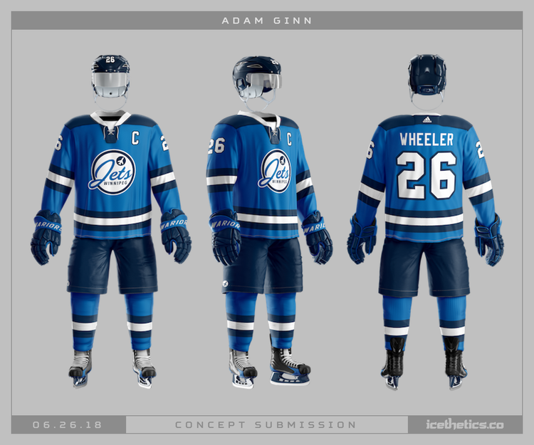
This seems not super far off.
i will fight you in your home turf: the CHUD tunnel beneath P&MNo.
Plus your incorrect opinion on Portage and Main will make me disagree with anything you say going forward.
Brominator
Registered User
So far, I'm not too excited by it. Seems too cookie-cutter-retro to me. Anther jersey without red is also a bummer - add some red striping and red pants and even this jersey would really pop. Our regular jerseys are already (mainly) monochromatic and bland. 3rd jerseys are a opportunity to have more fun.
Ah well, like others, I will still probably buy one.
Ah well, like others, I will still probably buy one.
what's with the red fixation?So far, I'm not too excited by it. Seems too cookie-cutter-retro to me. Anther jersey without red is also a bummer - add some red striping and red pants and even this jersey would really pop. Our regular jerseys are already (mainly) monochromatic and bland. 3rd jerseys are a opportunity to have more fun.
Ah well, like others, I will still probably buy one.
if anything, it would be pretty great if they looked at Bomber blue and some gold piping.
White Out 902
I'm usually right.
Boring and uninteresting. Meanwhile we have incredible jerseys from the 70s, 80s and 90s to work with and they douse us this lukewarm dishwater.
I get they want to have their own identity but the fans spoke and you named this franchise the Jets. Own it. It's what the fans want.
I get they want to have their own identity but the fans spoke and you named this franchise the Jets. Own it. It's what the fans want.
dude...Boring and uninteresting. Meanwhile we have incredible jerseys from the 70s, 80s and 90s to work with and they douse us this lukewarm dishwater.
I get they want to have their own identity but the fans spoke and you named this franchise the Jets. Own it. It's what the fans want.
many many more years left to bring back the (awful) 90s logo. patience.
civic204
Registered User
- Jun 1, 2012
- 412
- 149
This seems not super far off.
I suspect this is based on the description in the thread. I think it was posted shortly after.
Ad
Latest posts
-
 Around the League Thread | Stop f***ing crying, bro, this isn’t Junior.
- Latest: AwesomeInTheory
-

-
 Series Talk: WCSF - Vancouver Canucks vs Edmonton Oilers
- Latest: Sergei Shirokov
-
