
What was the worst jersey in modern NHL history?
- Thread starter sabremike
- Start date
You are using an out of date browser. It may not display this or other websites correctly.
You should upgrade or use an alternative browser.
You should upgrade or use an alternative browser.
FissionFire
Registered User
Bonus pic of cool cat too.
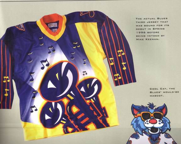
Vetoing this jersey may be the smartest thing Mike Keenan ever did in the NHL.
HockeyFan100
Registered User
- Oct 7, 2012
- 4,422
- 3,309
Oilers and Canucks in the late 90s/2000s had some of the most hideous jerseys ever unleashed.

Those are easily way better than their current ones.

Bertuzzzi44
Registered User
- Jun 26, 2018
- 3,411
- 2,997
Those are easily way better than their current ones.
Gross
aufheben
#Norris4Fox
Lirl I never even noticed that.I used to think it was this one. But it's so bad I want it. The fact the cartoon duck is wearing a jersey with an alternate logo on it is hilarious.
aufheben
#Norris4Fox
The 1990s were a time, man.Someone was paid lots of money to come up with that design and then it was approved by a board of directors.
Let that sink in.
LakeLivin
Armchair Quarterback

njdevils1982
Hell Toupée!!!
Is this really debatable?

harold snepsts would beat your ass if you said that to his face
82Ninety42011
Registered User
Though I agree Canucks V's are champs of any ugly jersey contest thought I'd add one that most haven't seen. Kansas City Scouts from the 70's.

kaiser matias
Registered User
- Mar 22, 2004
- 4,727
- 1,871
harold snepsts would beat your ass if you said that to his face
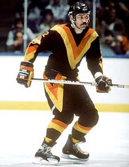
Even worse, that's Tiger Williams in the photo (Snepsts never wore a helmet).
MetalheadPenguinsFan
Registered User
Svencouver
Registered User
These are ripe for an ironic comeback. I would be elated beyond words if they wore these in an actual NHL game. I would probably cryBonus pic of cool cat too.
Legionnaire
Help On The Way
Ahh yes, the Dallas Gynecolgists.
The mooterus.
mattihp
Registered User
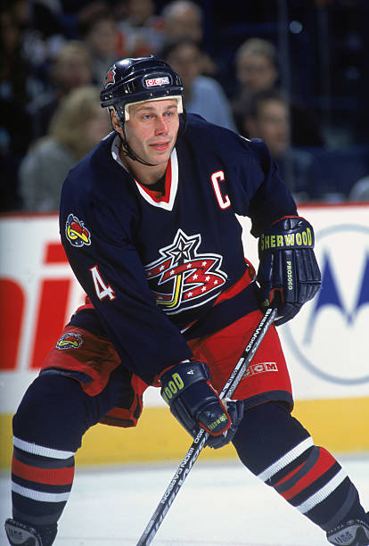
Probably an unpopular opinion though. And the third team's jersey that we have seen with Odelein in this thread

I have to disagree.Though I agree Canucks V's are champs of any ugly jersey contest thought I'd add one that most haven't seen. Kansas City Scouts from the 70's.
This is one dope jersey. The colours go so well together and the logo was very detailed for that time.
Don't like it either but it brings that nostalgic touch with it. Maybe that's the point that attracts people to liking the jersey.Never understood why some people liked those :
:format(webp)/cdn.vox-cdn.com/uploads/chorus_image/image/65809138/84580781.jpg.0.jpg)
82Ninety42011
Registered User
I don't know about the colours quite similar to Canucks V's just on white really instead.I have to disagree.
This is one dope jersey. The colours go so well together and the logo was very detailed for that time.
Maplebeasts
I See Demons!!!!!
Oddbob
Registered User
- Jan 21, 2016
- 15,937
- 10,483
Bonus pic of cool cat too.
Was this seriously in the running? This is ECHL level bad!
Oddbob
Registered User
- Jan 21, 2016
- 15,937
- 10,483
Though I agree Canucks V's are champs of any ugly jersey contest thought I'd add one that most haven't seen. Kansas City Scouts from the 70's.
These are definitely up there for worst! Why on earth is there blue in the logo, which already sucked without the odd colours.
FerrisRox
"Wanna go, Prettyboy?"
These are definitely up there for worst! Why on earth is there blue in the logo, which already sucked without the odd colours.
What's wrong with blue in the logo? There's blue throughout the jersey.
Oddbob
Registered User
- Jan 21, 2016
- 15,937
- 10,483
What's wrong with blue in the logo? There's blue throughout the jersey.
The jersey that is posted in this photo has no blue on it.
Oilers Propagandist
Relax junior, it’s just a post.
Nah, man you’re trippin out. The current canucks jerseys are nice. The millionaires ones were good too.Those are easily way better than their current ones.
Anyways, I would argue that these are pretty horrible. Like who the hell thought that adding the Alberta and Canadian flags were a good idea or as they would say idear.
FerrisRox
"Wanna go, Prettyboy?"
The jersey that is posted in this photo has no blue on it.
Are you colour blind?
Oddbob
Registered User
- Jan 21, 2016
- 15,937
- 10,483
Are you colour blind?
You mean the blue, that is so dark it may as well be black?